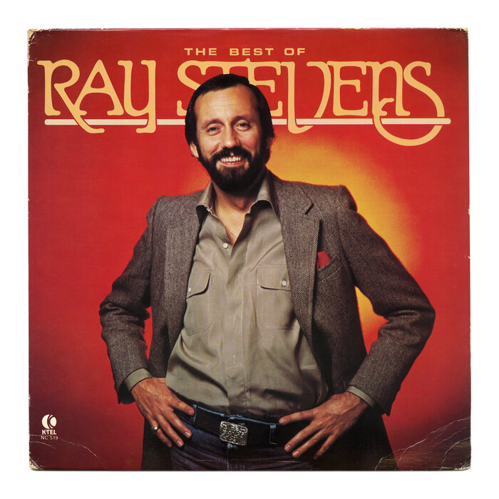
The Best of Ray Stevens album art
Published January 31, 2026
By FontsInUse
Photo(s) by Bart Solenthaler on Flickr.
Source: www.flickr.com Uploaded to Flickr by Bart Solenthaler and tagged with “parsons”. License: All Rights Reserved.


Source: archive.org License: All Rights Reserved.
This post was originally published at Fonts In Use
Source: www.flickr.com Uploaded to Flickr by Bart Solenthaler and tagged with “parsons”. License: All Rights Reserved.
This double LP with the best of Ray Stevens (b. 1939) was released by K-Tel in 1980. The name of the singer-songwriter and comedian is shown in Parsons, a typeface designed in 1917 by Will Ransom. Parsons came with a couple of alternate swash caps and select glyphs with extra long ascenders and descenders. It didn’t have descending forms for R V S, though. Richard Flair a.k.a. Puritan Flair is a phototype version with more alternates, but it likewise lacks the glyphs seen here.
Source: archive.org License: All Rights Reserved.
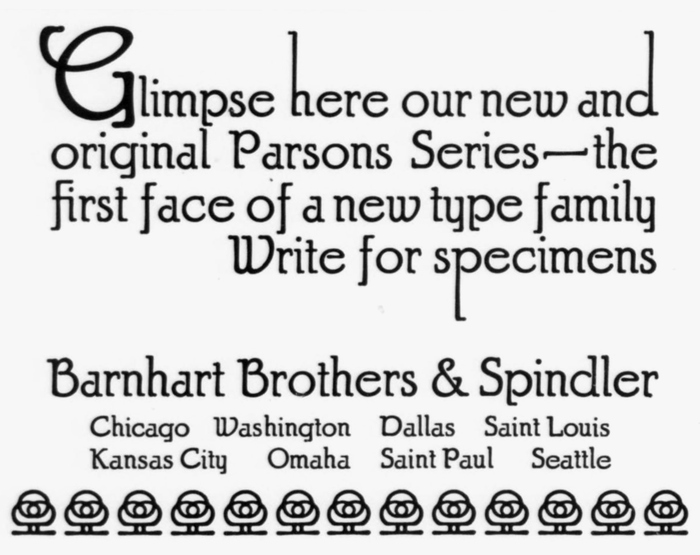
The Parsons Series as it was advertised by Barnhart Brothers & Spindler in the November 1917 issue of the Inland Printer
This post was originally published at Fonts In Use
Read full story.
WRITTEN BY
FontsInUse
An independent archive of typography.
More from FontsInUse