Nampa Christian Housing brand identity
Source: www.overmatter.design License: All Rights Reserved.

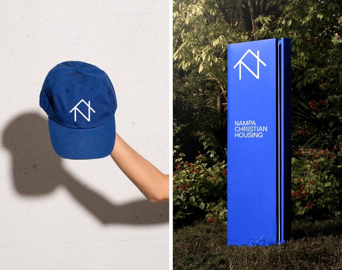
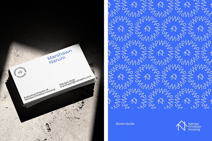
Early Sans is used for the identity of Nampa Christian Housing, a chain of senior living communities in Idaho.
From Overmatter’s case study:
We wanted to design an identity that didn't patronize people who can no longer afford appropriate housing—the market in Idaho has skyrocketed in recent years, and for many seniors, their benefits ended when their spouses passed away.
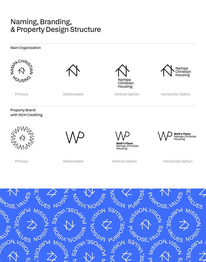
As such, the brand needed to be hopeful, charming, and a sense a pride for members of the community. Nampa Christian Housing is the organization dedicated to developing mulitple sites, but each site will be a standalone campus. The brand has to adapt to each location in order to feel 'homely' to residents while still carrying the prowess of NCH so they can continue to develop projects.
Source: www.overmatter.design License: All Rights Reserved.
Source: www.overmatter.design License: All Rights Reserved.

Source: www.overmatter.design License: All Rights Reserved.

Source: www.overmatter.design License: All Rights Reserved.
This post was originally published at Fonts In Use