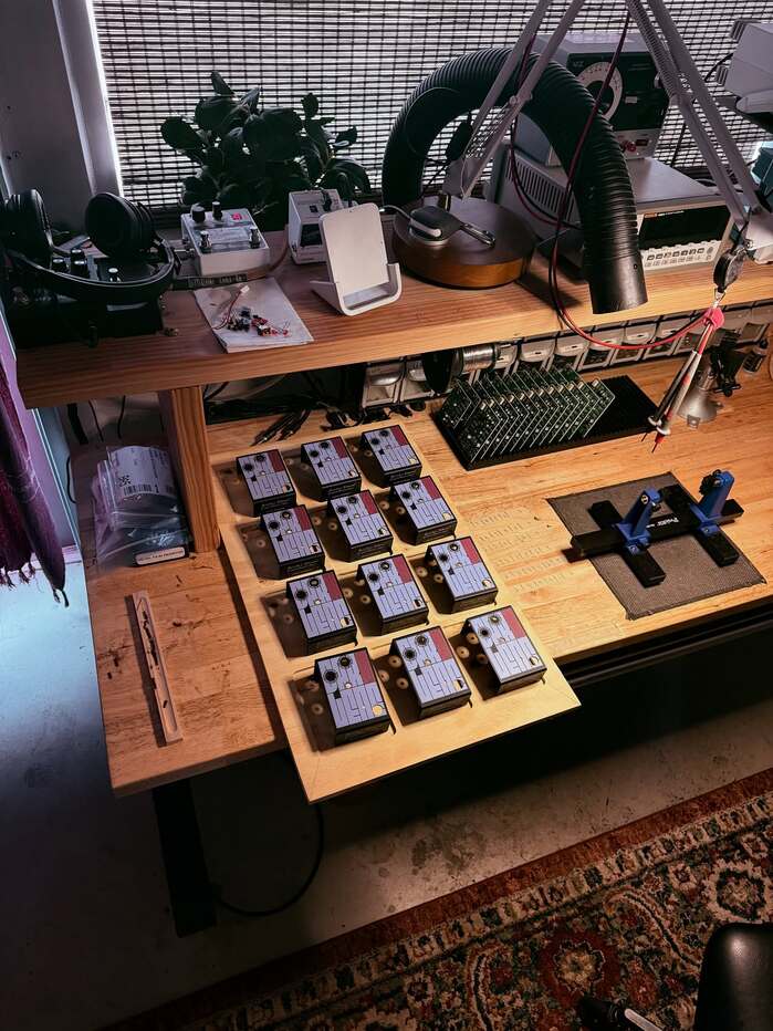
Darlene effects pedal
Heather Brown Electronicals. License: All Rights Reserved.

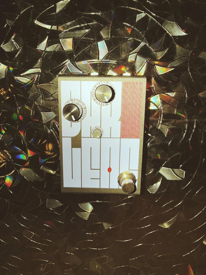
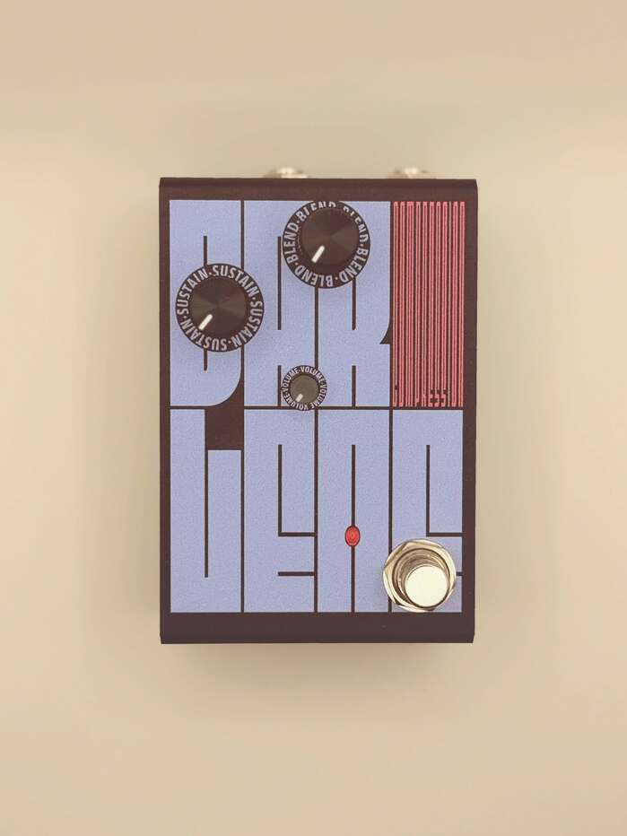
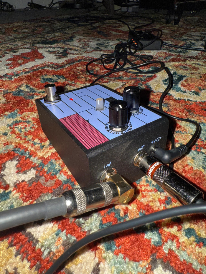
Darlene is a new effects pedal created by Heather Brown Electronicals. Brown describes its voicing as “intentionally neutral. No color, no smear. Just preserved dynamics with rich sustain, natural attack, and silent operation.”
Designed by Graham McClanahan, this pedal goes all-in on typography. Nearly the entire face (!) of the pedal is occupied by the pedal’s name, typeset in Fit. The letters are arranged in a 4×2 grid, with “DARLENE” set in Fit’s Normal width and “COMPRESSION” squeezed into the upper right cell, stretching the typeface to its narrowest, least-readable limit!
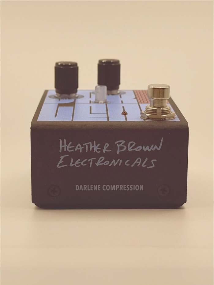
The pedal’s dials have labels set on a circle in Avenir Next Condensed. Supplemental information on the side is Heather’s handwriting, digitized!
McClanahan said about the choosing the typeface:
I was actually scrolling Adobe fonts a while back and FIT stood out immediately, so I saved it and played around with it but didn’t really have an application. When I worked with Heather a few months later, we tried a lot of different artwork iterations and nothing really seemed right and then I stumbled upon FIT again. It was my first time using a variable typeface in print so it was a lot trial and error and fun. True to its name it just fits anywhere and has so many possibilities (I probably did over 50 different versions initially because it was so fun). Also this being a compression pedal FIT seemed natural here. Absolutely brilliantly crafted. Something that also worked so well is Heather was hoping to have someway to emphasize DAR on Darlene because of a family member’s nickname that inspired the theme/name of the pedal. This wasn’t really working with the other iterations we went through and we were ready to ditch it but with how flexible the layout possibilities are on FIT it was a huge win to incorporate that in the final. Most importantly David’s typeface carries the design so credit to his brilliance here and I’m excited to see more of what’s to come from him.
As the font’s designer, I couldn’t be more thrilled with this application of Fit… this is the kind of thing it was born to do!
Heather Brown Electronicals. License: All Rights Reserved.
Heather Brown Electronicals. License: All Rights Reserved.
Heather Brown Electronicals. License: All Rights Reserved.
Heather Brown Electronicals. License: All Rights Reserved.
Heather Brown Electronicals. License: All Rights Reserved.
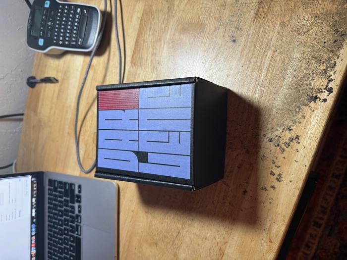
Packaging
Heather Brown Electronicals. License: All Rights Reserved.
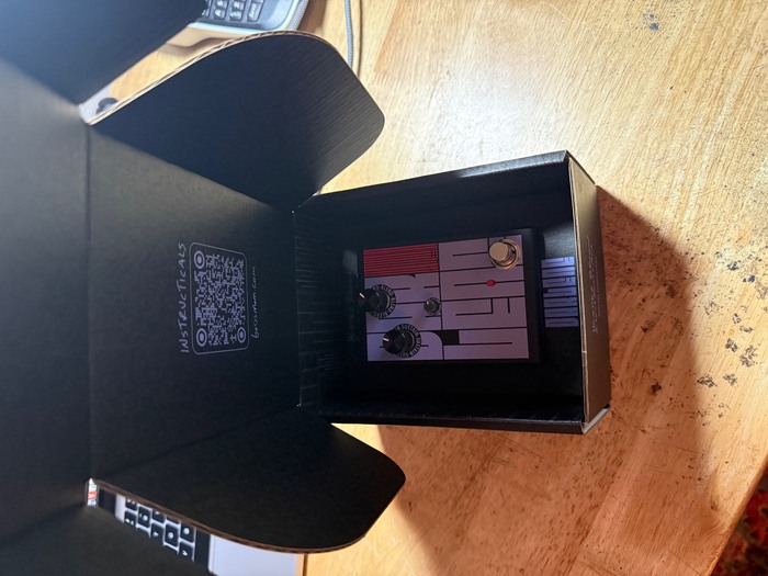
Packaging interior
This post was originally published at Fonts In Use