Writing Systems of the Otherworld
Edgar Walthert. License: All Rights Reserved.
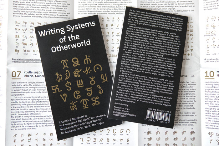
The fifth poster in this ever-extending series, which began with The Annex of Universal Languages, was initiated by Akiem Helmling, the curator of Alphabetum in The Hague. This poster was created in collaboration with Tim Brookes from Endangered Alphabets, who researched and wrote the 20 dream-stories presented in this publication.
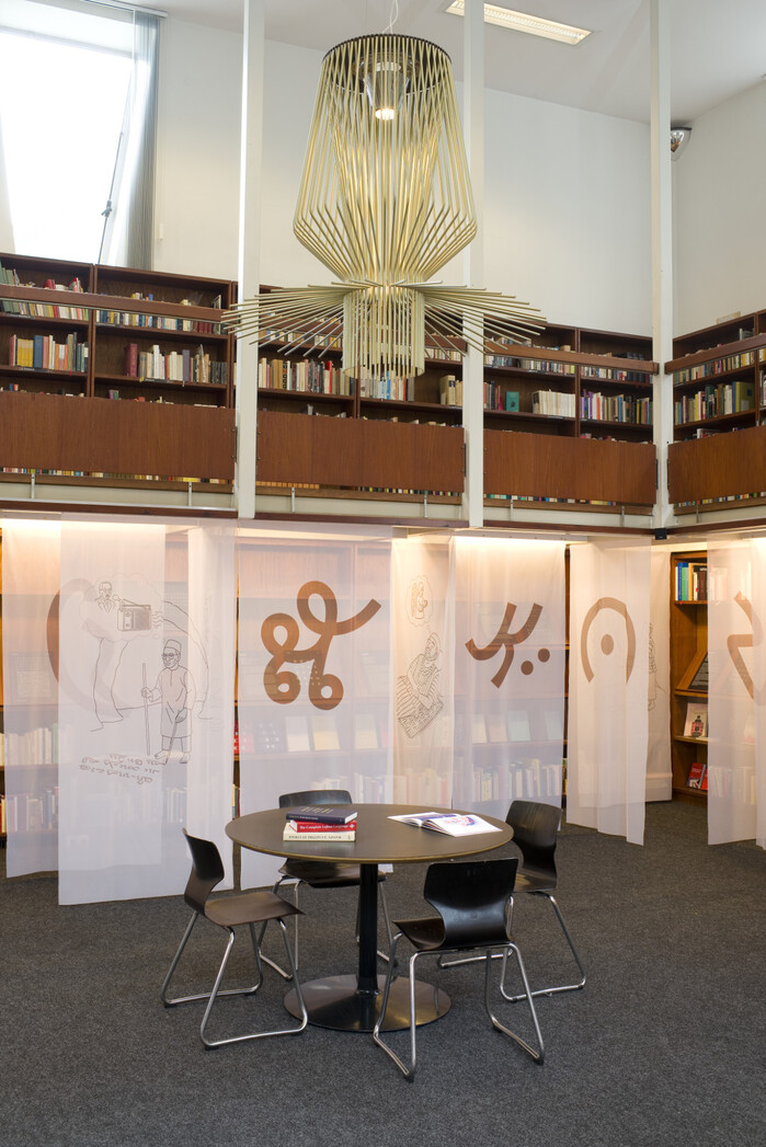
From September 6, 2025 to January 25, 2026, Alphabetum hosted an exhibition of the same name, where the illustrations, writing systems, and their creation myths were presented. The translucent flags created a dreamscape that invited the audience to browse through and become immersed in the work.
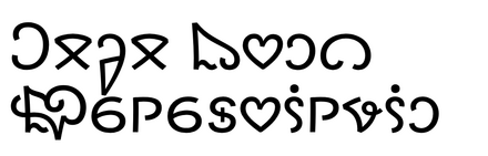
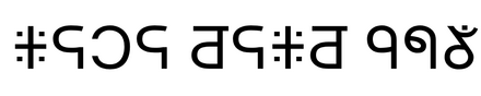
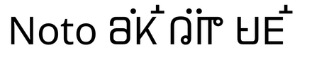
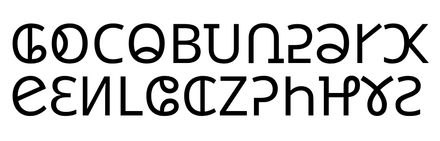
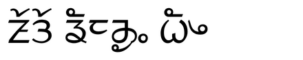
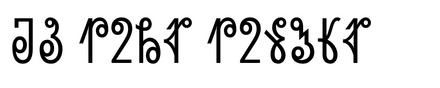
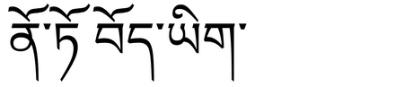
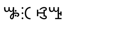
In creating this poster, I prioritized Noto Sans and Serif versions of the writing systems where available, secondly looked to existing Unicode proposals, and as a last resort, quickly digitized blurry images. Eleven of the 20 alphabets and syllabaries have already been added to the Noto type family, while others had Unicode proposals clean enough to use. In the case of Bété, I reached out to ANRT alumnus Adam Yeo, who provided me with his digital interpretation of Frédéric Bruly Bouabré’s handwritten script.
The poster has been offset printed – locally in the Netherlands – with Pantone Gold and Black and was mechanically folded by a bookbinder in Haarlem.
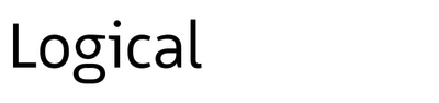
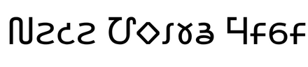
Like the other parts of the series, this edition also uses my typeface Logical which, thanks to its inclusion of icons that can be transformed from words, initiated this whole adventure. Handing a specimen of Logical to Richard Niessen in 2018 caused him to invite me to participate in his Palace of Typographic Masonry by adding a new room. Logical has been released by Bold Monday and combines the warmth and legibility of humanist typefaces with the technical look of typefaces like DIN and Isonorm. Its markdown-inspired syntax to transform words into icons via OpenType features makes them easily accessible even in software without a glyphs palette. The underline feature, which ensures that descenders are not cut off, also gets heavy use in the referenced links below each panel.
Jhoeko. License: All Rights Reserved.
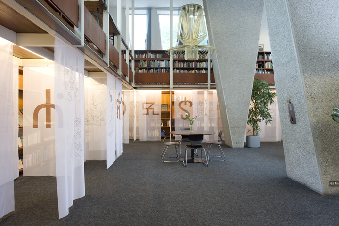
The view when entering Alphabetum in The Hague. The publicly accessible library invites visitors to read books, have a coffee, or discuss language with others. Its brutalist yet warm architecture makes every visit to Alphabetum an enriching experience.
Edgar Walthert. License: All Rights Reserved.
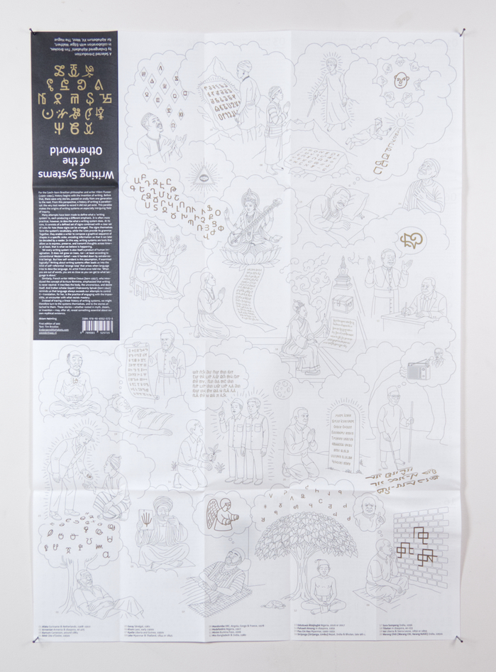
The poster side of the panel illustrates 20 out of 22 visions displayed in the exhibition.
Edgar Walthert. License: All Rights Reserved.
Each of the 20 panels describes an origin story of the writing system presented below. The small number in the top right indicates the number of active users.
Jhoeko. License: All Rights Reserved.
Another view of the exhibition in Alphabetum with the beautiful Foscarini Allegro Assai suspension lamp.
Jhoeko. License: All Rights Reserved.
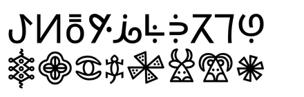
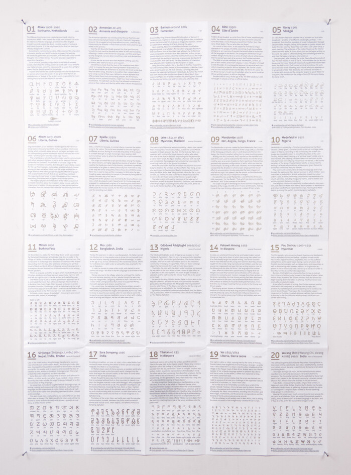
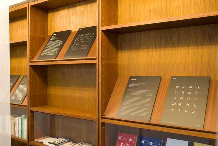
Behind the flags, each writing system is featured on two black A3 panels. On the left, the text and information provided by Tim Brookes; on the right, an example or the full set of glyphs.
This post was originally published at Fonts In Use