Vor dem Knall movie posters and titles
Published February 3, 2026
By FontsInUse
Contributed by Rellence (prev. Ultra Kuhl)
Source: the-brandidentity.com License: All Rights Reserved.

Source: the-brandidentity.com License: All Rights Reserved.
Source: the-brandidentity.com License: All Rights Reserved.
Source: the-brandidentity.com License: All Rights Reserved.
Source: the-brandidentity.com License: All Rights Reserved.
Source: the-brandidentity.com License: All Rights Reserved.
Source: the-brandidentity.com License: All Rights Reserved.
Source: the-brandidentity.com License: All Rights Reserved.
Source: the-brandidentity.com License: All Rights Reserved.
Source: the-brandidentity.com License: All Rights Reserved.
This post was originally published at Fonts In Use
Source: the-brandidentity.com License: All Rights Reserved.
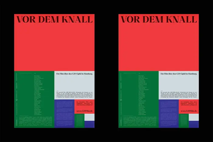
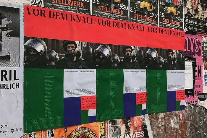
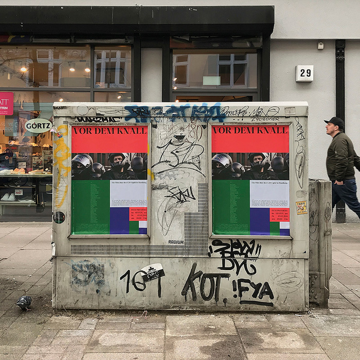
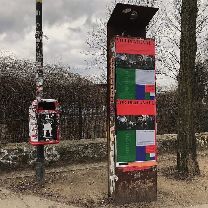
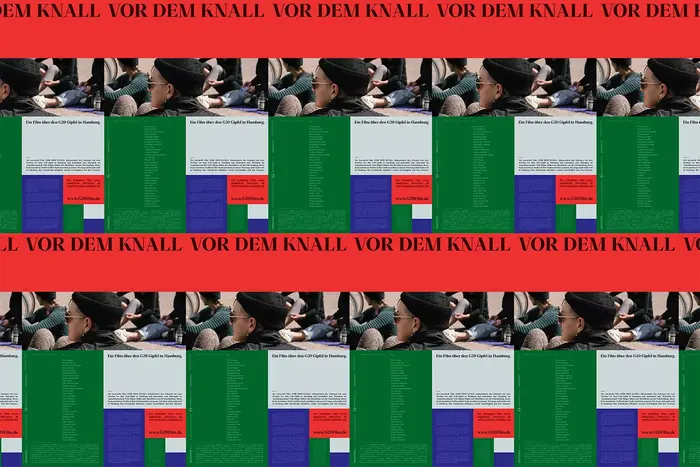
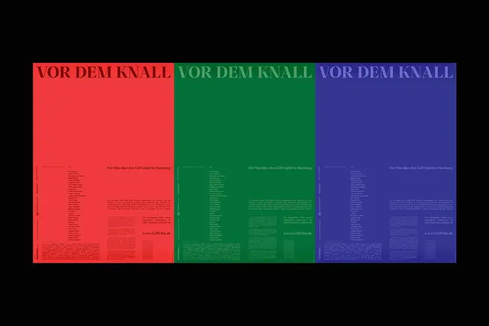
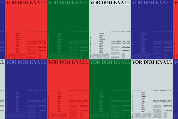
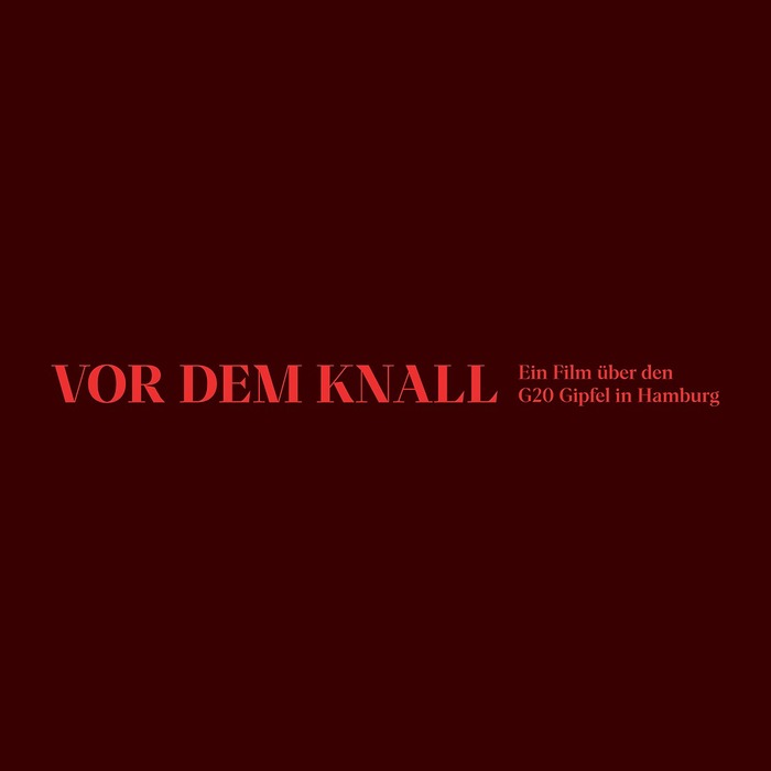
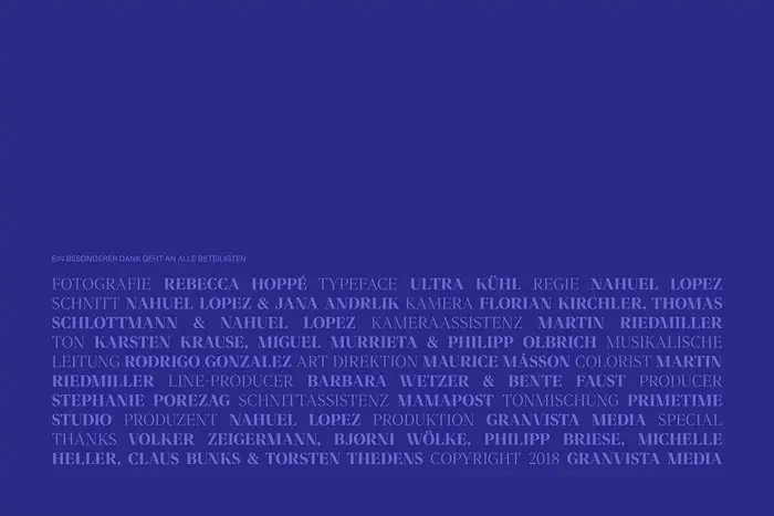
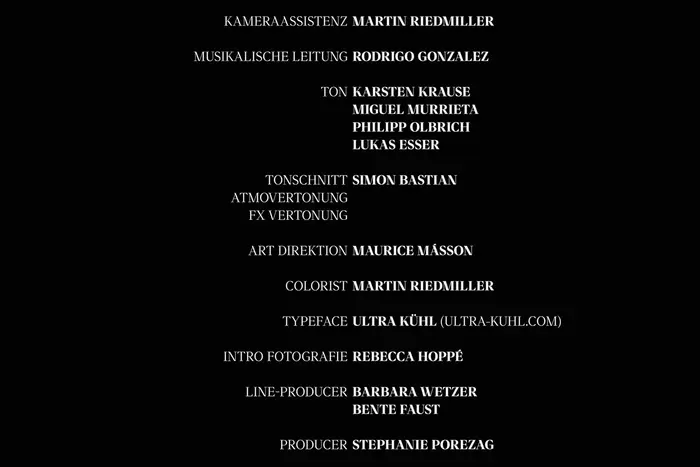
Para from Rellence was used for the visual identity of Vor dem Knall, a documentary about the 2017 G20 summit in Hamburg. The typeface gives the project a sharp and contemporary tone that fits the film’s focus on political tension and civic atmosphere.
From The Brand Identity:
The film premiered on April 3rd 2018. Designer Maurice Másson [a.k.a. Maurice Schilling] created the visual identity for the film, which includes posters, title sequences and closing credits.
Source: the-brandidentity.com License: All Rights Reserved.
Source: the-brandidentity.com License: All Rights Reserved.
Source: the-brandidentity.com License: All Rights Reserved.
Source: the-brandidentity.com License: All Rights Reserved.
Source: the-brandidentity.com License: All Rights Reserved.
Source: the-brandidentity.com License: All Rights Reserved.
Source: the-brandidentity.com License: All Rights Reserved.
Source: the-brandidentity.com License: All Rights Reserved.
Source: the-brandidentity.com License: All Rights Reserved.
This post was originally published at Fonts In Use
Read full story.
WRITTEN BY
FontsInUse
An independent archive of typography.
More from FontsInUse