MAAP
Published February 3, 2026
By FontsInUse
Contributed by WELTKERN® Typefaces
Source: maap.cc MAAP. License: All Rights Reserved.


Source: maap.cc MAAP. License: All Rights Reserved.
Source: maap.cc MAAP. License: All Rights Reserved.
Source: maap.cc MAAP. License: All Rights Reserved.
Source: maap.cc MAAP. License: All Rights Reserved.
Source: maap.cc MAAP. License: All Rights Reserved.
Source: maap.cc MAAP. License: All Rights Reserved.

Source: maap.cc MAAP. License: All Rights Reserved.

Source: maap.cc MAAP. License: All Rights Reserved.
Source: maap.cc MAAP. License: All Rights Reserved.
This post was originally published at Fonts In Use
Source: maap.cc MAAP. License: All Rights Reserved.
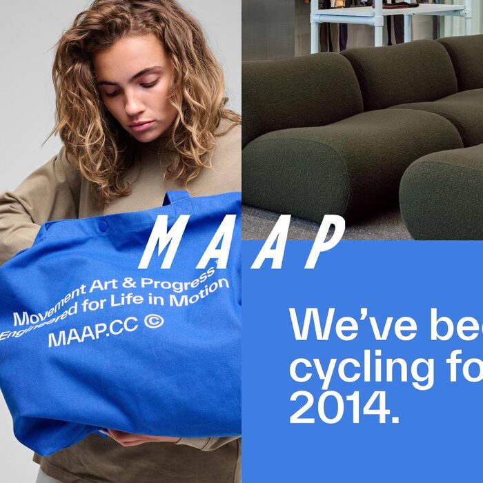
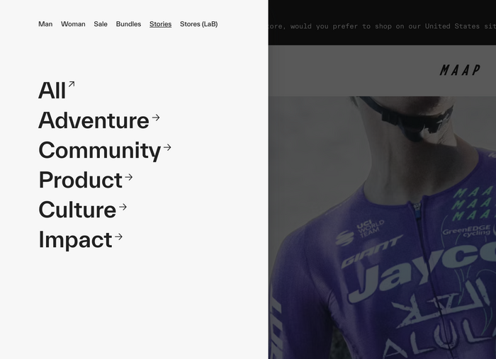
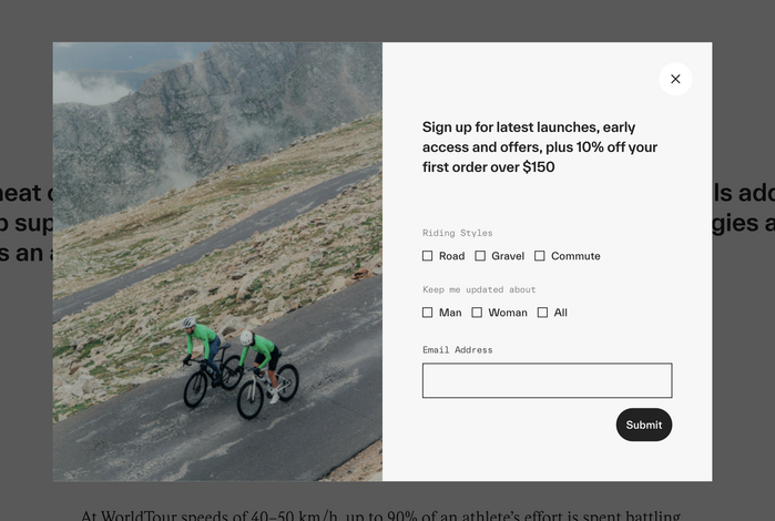
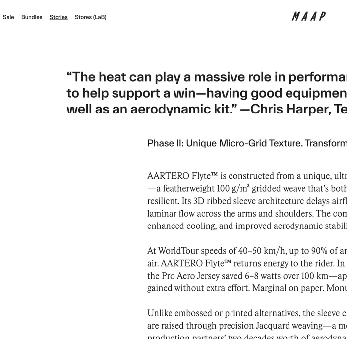
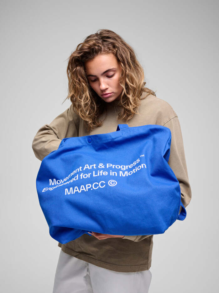
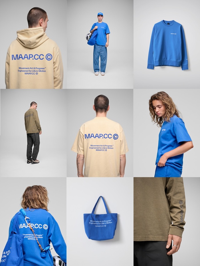
Born in Melbourne, MAAP builds performance cycling gear with a sharp eye for style, function and detail. Since 2014, the brand has fused fashion, graphic design and technical expertise to push the culture of riding forward—on and off the road.
The visual identity reflects this hybrid DNA. TWK Everett and TWK Everett Mono, designed by Nolan Paparelli and published by WELTKERN®, form the foundation of MAAP’s typographic system. These two utilitarian grotesks offer clarity, rhythm and modern restraint, whether used for bold headlines or technical specs. They are paired with Rhymes, a confident serif by Jakub Samek (Maxitype), which adds tonal contrast and editorial flair.
Source: maap.cc MAAP. License: All Rights Reserved.
Source: maap.cc MAAP. License: All Rights Reserved.
Source: maap.cc MAAP. License: All Rights Reserved.
Source: maap.cc MAAP. License: All Rights Reserved.
Source: maap.cc MAAP. License: All Rights Reserved.
Source: maap.cc MAAP. License: All Rights Reserved.
Source: maap.cc MAAP. License: All Rights Reserved.
Source: maap.cc MAAP. License: All Rights Reserved.
Source: maap.cc MAAP. License: All Rights Reserved.
This post was originally published at Fonts In Use
Read full story.
WRITTEN BY
FontsInUse
An independent archive of typography.
More from FontsInUse