Michaela Barnett campaign website
Source: www.michaelafortennessee.com License: All Rights Reserved.



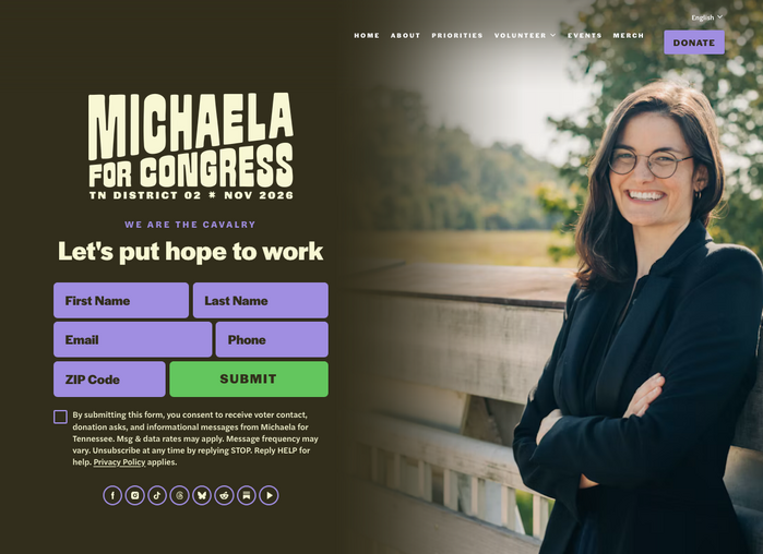
Halyard by Darden Studio is the typographic backbone of Michaela Barnett’s campaign website.
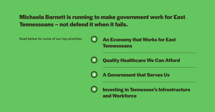
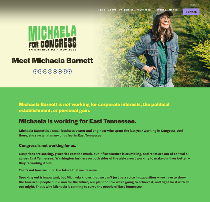
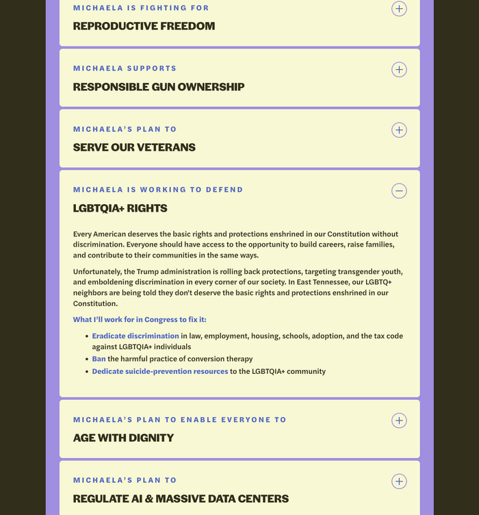
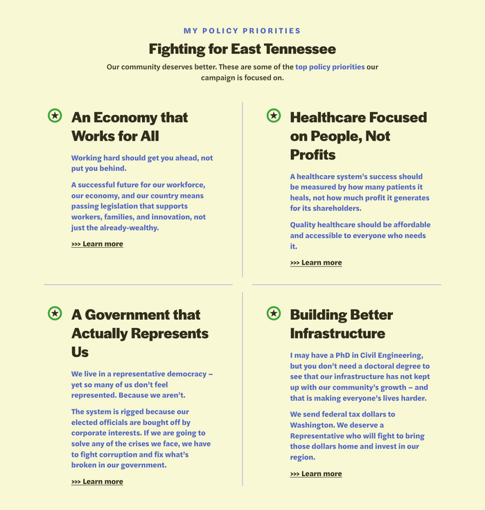
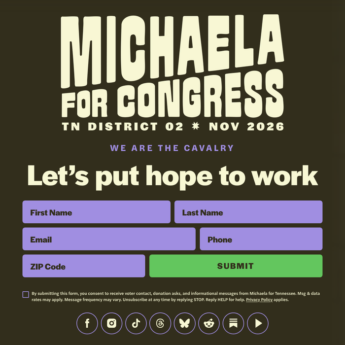
Michaela Barnett is running for election to the U.S. House to represent Tennessee’s 2nd Congressional District. Her website features headlines in Halyard Display’s Bold weight. This includes the slogan “Let’s put hope to work” on the homepage. The same impactful font style also serves for the call to action, “Fuel this grassroots movement to flip TN-02”, and the donation amounts. Halyard Text – distinguished by more open shapes – can be seen in use for the bio paragraphs, the policy list, and the sign-up form labels.
It’s a proper Display/Text pairing featuring different styles from one family, used at the right sizes. Thanks to the competent typographic choices, the website delivers its message in a convincing manner. The design is rounded off by an activating logo (based on FBS Mecho) and dashes of color in an underused combo (purple and green).
Source: www.michaelafortennessee.com License: All Rights Reserved.

Source: www.michaelafortennessee.com License: All Rights Reserved.

Source: www.michaelafortennessee.com License: All Rights Reserved.
Source: www.michaelafortennessee.com License: All Rights Reserved.
Source: www.michaelafortennessee.com License: All Rights Reserved.

Source: www.michaelafortennessee.com License: All Rights Reserved.
Source: www.michaelafortennessee.com License: All Rights Reserved.
Source: www.michaelafortennessee.com License: All Rights Reserved.
This post was originally published at Fonts In Use