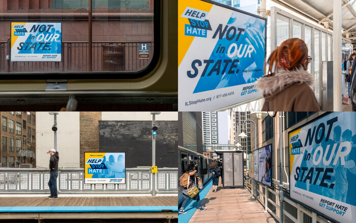
Help Stop Hate

Source: span.studio Span. License: All Rights Reserved.


Transforming words into actions.
The State of Illinois Department of Human Rights (IDHR) and the Commission on Discrimination and Hate Crimes (CDHC) launched a statewide service to support people targeted by hate. It had a phone number. What it lacked was the public’s awareness and trust. My team at Span was brought in to change that.
Working alongside UIC’s Institute for Healthcare Delivery Design (IHDD), we renamed, rebranded, and reintroduced the service to the public. The result was Help Stop Hate – a trauma-informed, multilingual, statewide service and campaign that reframed reporting not as retaliation, but as care in action.
Initially piloted as Illinois v. Hate, the helpline's name implied conflict and positioned the state as the protagonist. Moving away from tension to solidarity, the renamed service Help Stop Hate is a three-word promise. Help centers care. Stop signals urgency. Hate names the problem—without euphemism.
Three cuts of Grilli Type’s GT Planar were used, allowing ‘Help’ to lean forward into action, ‘Stop’ to lean back in urgency, and ‘Hate’ to sit still—unignorable. The visual language draws on civic forms: rigid diagonals, grounded color, modular composition. Designed to function everywhere from Chicago CTA ads to community newspapers and rural county billboards.
To reach survivors—not just residents—we kept the value proposition simple and kind. “Report hate, get support” is about access and letting people know: they are not alone.
This is where the secondary type Grenette come in with a quiet strength. Its rounded serifs and open forms contrast the sharpness of GT Planar, with enough tension to hold your attention. It reads almost tender, full of warmth and charm with a subtle nuance that feels hand-touched.
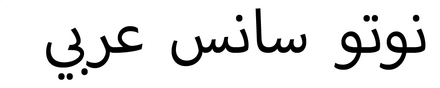
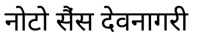
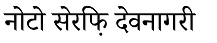
The Not in Our State campaign launched in the seven most spoken languages in Illinois: English, Spanish, Arabic, Polish, Hindi, Tagalog, and Mandarin. To complement the primary sans and serif styles of the identity, each language pairing used two typefaces. For Arabic, we selected Noto Sans Arabic and Noto Naskh Arabic. Hindi used Noto Sans Devanagari alongside Noto Serif Devanagari. Mandarin was set in Noto Sans SC and Noto Serif SC.

Source: span.studio Span. License: All Rights Reserved.

Source: span.studio Span. License: All Rights Reserved.

Source: span.studio Span. License: All Rights Reserved.

Source: span.studio Span. License: All Rights Reserved.

Source: span.studio Span. License: All Rights Reserved.

Source: span.studio Span. License: All Rights Reserved.

Source: span.studio Span. License: All Rights Reserved.
Source: span.studio Span. License: All Rights Reserved.

Source: span.studio Span. License: All Rights Reserved.

Source: span.studio Span. License: All Rights Reserved.

Source: span.studio Span. License: All Rights Reserved.
This post was originally published at Fonts In Use