KinderGPT
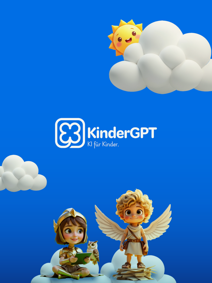
Source: apps.apple.com License: All Rights Reserved.


Darden Studio’s Kit is used in both Rounded and Sans styles for the typography of KinderGPT, an AI chat companion for kids.
The KinderGPT wordmark makes use of Kit Rounded in its Bold weight, with tightened spacing and no wordspace. In the logo, it appears next to a shamrock symbol that’s drawn with strokes of the same weight and roundedness as the letterforms. Kit Rounded’s Bold is also the font used for the headlines and the main menu on the website.
Kit Sans, the straight-edged counterpart to Kit Rounded, is used, too. With its more matter-of-fact personality, it’s reserved for information directed at parents.
The text typeface is Playwrite Deutschland Grundschrift, which is one of the country-specific handwriting scripts generated from TypeTogether’s typeface engine for primary school cursive fonts.

Source: www.kindergpt.com License: All Rights Reserved.
Detail from the homepage with logo and headline in Kit Rounded Bold and text in two weights of Playwrite

Source: www.kindergpt.com License: All Rights Reserved.
Website menu. The default letter-spacing of Kit Rounded Bold is here reduced by 0.05 rem.

Source: www.kindergpt.com License: All Rights Reserved.
The animated avatars for the AI companion are taken from the world of Greek and Norse mythology, featuring gods and goddesses like Zeus, Athene, Aphrodite, Thor, Poseidon, and Hermes.

Source: www.kindergpt.com License: All Rights Reserved.
In Kit, capital letters are a tad shorter than ascenders in h or d – and also than glyphs like the question mark.

Source: apps.apple.com License: All Rights Reserved.
The non-rounded Kit Sans is used for screens from the parental area.

License: All Rights Reserved.
The font used in the app itself is Quicksand.
This post was originally published at Fonts In Use