Date Better
Published August 18, 2025
By FontsInUse
Contributed by Typozon .xyz
Source: www.instagram.com Date Better. License: All Rights Reserved.


Source: thedieline.com License: All Rights Reserved.

License: All Rights Reserved.
License: All Rights Reserved.
License: All Rights Reserved.
This post was originally published at Fonts In Use
Source: www.instagram.com Date Better. License: All Rights Reserved.
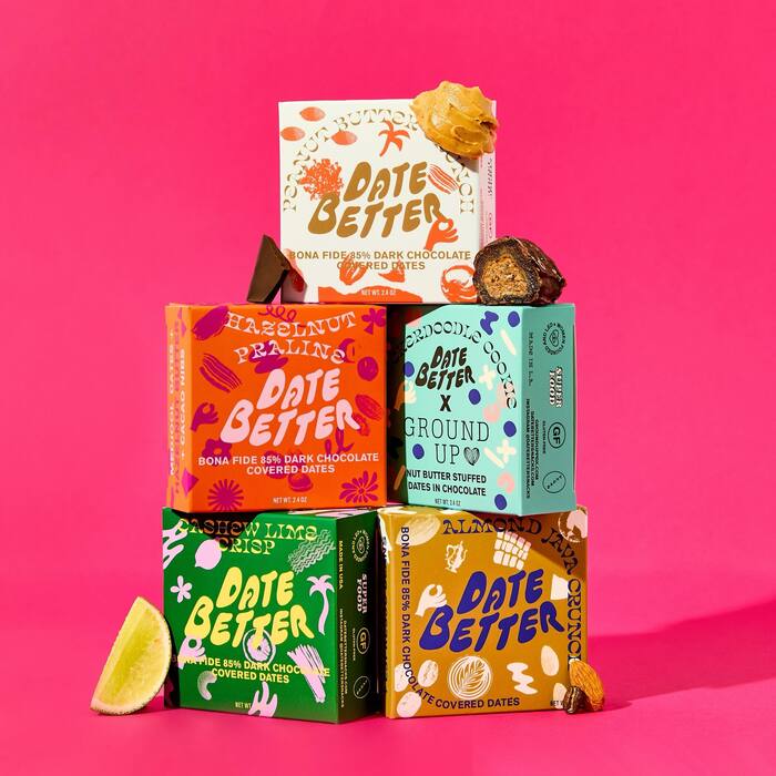
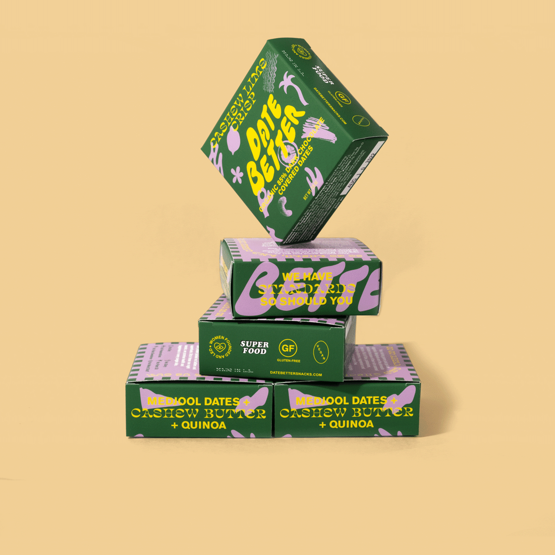
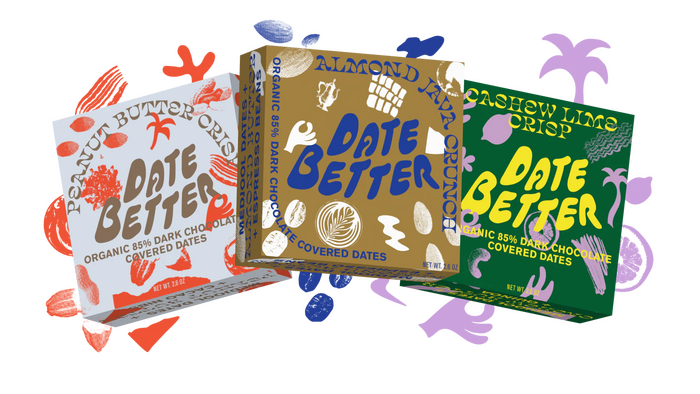
Julianna Bach used Salvaje Display for the packaging designs of Date Better.
From Rudy Sanchez’ article for The Dieline:
Medjool dates are a variety of palm fruit that, unlike most other dates, are large, soft, and chewy with a caramel-like taste. They’re also sweeter than their smaller counterparts. This variety of dates, originating in Morocco but now grown globally, is a natural snack that is tasty on its own, but folks can also combine them with nut butter for a delicious, healthier candy.
The other fonts are Akzidenz-Grotesk Bold and Arial Black, used in all caps. “Date Better” probably is custom drawn. Some boxes additionally feature Cooper Black Italic (“Superfood”) and Typo Slab Serif (“Ground Up”).
Source: thedieline.com License: All Rights Reserved.
License: All Rights Reserved.
License: All Rights Reserved.
License: All Rights Reserved.
This post was originally published at Fonts In Use
Read full story.
WRITTEN BY
FontsInUse
An independent archive of typography.
More from FontsInUse