Harper’s Bazaar Italia, issue 25: “Da Capo”
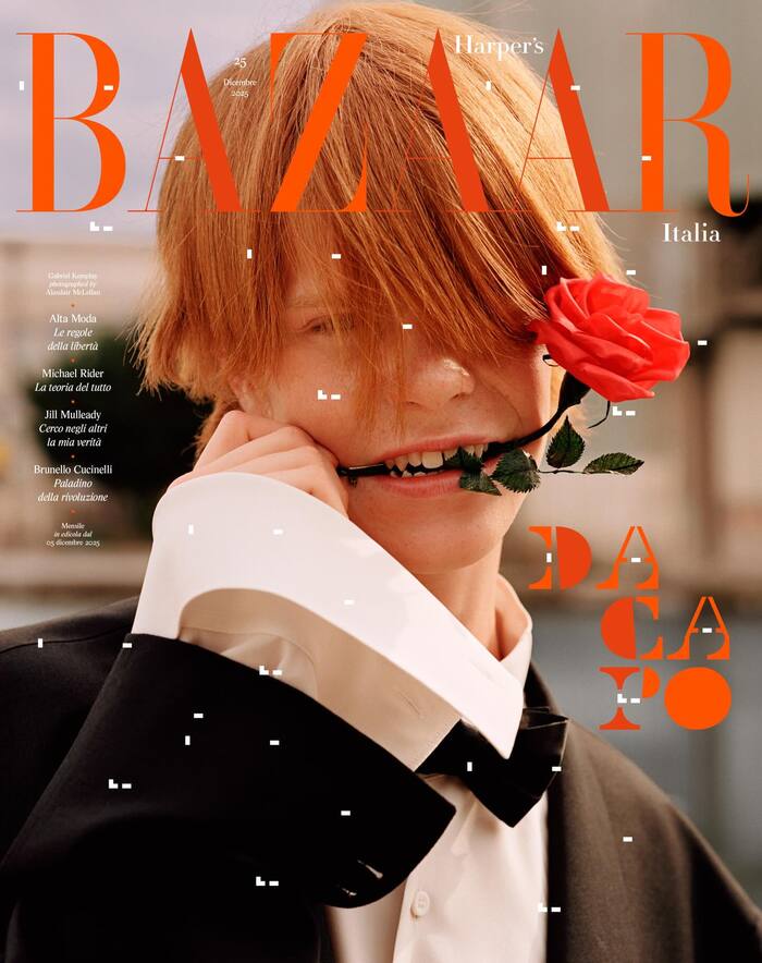
Source: www.harpersbazaar.com Harper’s Bazaar Italia, M/M (Paris). License: All Rights Reserved.


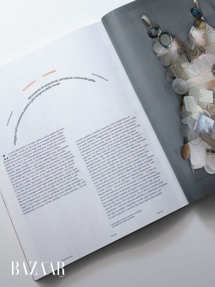
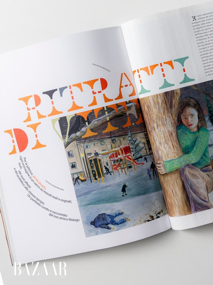
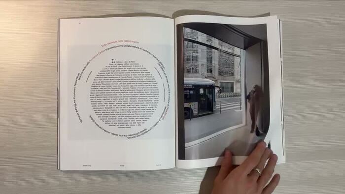
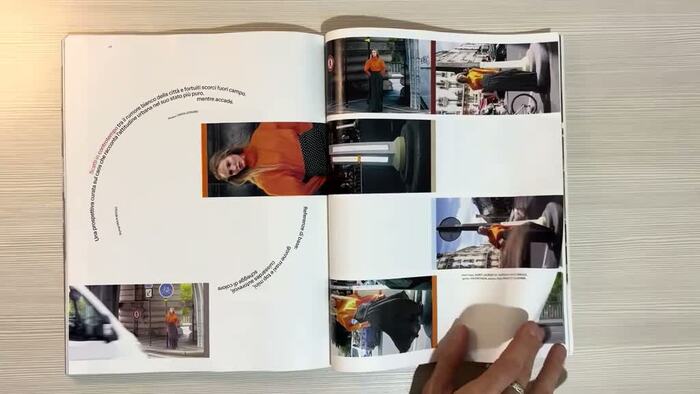
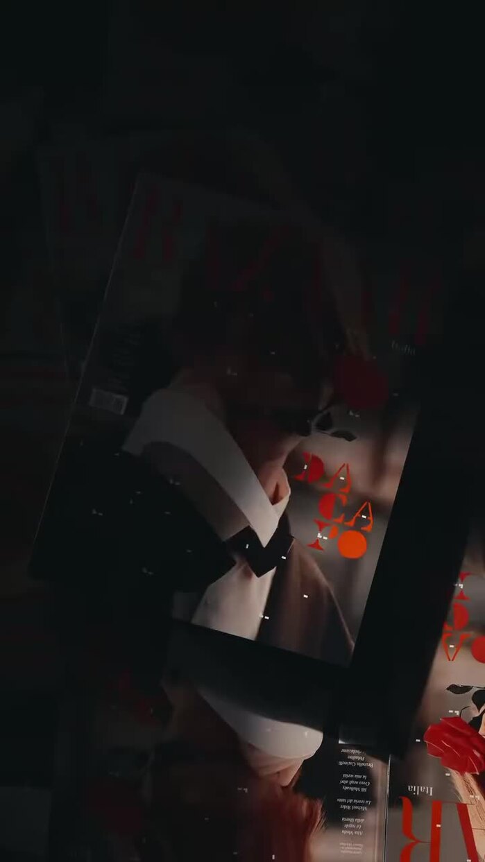
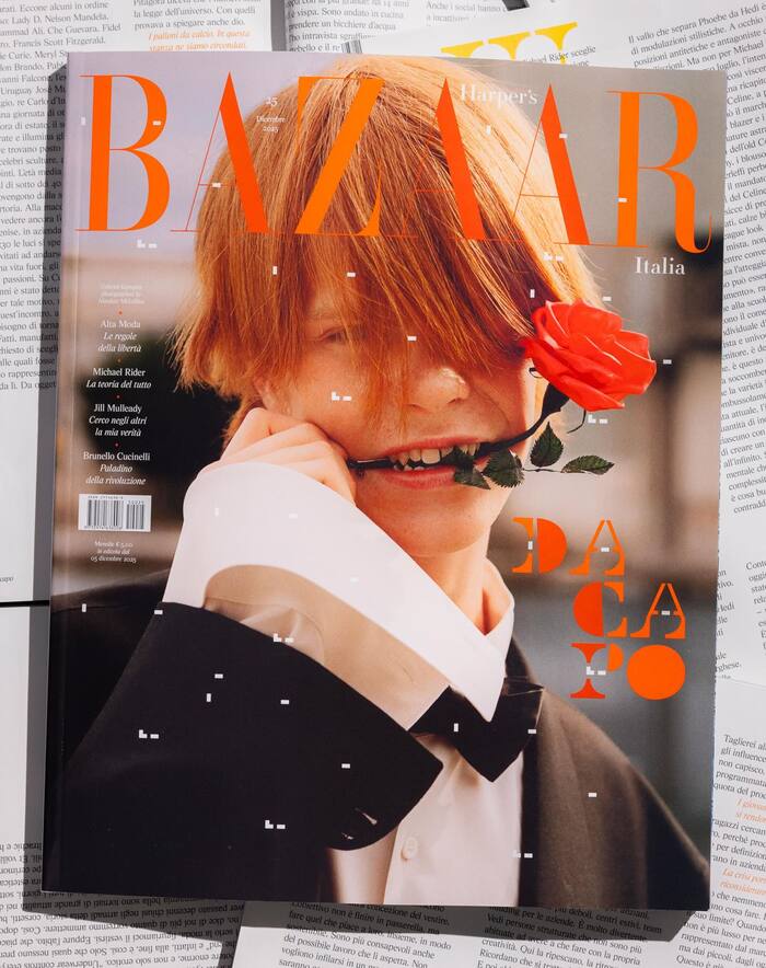
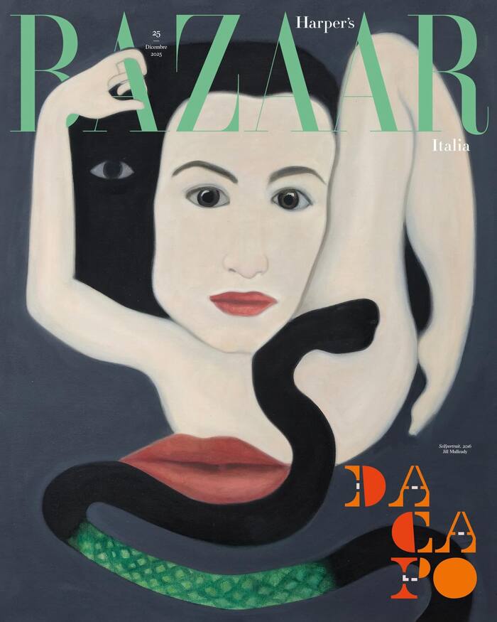
Harper’s Bazaar, the world’s oldest fashion magazine still in publication, in its 25th issue, titled “Da Capo” (“from the beginning”), continues the visual and typographic language developed under the creative direction of M/M (Paris), who began their collaboration with the magazine with issue 22, in September 2025.
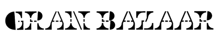
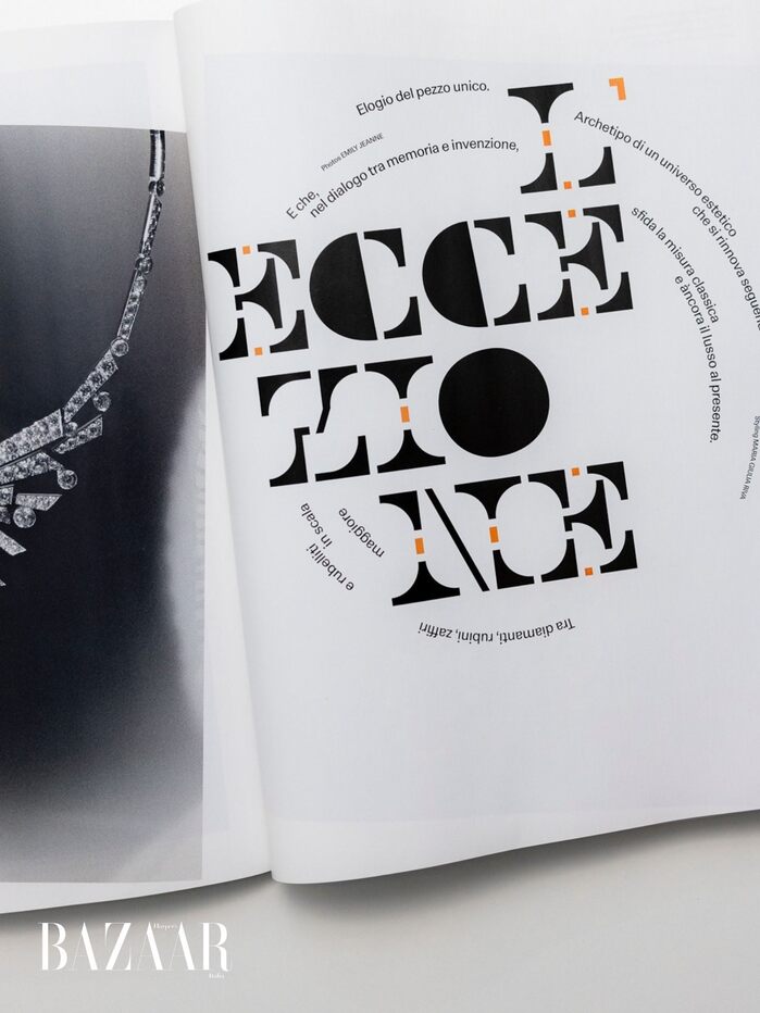
For the headlines, M/M designed Gran Bazaar, a custom typeface created specifically for the magazine, reminiscent of the mobile sculptures of Milanese artist and designer Bruno Munari.
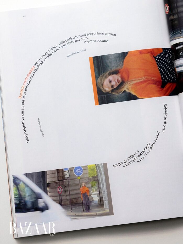
M/M also use AL Sigla for body text, a revival by Alex Lescieux of FTC Sigla by Umberto Fenocchio, a 1960s typeface with more subtle and playful touches, particularly in its punctuation. For headings and captions, they chose LL Schema, a warm modernist grotesque designed by Alberto Malossi and published by Lineto. A more contemporary, rounder and less abrupt reinterpretation of Permanent, designed by Karlgeorg Hoefer in 1962, Schema retains its contrast while softening its forms.
Words from M/M:
One of the ideas was to give the magazine a typographic voice that would be Italian without being nostalgic, modernist without being neutral, and graphic without becoming rigid.
Permanent, too, has a strong Italian connection. The German type foundry Ludwig & Mayer had established a collaboration with Officine Simoncini, which produced innovative matrices for typesetting machines.
Through the Bolognese company, the typeface entered the visual language of Italy in the 1960s and 1970s—present everywhere, but rarely in the foreground. It was never Helvetica. It was the closest thing to it, but warmer and stranger.
In this sense, the title of issue 25, “Da Capo”, resonates particularly well with the work M/M have been doing for Bazaar Italia. Rather than simply reviving the past, they return to the sources of Italian modernism and bring them into the present through new forms and uses.
Schema’s own history is equally unusual. Originally developed as a university project, the typeface first made a major editorial appearance in the pages of Bazaar. It was then published a few months later by Lineto under the name Schema. This swift passage from academia to the pages of a fashion magazine, and ultimately to commercial publication, gives the project a particularly singular, even iconoclastic dimension.
Source: www.harpersbazaar.com Harper’s Bazaar Italia, M/M (Paris). License: All Rights Reserved.
Source: www.harpersbazaar.com Harper’s Bazaar Italia, M/M (Paris). License: All Rights Reserved.
Source: www.harpersbazaar.com Harper’s Bazaar Italia, M/M (Paris). License: All Rights Reserved.
Source: www.harpersbazaar.com Harper’s Bazaar Italia, M/M (Paris). License: All Rights Reserved.
Source: www.harpersbazaar.com Harper’s Bazaar Italia, M/M (Paris). License: All Rights Reserved.
Source: www.harpersbazaar.com Harper’s Bazaar Italia, M/M (Paris). License: All Rights Reserved.
Source: www.harpersbazaar.com Harper’s Bazaar Italia, M/M (Paris). License: All Rights Reserved.
Source: www.harpersbazaar.com Harper’s Bazaar Italia, M/M (Paris). License: All Rights Reserved.
Source: www.harpersbazaar.com Harper’s Bazaar Italia, M/M (Paris). License: All Rights Reserved.
This post was originally published at Fonts In Use