Otriea skincare
Source: hugmun.studio Maciej Miloch. License: All Rights Reserved.




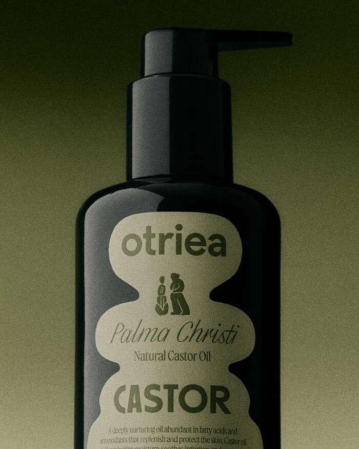
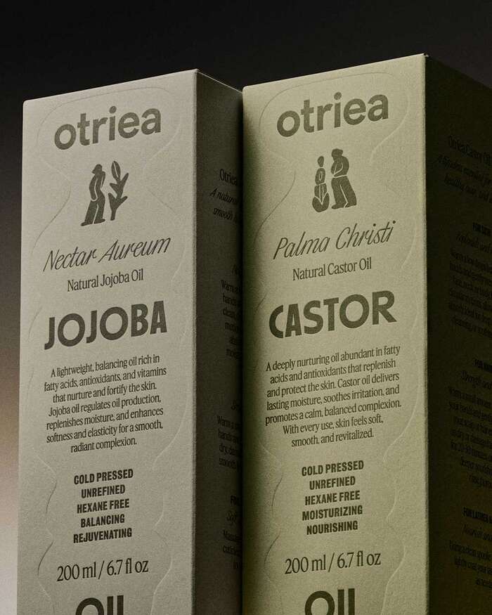
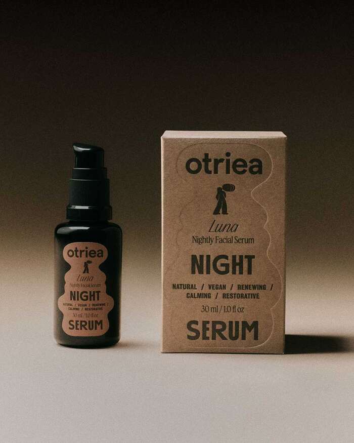
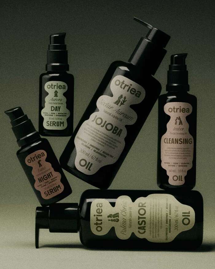
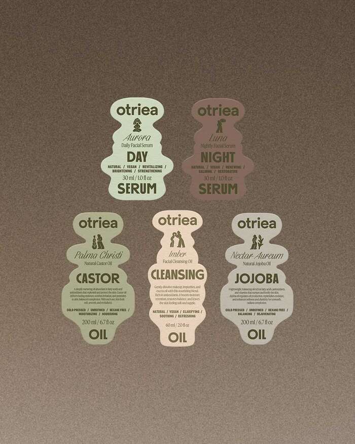
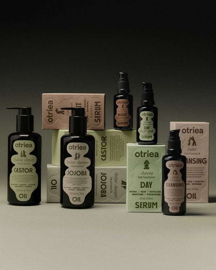
Otriea is a skincare brand built around wild-harvested and organic oils and botanicals. Copenhagen studio Hugmun designed its identity, packaging and printed matter, using a palette of muted earth tones and a set of figurative symbols modelled like small clay sculptures, which also appear in the brand's animations.
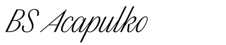
The labels mix several typefaces, chosen, in the studio’s words, to “convey both strength and elegance”. BS Acapulko, a copperplate script by Arthur Schwarz, sets the Latin names given to each product, such as Nectar Aureum for the jojoba oil and Palma Christi for the castor oil. It sits between the bold capitals of First Aid Kit C for the product names and Feature used for the descriptive text. The list of characteristics uses all-caps First Aid Kit A.
The logo uses all-lowercase Rund Display with alternates for a and t.
Design by Hugmun, with photography by Maciej Miloch and animation by Marek Degórski. Marceli provided the printing.
Source: hugmun.studio Maciej Miloch. License: All Rights Reserved.
Source: hugmun.studio Maciej Miloch. License: All Rights Reserved.
Source: hugmun.studio Maciej Miloch. License: All Rights Reserved.
Source: hugmun.studio Maciej Miloch. License: All Rights Reserved.
Source: hugmun.studio Maciej Miloch. License: All Rights Reserved.
This post was originally published at Fonts In Use