Giulia Essyad and Thomas Kern at Fri Art exhibition posters

Sophie Wietlisbach. License: All Rights Reserved.
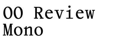
Designed by Wara Ugarte, the 2020/2021 posters for Giulia Essyad’s A Selene Blues and Thomas Kern’s je te regards et tu dis are two of the earlier applications of the typeface Review Mono Regular and Cursive by Sophie Wietlisbach.
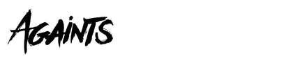
All posters and ephemera are designed for the Kunsthalle Friart in Fribourg, Switzerland. The typeface combines the proportions and serif details with a monospaced structure. The Regular is used in bigger sizes on posters and for titles, as well as for the body text. Cursive is used on for certain parts of the running text to highlight details. Currently, all styles are now called OO Review Mono in the family and are published by Outline Online. The brush script used for A Selene Blues is Againts by Ramandhani Nugraha.

Sophie Wietlisbach. License: All Rights Reserved.

Sophie Wietlisbach. License: All Rights Reserved.

Sophie Wietlisbach. License: All Rights Reserved.

Sophie Wietlisbach. License: All Rights Reserved.

Sophie Wietlisbach. License: All Rights Reserved.

Sophie Wietlisbach. License: All Rights Reserved.

Sophie Wietlisbach. License: All Rights Reserved.
This post was originally published at Fonts In Use