Great Western Railway identity and signs
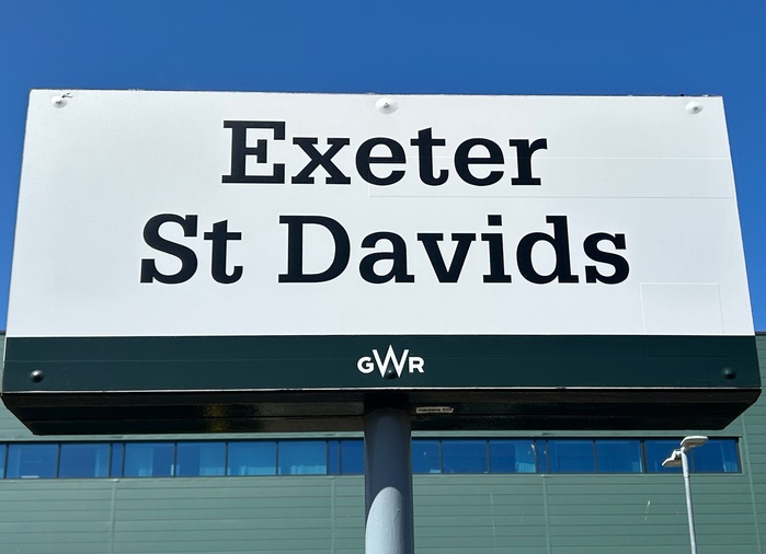
Photo: james millner. License: All Rights Reserved.
Station sign; Exeter St Davids, two hours from London on the Great Western Railway

The original Great Western Railway company was founded in 1833. It ran train services that linked London to the Midlands, the South West, and parts of Wales, and employed Isambard Kingdom Brunel as its chief engineer. Brunel even dreamed of being able to sell a single ticket to allow travel from London Paddington to New York, via the SS Great Western.
The company became part of the British Railways Board in the nationalization of 1948. After privatization in the 1990s, the assets ended up as part of First Great Western, which was then relaunched in 2015 as Great Western Railway, with a new brand identity developed by John Rushworth at Pentagram.
Rushworth’s team was briefed to create an identity that “marked the start of a renaissance of rail”. The new look aims to show that “we are a rail company again and we are proud of it.”
Apart from the GWR logo, the branding is mostly evident to passengers in the form of the Glypha typeface, on everything from station names to trains to timetables.
It's possible that this typeface will be slowly phased out over the next few years; the font chosen by newly-nationalized Great British Railways for all signage is Rail Alphabet 2.
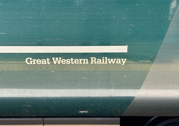
Photo: james millner. License: All Rights Reserved.
On the side of the train carriage
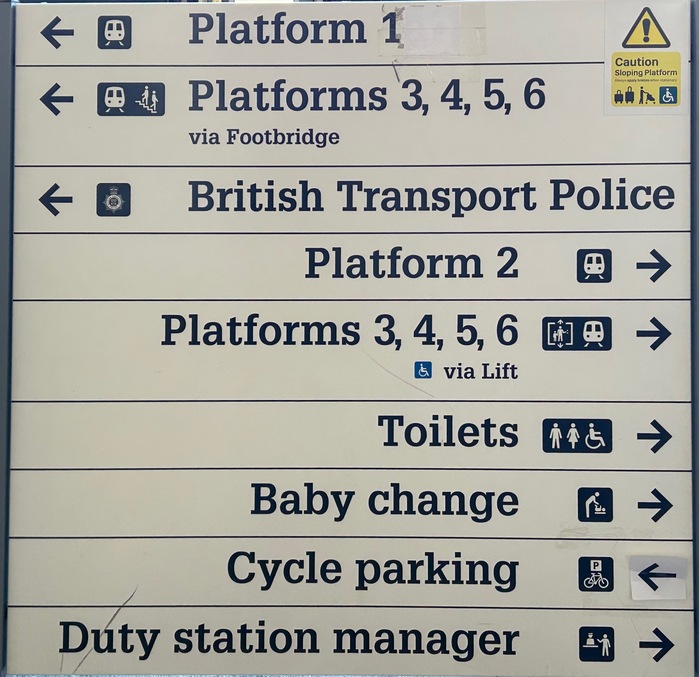
Photo: james millner. License: All Rights Reserved.
Signs at Exeter St Davids station
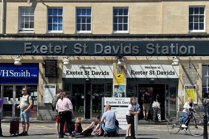
Photo: james millner. License: All Rights Reserved.
The facade at Exeter St Davids. Probably to save money and effort, the old signage was untouched when the new brand was applied.
This post was originally published at Fonts In Use