Harwell
Source: dnco.com DNCO. License: All Rights Reserved.

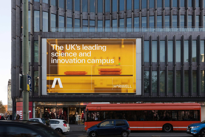
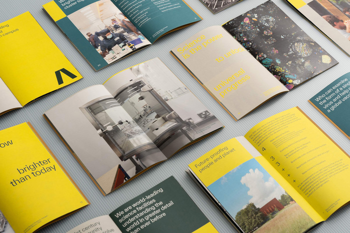
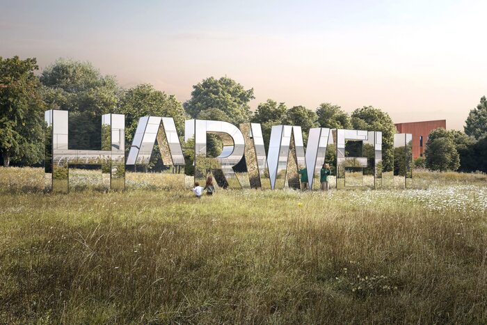
Harwell is the UK’s leading science and innovation campus, located south of Oxford and sitting on a 700-acre estate. Harwell's new identity has been designed by London-based studio DNCO, using solely TWK Everett (by Nolan Paparelli) as a branding typeface.
Here is a short video introducing Harwell’s mission and values. Subscribers of Under Consideration can also see a thorough analysis of Harwell’s rebranding.
Excerpt from DNCO’s project page:
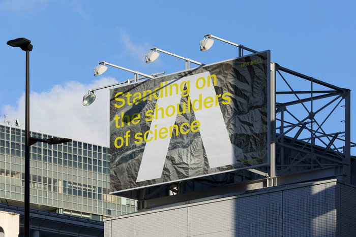
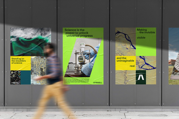
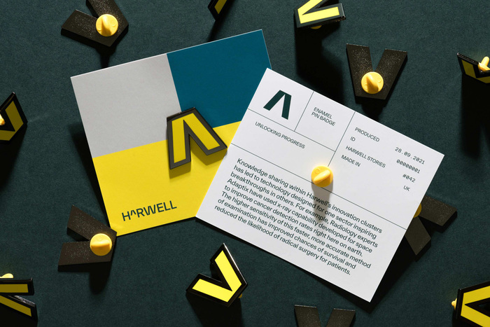
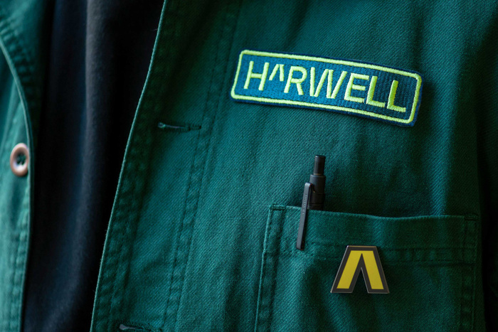
We use science to understand the world around us, and mathematics is its universal language. Inspired by this maxim, we rooted the Harwell brand in scientific and mathematical notation, using a ‘caret’ — a symbol representing an exponent, square, cube or other power — to anchor the visual identity. It encapsulates Harwell as a place that brings people and ideas together, supercharging growth: an exponent to solving the critical problems facing our planet.
Source: dnco.com DNCO. License: All Rights Reserved.

Source: dnco.com DNCO. License: All Rights Reserved.
Source: dnco.com DNCO. License: All Rights Reserved.
Source: dnco.com DNCO. License: All Rights Reserved.

Source: dnco.com DNCO. License: All Rights Reserved.

Source: dnco.com DNCO. License: All Rights Reserved.
Source: dnco.com DNCO. License: All Rights Reserved.
Source: dnco.com DNCO. License: All Rights Reserved.
Source: dnco.com DNCO. License: All Rights Reserved.
Source: dnco.com DNCO. License: All Rights Reserved.

Source: dnco.com DNCO. License: All Rights Reserved.
Source: dnco.com DNCO. License: All Rights Reserved.
Source: dnco.com DNCO. License: All Rights Reserved.

Source: dnco.com DNCO. License: All Rights Reserved.
Source: dnco.com DNCO. License: All Rights Reserved.
This post was originally published at Fonts In Use