Kirby: Planet Robobot logo, interface, dialogue


From Wikipedia:
Kirby: Planet Robobot is a 2016 platform game developed by HAL Laboratory and published by Nintendo for the Nintendo 3DS. It is the eleventh mainline installment in the Kirby series and the spiritual sequel to Kirby: Triple Deluxe. The story follows Kirby as he defends Planet Popstar from an alien corporation known as the Haltmann Works Company that wishes to mechanize the planet so that they can plunder its natural resources. New to the series in this game is Kirby's ability to utilize a mecha suit known as the Robobot Armor to solve puzzles and fight enemies.
Fitting the futuristic theme of the game, several of the fonts used are mechanical or computerized in nature.
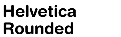
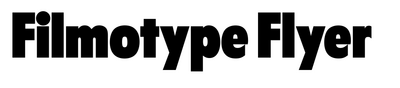
The title logo is set in Helvetica Rounded (“Kirby”) and Filmotype Flyer (“Planet Robobot”). Both are modified.
The “Kirby” logo is oblique and uneven, and the gap of the letter b is replaced with a star. Unique to this installment, the logo is filled with a glowing scanline effect.
The “Planet Robobot” subtitle is skewed inward and given a metallic, stenciled appearance. The first letter o in “Robobot” is replaced with a nut.

Source: wikirby.com HAL Laboratory, Inc. / Nintendo. License: All Rights Reserved.
Title screen. Logo is set in Helvetica Rounded Black and Filmotype Flyer. Body text is in Rodin, except for “2016”, which is in Kafu Techno.

Source: wikirby.com HAL Laboratory, Inc. / Nintendo. License: All Rights Reserved.
Gameplay screen. “Fire” is set in Rodin. “Drop Ability” and “Pause” are in Carat. Numbers are in Kafu Techno.
All in-game text utilizes typefaces from Fontworks.

Source: wikirby.com HAL Laboratory, Inc. / Nintendo. License: All Rights Reserved.
Game Over screen. “Game Over” is set in Kafu Techno; “Continue” and “Quit” are in Rodin.
Display text is set in Carat and Kafu Techno, and body text is set in Rodin. Rodin's numbers are replaced with those from Kafu Techno.
Carat is a typeface with thick vertical lines and thin horizontal lines evocative of MICR fonts. Its characters are blocky but not rigid.
Kafu Techno has strokes of even width, and squared characters with subtly rounded-off edges and tips. It resembles the characters on an LCD screen.
Rodin is a common font family for body text in Nintendo games, easily readable at a distance with consistent stroke widths.
The short-tempered boss of the Haltmann Works Company, President Haltmann, has his dialogue set in Comic Reggae. This typeface uses jagged edges and straight lines, with the thickness of each stroke increasing as it reaches the end.
The sentient supercomputer Star Dream’s dialogue is set in Skip. Its vertical lines are slightly thicker than its horizontal lines, and its edges are tapered outward.

Source: wikirby.com HAL Laboratory, Inc. / Nintendo. License: All Rights Reserved.
Headers are set in Carat.

Source: wikirby.com HAL Laboratory, Inc. / Nintendo. License: All Rights Reserved.
Dialogue from President Haltmann is set in Comic Reggae. Character nametags are in Rodin.

Source: wikirby.com HAL Laboratory, Inc. / Nintendo. License: All Rights Reserved.
Dialogue from Star Dream is set in Skip.
This post was originally published at Fonts In Use