Goldielocks – Two of a Kind album art and release poster

Sony Music Finland. License: All Rights Reserved.


For the release party of music artist Goldielocks—following her breakthrough year and standout success at UMK—we designed a poster built around her primary typeface, Windsor Roman, with Windsor BT’s Light Condensed for the smaller texts. As the event took place close to Halloween, the concept introduced a subtle, atmospheric Halloween influence layered onto the official promotional and press imagery for her debut album, Two of a Kind. The album marks Goldielocks’ emergence as one of Finland’s most promising new international pop artists.
Graphic design, typeface visualization, and album visuals were created by Jirka Väätäinen, with photography by lumiilo. The typeface for the album titles and tracklist is Podium Sharp, which name suits the stage-craving aura and danceable mood on this album and cover.

Sony Music Finland. License: All Rights Reserved.
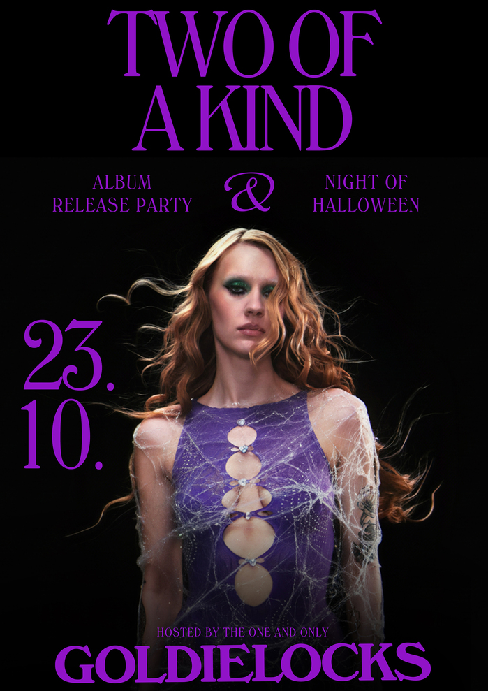
Photo: Julian Grönberg. Sony Music Finland. License: CC BY-NC-SA.

Photo: Julian Grönberg. Sony Music Finland. License: CC BY-NC-SA.
This post was originally published at Fonts In Use