Martin Parr by Val Williams
Source: www.abebooks.com Northern Lights Rare Books and Prints (edited). License: All Rights Reserved.
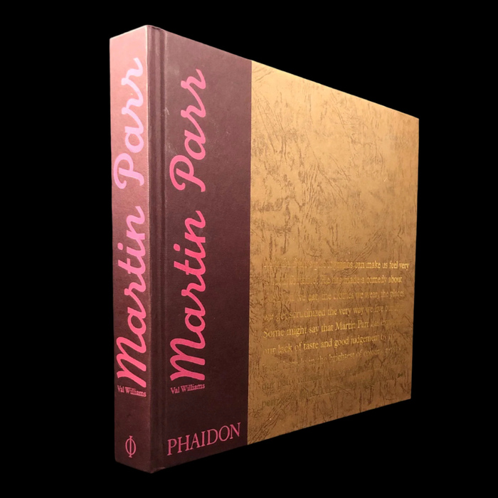
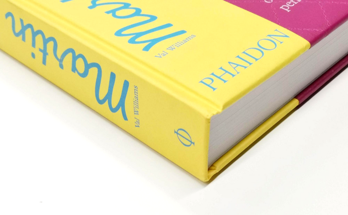
Cover and spine of the hardback edition with gold foil stamping, 29.7×25.6 cm


For me, Monoline Script will always be linked to its prominent use for the comprehensive Martin Parr monograph:
This encyclopaedia of Martin Parr covers his long career as an image maker and has an insightful text written by longstanding friend and colleague, Val Williams. The book was produced to accompany his retrospective exhibition at the Barbican in London, which then toured over ten more venues. A detailed analysis of Parr’s development and career shows how he became a passionate collector of ephemera. Published by Phaidon Press Limited, London, 2002. Text by Val Williams. Designed by UNA (London) Designers.
With the spine lettering featuring the artist’s name in big pink script letters against a purple background, the book stands out from every shelf. I treated myself with a copy after attending a presentation held by Parr at a photography conference in Berlin in the early 2000s. I immediately fell in love with his keen eye for fellow human beings and their quirks.
Martin Parr sadly died on 6 December 2025 at his home in Bristol, England. In his obituary for the Guardian, Charles Darwent described him as a “photographer whose unblinking eye documented the human subject as a birdwatcher might, via plumage, habitat and diet.”
Works by Parr and such that are related to him and his foundation came up on Fonts In Use before. His Boring Postcards even inspired a set of Uses with generic tourism postcards from the mid-20th century.
Source: www.abebooks.com Zed Books. License: All Rights Reserved.
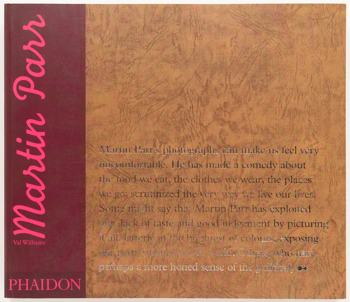
Cover of the softback edition (2003) with silver (?) foil stamping. The text typeface is another creation by the English Monotype Corporation: Plantin.
Source: www.abebooks.com PhotoTecture Books (edited). License: All Rights Reserved.
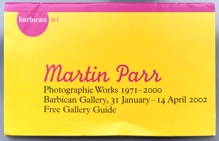
The same typeface combination was used for a free gallery guide with postcards published on the occasion of Parr’s retrospective exhibition Photographic Works 1971–2000 at London’s Barbican Gallery in 2002.
Source: www.abebooks.com ROCKET (edited). License: All Rights Reserved.
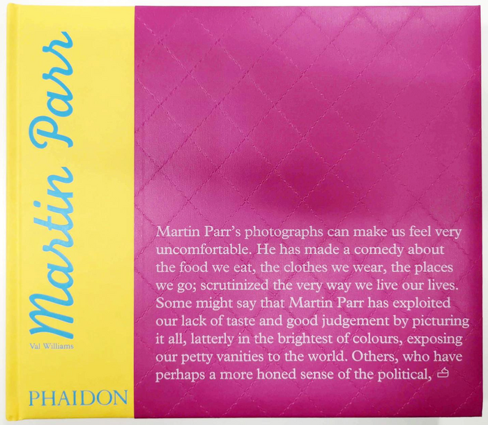
The cover for the second edition from 2014 adopts the colors of the gallery guide (see above) and foregoes the foil stamping.
Source: www.abebooks.com ROCKET (edited). License: All Rights Reserved.
This post was originally published at Fonts In Use