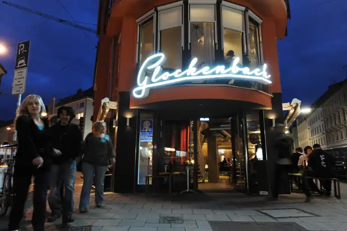
Glockenbach restaurant, München
Published December 3, 2023
By FontsInUse
Contributed by Florian Hardwig
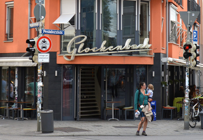
Photo: Florian Hardwig. License: CC BY-SA.
Source: www.yelp.de Ralph H. / Yelp. License: All Rights Reserved.
Source: www.flickr.com mhk_s. License: All Rights Reserved.
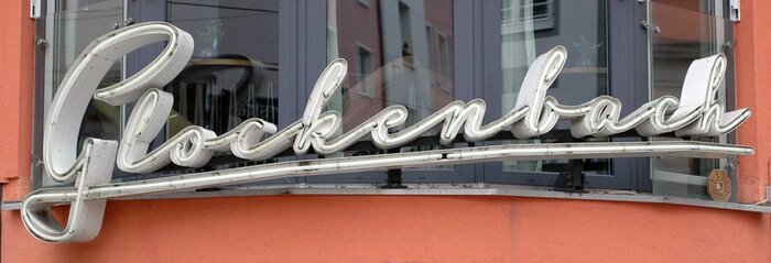
Source: www.sueddeutsche.de Stephan Rumpf. License: All Rights Reserved.
This post was originally published at Fonts In Use
Photo: Florian Hardwig. License: CC BY-SA.
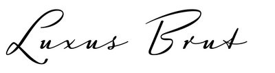
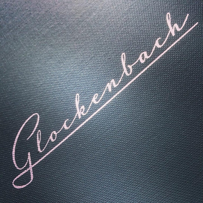
For Luxus Brut, type designer Roland Hörmann got his inspiration from an old sign of a bookbinder’s shop in Vienna. In this application, the letterforms resume their old role and proudly proclaim the name above the entrance. In the case of the Glockenbach restaurant, they are not painted on a board, but produced as neon tube, housed in a three-dimensional casing. The script logo also appears in other applications, for example on the menu.
In November 2017, after eight years of operation, the restaurant in Munich’s district of the same name closed its doors.
Source: www.yelp.de Ralph H. / Yelp. License: All Rights Reserved.
Source: www.flickr.com mhk_s. License: All Rights Reserved.
Menu cover
Source: www.sueddeutsche.de Stephan Rumpf. License: All Rights Reserved.
This post was originally published at Fonts In Use
Read full story.
WRITTEN BY
FontsInUse
An independent archive of typography.