Fresh As

Source: www.studiosouth.co.nz Studio South. License: All Rights Reserved.

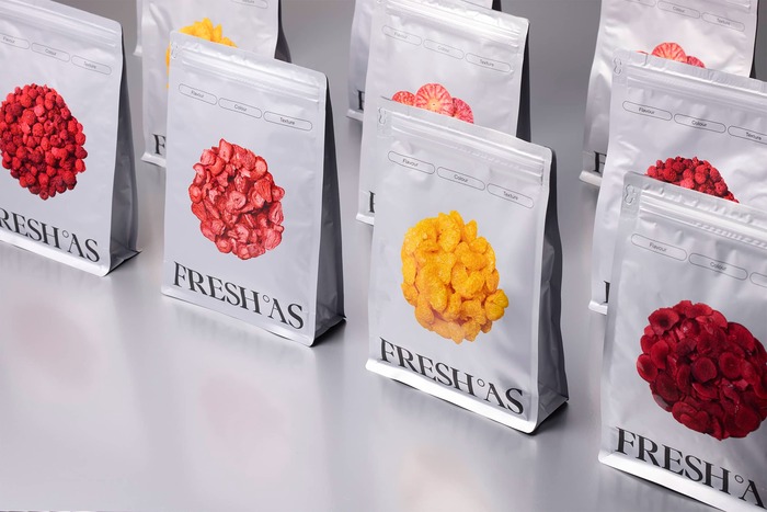
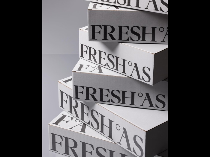
Para by Rellence is used for the logo and rebrand of Fresh As, the innovative home of premium freeze-dried ingredients. The sans is TT Commons by TypeType.
From Studio South’s website:
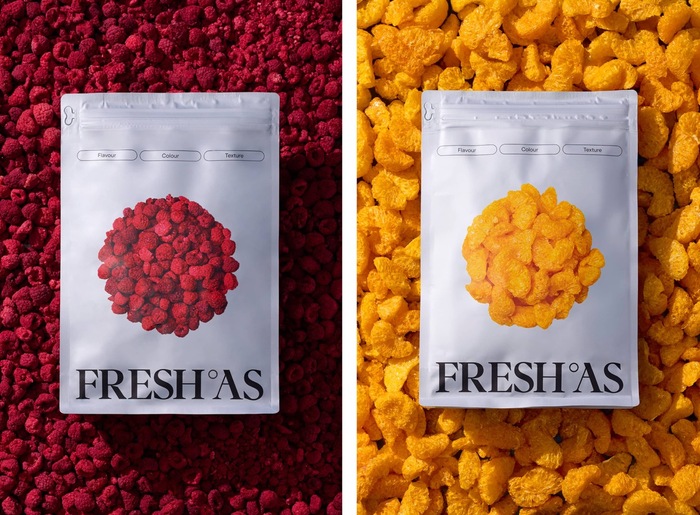
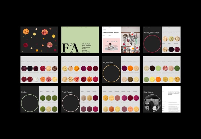
Fresh ° As elevates any dish through colour, texture and flavour. Using premium, hand-processed ingredients freeze-dried with state-of-the-art technology, the brand delivers pure intensity and versatility. Working across food service, retail and manufacturing, Fresh ° As inspires chefs and mixologists, supports home cooks, partners with leading FMCG brands, and is rapidly expanding from New Zealand and Australia into the U.S. and UK/EU. For over two years, South has partnered with Fresh ° As to embed design at the heart of the brand. From strategy to identity, packaging, digital and content, our work creates a cohesive system that scales globally. Centred on the degree symbol (°), the brand unfolds as a constellation of flavours, each product treated like a planet; precise, premium and quietly other-worldly.
Studio South. License: All Rights Reserved.
Source: www.studiosouth.co.nz Studio South. License: All Rights Reserved.
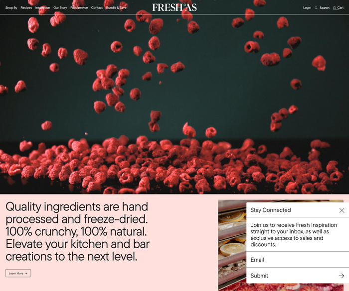
Source: fresh-as.com License: All Rights Reserved.
Source: www.studiosouth.co.nz Studio South. License: All Rights Reserved.
Studio South. License: All Rights Reserved.
This post was originally published at Fonts In Use