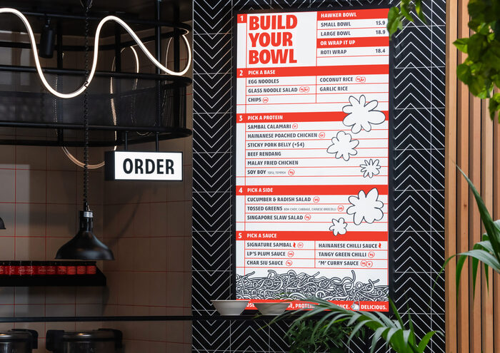
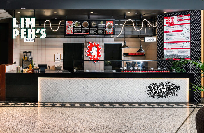
Lim Peh’s Hawker Bowls
Source: marilynandsons.com License: All Rights Reserved.


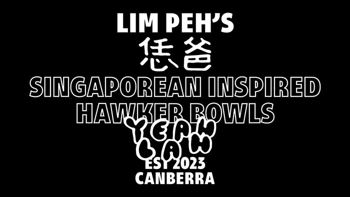
Lim Peh’s began as a hawker-inspired noodle shop in Canberra, with a homemade identity and fast-casual franchise ambitions. Chef Shaoyi, who grew up in 1990s Singapore, wanted to create something his son growing up in 2020s Canberra could connect with too. Lim Peh’s is about blending generations, cultures and memories into a shared, experience that is familiar but not nostalgic.
During briefing conversations, it always came back to one word: rebellion. Not rebellion for its own sake, but a welcoming, purposeful one. Lim Peh’s wanted to feel as familiar to a first-time visitor as it did to a lifelong hawker lover. The identity needed to flex to be comfortable in a tucked-away laneway and in Woden Westfield. It had to be multicultural, multilingual and full of attitude. Never ‘yeah, nah’. Always ‘yeah, lah.’
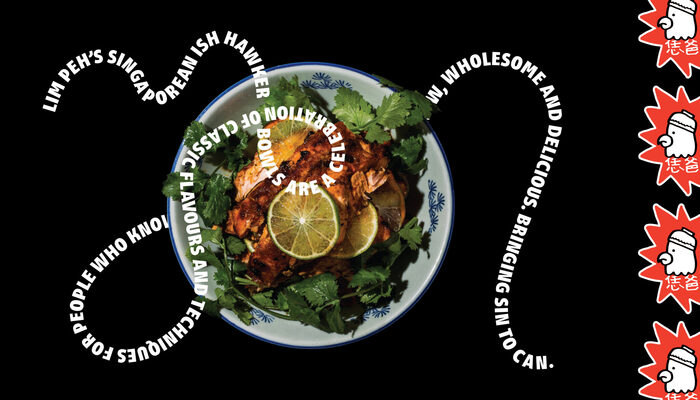
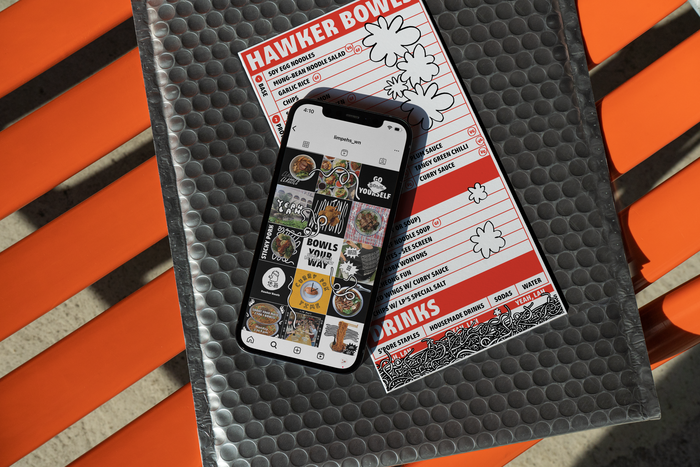
DT Strait Sans by Death of Typography brings the Singaporean-ish flavour to the brand across menus, staff uniforms, packaging and the logotype itself. Full of personality and plays well with other faces, even our hand-drawn custom type, Noodle Sans (not shown here). Lantinghei is used for Chinese text.
Source: marilynandsons.com Lim Peh's. License: All Rights Reserved.
Source: marilynandsons.com Lim Peh's. License: All Rights Reserved.
Source: marilynandsons.com Lim Peh's. License: All Rights Reserved.
Source: marilynandsons.com Lim Peh's. License: All Rights Reserved.
Source: marilynandsons.com Lim Peh's. License: All Rights Reserved.
This post was originally published at Fonts In Use