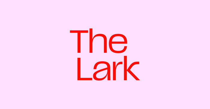
The Lark
Source: studiokat.design License: All Rights Reserved.

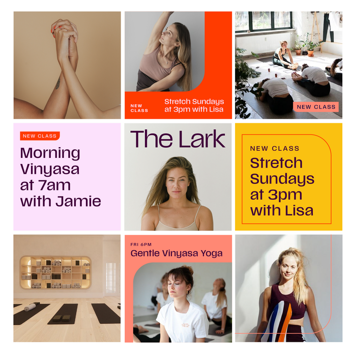
Part social club, part workout spot, part cafe and curated retail shop, 100% neighborhood retreat. The Lark is a local haven where space abounds and time stops.
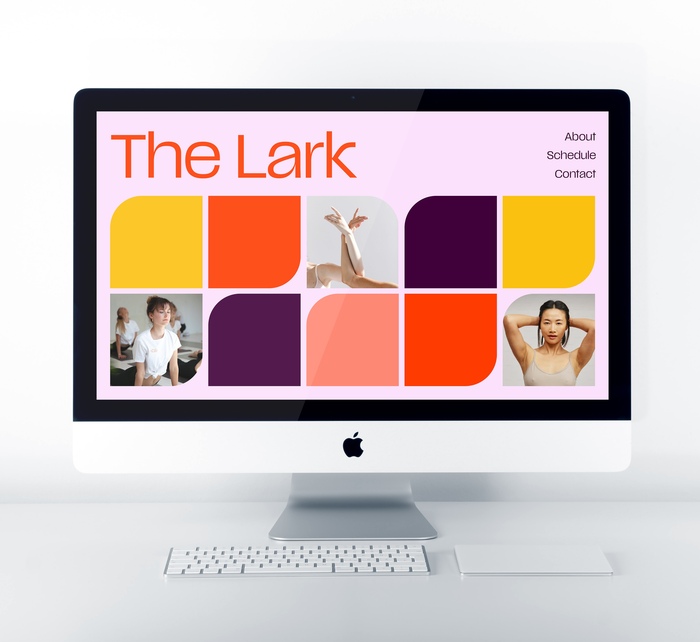
I worked with the Lark’s founder at the very beginning, from naming to logo design to website. The fitness space is a crowded one, and we wanted the Lark to stand out as a uniquely bold, community-oriented, female-forward club. For me, that meant starting with a lot of research into other fitness spaces. I discovered that most commercial fitness spaces looked extremely masculine and aggressive: Impact-esque fonts, grays and blacks and neons, and muscle-forward messaging. More female-driven spaces like pilates and yoga practices were the complete opposite: flowery fonts, neutrals and pastels, and borderline saccharine language. The Lark needed to be feminine yet strong, bold but welcoming.
I chose Scale as the primary font because I felt it encompassed all of those traits. It has personality, it has dips and curves, and it demands attention. The color palette helps bring that personality to life with energetic, sunset-inspired hues. Instead of leaning on one main brand color like so many gyms do, I created a vivid and flexible system that allows assets to lean into different aspects of the club. Cocktail party? The deep eggplant can be paired with light pink to evoke the night. HIIT workout? Bright reds and oranges are there to get people hyped up.
Source: studiokat.design License: All Rights Reserved.
Source: studiokat.design License: All Rights Reserved.
Source: studiokat.design Photo: Katie Ehrlich. License: All Rights Reserved.
This post was originally published at Fonts In Use