Thomas de Monaco
Source: www.thomasdemonaco.com Thomas de Monaco. License: All Rights Reserved.


Thomas de Monaco is a Swiss perfume house known for its refined approach to contemporary niche fragrance. Each scent is developed and produced in Switzerland, combining traditional perfumery craftsmanship with a modern visual language.
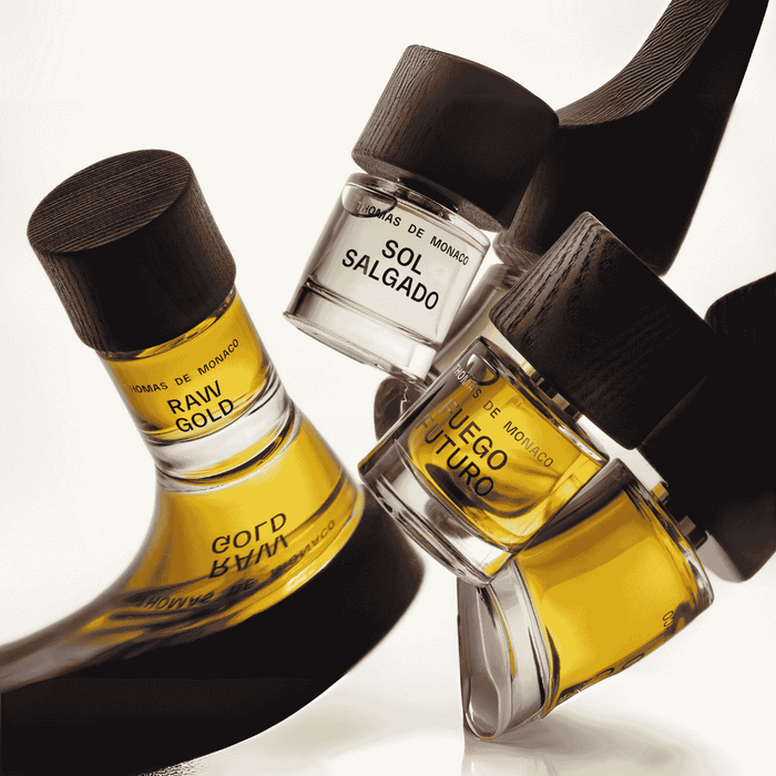
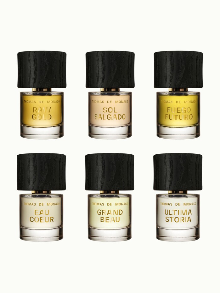
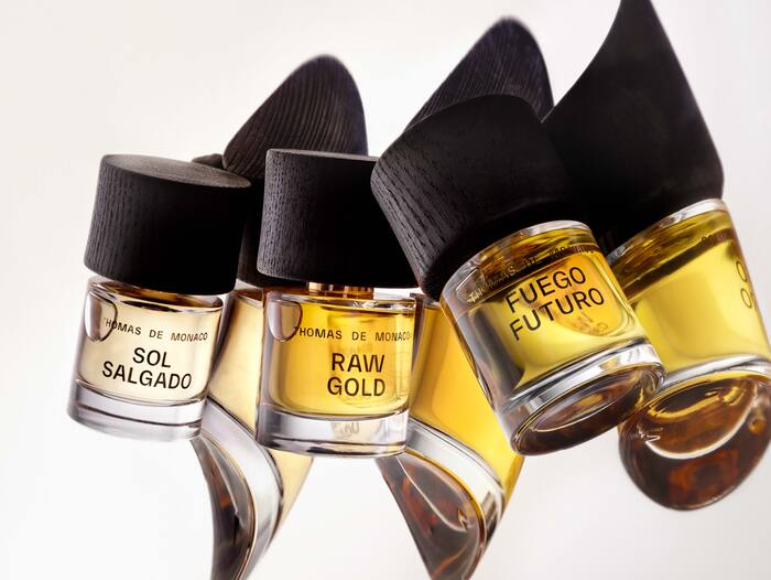
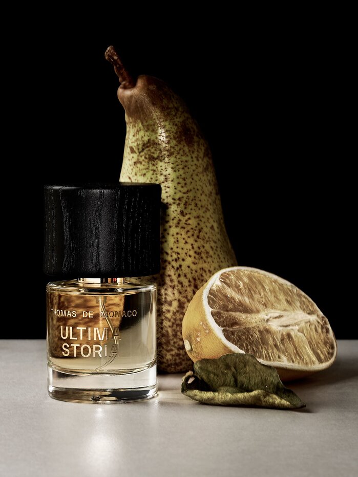
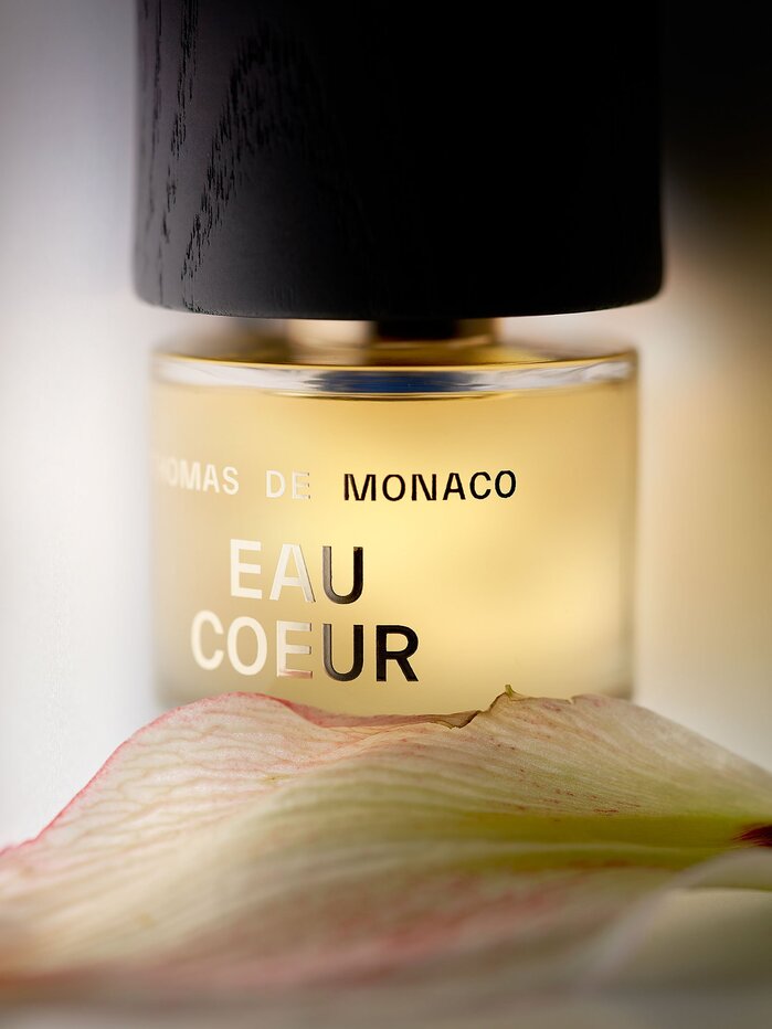
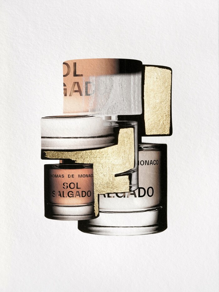
The brand’s collection currently includes Raw Gold, Sol Salgado, Fuego Futuro, Eau Coeur, Grand Beau, and Ultima Storia, six fragrances that explore different olfactory narratives, from warm mineral ambers to luminous citrus and sensual woods.
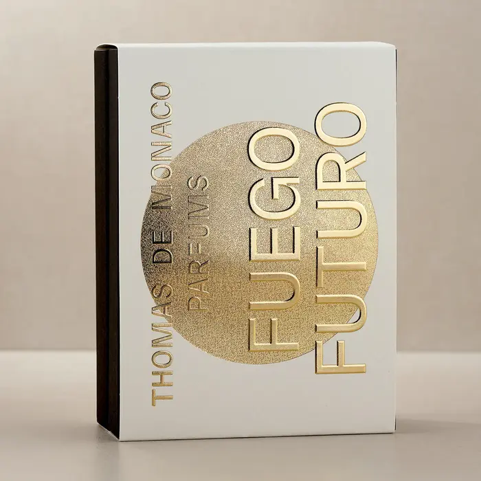
Typography plays a central role in the brand’s identity. TWK Everett and TWK Everett Mono, designed by Nolan Paparelli and published by WELTKERN®, are used throughout the brand’s visual system. The typefaces appear across packaging, perfume bottles, printed materials, and the website, creating a consistent and contemporary typographic voice.
Everett’s clean, confident grotesque structure pairs with the precise rhythm of Everett Mono, striking a balance between modern minimalism and quiet luxury. Applied in gold lettering on the glass bottles and across the brand’s communications, the typography reinforces the clarity and elegance of the Thomas de Monaco universe.
Source: linke.to Thomas de Monaco. License: All Rights Reserved.

Thomas de Monaco. License: All Rights Reserved.
Thomas de Monaco. License: All Rights Reserved.
Source: www.thomasdemonaco.com Thomas de Monaco. License: All Rights Reserved.
Source: www.thomasdemonaco.com Thomas de Monaco. License: All Rights Reserved.
Source: www.thomasdemonaco.com Thomas de Monaco. License: All Rights Reserved.
Thomas de Monaco. License: All Rights Reserved.
This post was originally published at Fonts In Use