Stepping Softly on the Earth exhibition catalog
Bloco Gráfico. License: All Rights Reserved.


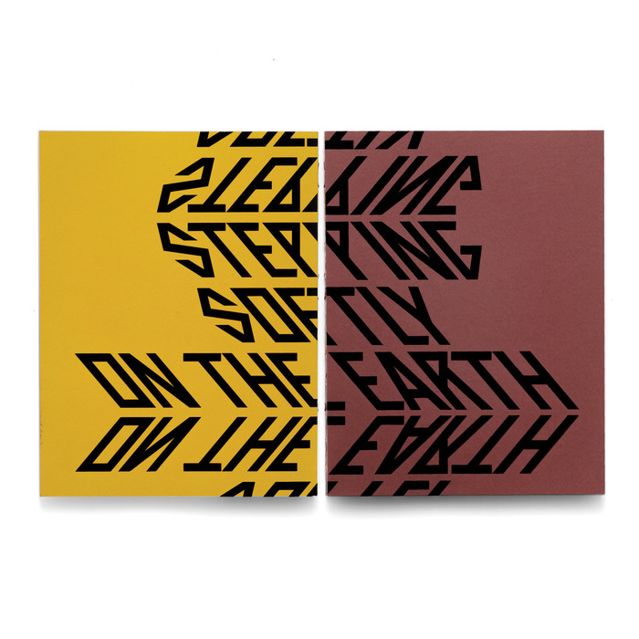
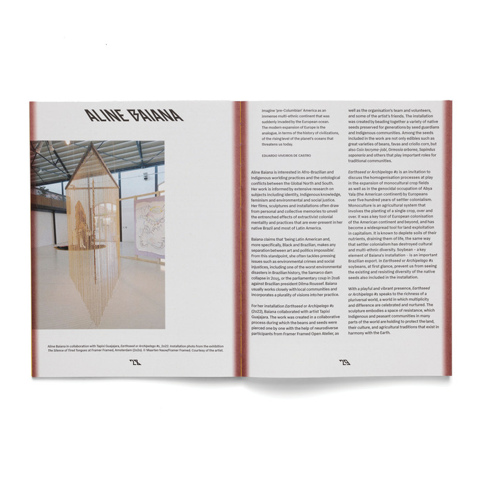
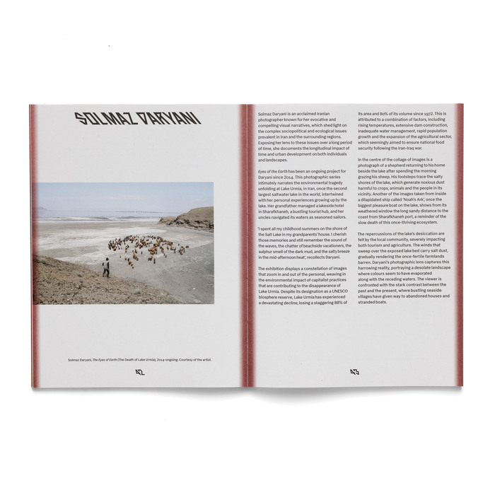
Stepping Softly on the Earth is a research-led exhibition featuring the work of twenty artists, most of them non-Western and Indigenous. Presented at the Northumbria University Gallery at Baltic, the exhibition invites visitors to reflect on human relationships with land and territory from decolonial and anti-colonial perspectives. It brings together artistic practices that understand the world as a pluriverse – a reality in which many worlds coexist and support one another, where all beings are interconnected and the separation between humans and nature dissolves.
The works address themes such as ancestral cosmovisions, spirituality, inter-species communication, embodied knowledge, oral traditions, autonomy, mapping and legal frameworks. The exhibition title revisits a passage cited by Indigenous activist, writer and thinker Ailton Krenak in his 2022 book Ancestral Future. Krenak refers to a speech attributed to Chief Seattle (c.1786–1866), in which he says that his people “step softly on the Earth” because they are deeply connected to it, and invites colonisers to teach their children to do the same.
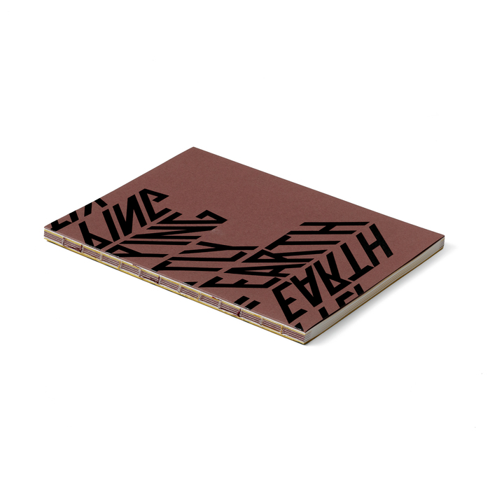
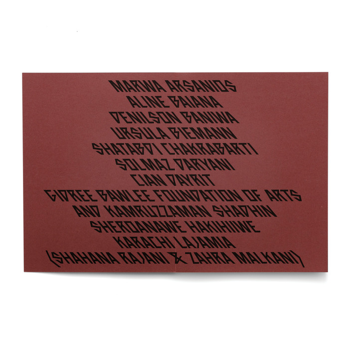
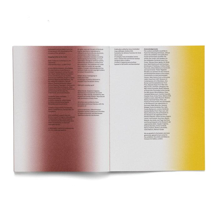
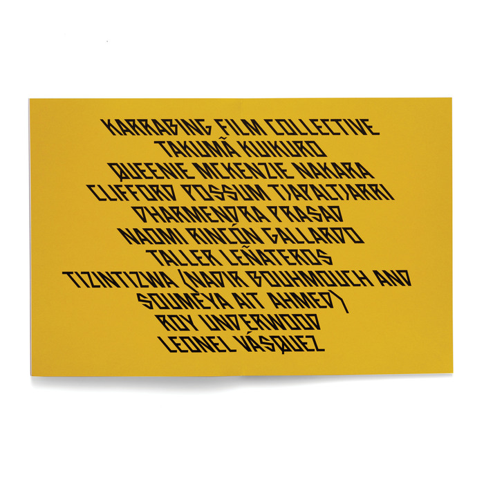
The catalog adopts a graphic language structured around expressive typography and a restrained color palette, which together organize the visual identity of the publication. The central element of the design is an angular, fragmented typography, Backslanted, used for the cover and section titles. Its geometric forms approach drawing as much as writing, suggesting multiple visual traditions while moving away from a neutral or institutional Western typographic language.
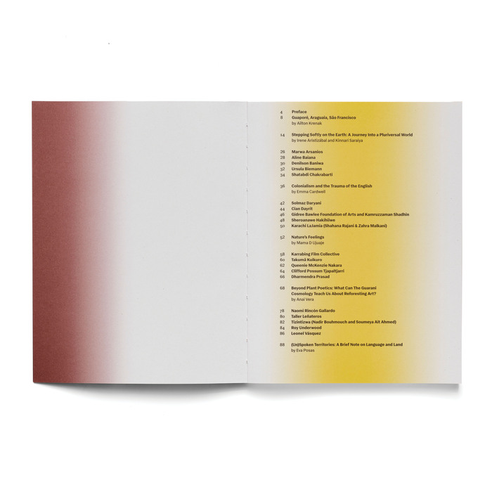
The color palette is based mainly on two tones, an earthy red and an intense yellow, applied as gradients across page backgrounds and edges. These fields of color evoke natural elements such as earth, sunlight and atmosphere, and function as visual environments that move through the book, creating continuity between different sections. The materiality of the object also reinforces the project’s conceptual framework: the exposed sewn binding and the earthy-toned cover emphasize the physicality of the book, suggesting a tactile and crafted quality. The texts are set in Gal Gothic, a Brazilian sans-serif typeface with subtle stroke contrast.
Bloco Gráfico. License: All Rights Reserved.
Bloco Gráfico. License: All Rights Reserved.
Bloco Gráfico. License: All Rights Reserved.
Bloco Gráfico. License: All Rights Reserved.
Bloco Gráfico. License: All Rights Reserved.
Bloco Gráfico. License: All Rights Reserved.
Bloco Gráfico. License: All Rights Reserved.
Bloco Gráfico. License: All Rights Reserved.
Bloco Gráfico. License: All Rights Reserved.
Bloco Gráfico. License: All Rights Reserved.
Bloco Gráfico. License: All Rights Reserved.
This post was originally published at Fonts In Use