PHI

Vivien Gaumand. License: All Rights Reserved.
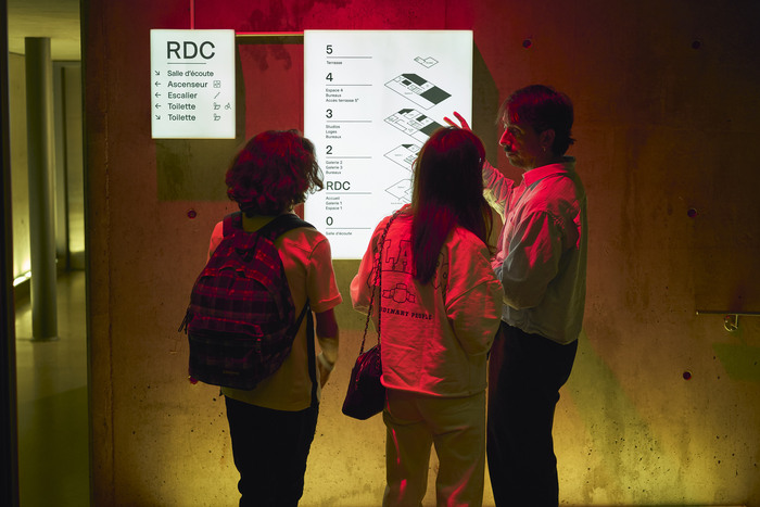
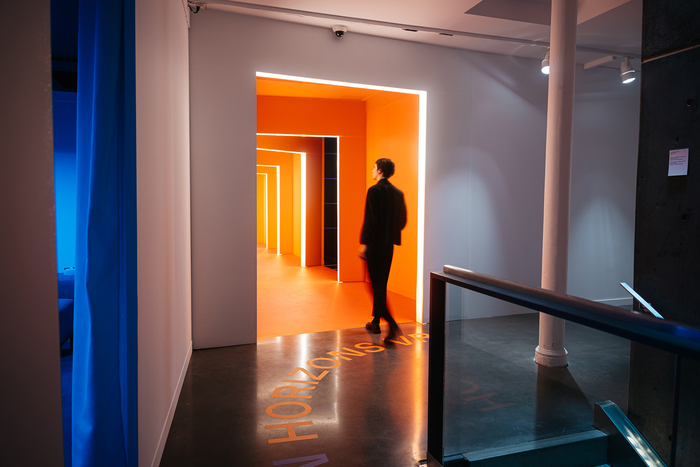
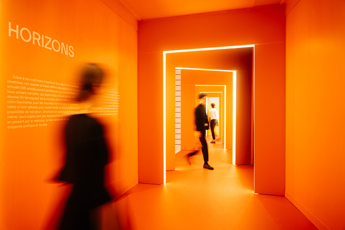
In 2021, Feed Studio was commissioned to redesign the visual identity of PHI, a Montreal-based art center founded by Phoebe Greenberg in 2007. For 20 years, the institution has shaped Montréal’s artistic landscape by exhibiting leading contemporary artists, including Yoko Ono and Yayoi Kusama. It has pioneered immersive experiences presented on the international stage, most notably at the Venice Biennale, establishing itself as a forward-thinking cultural hub.
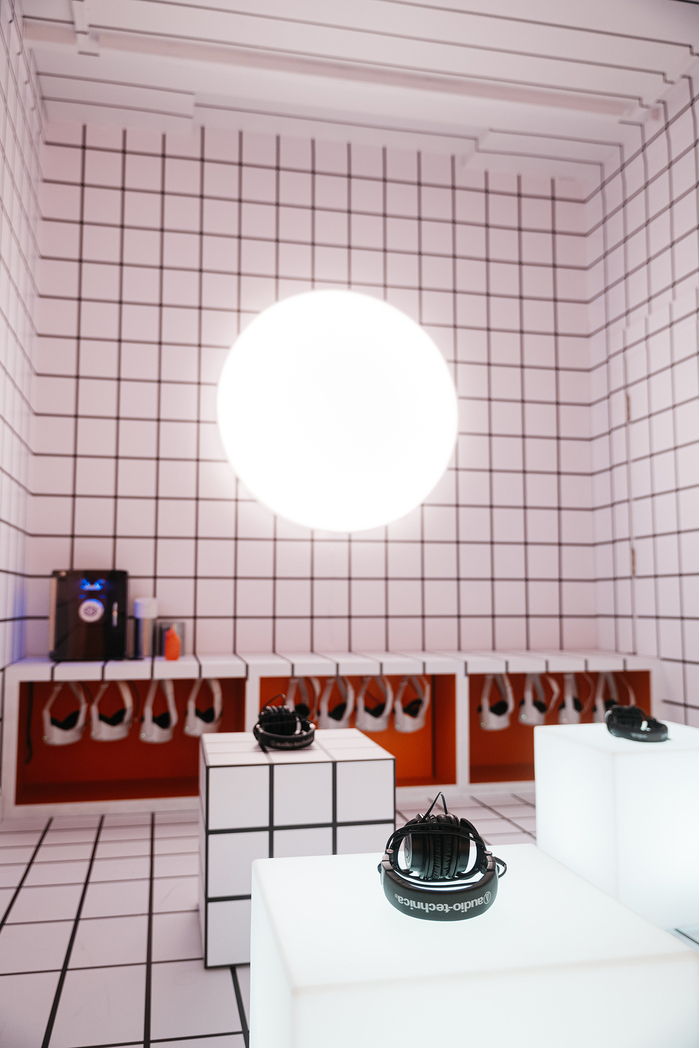
During its first decade, PHI went through significant transformations. It began as PHI Foundation, an avant-garde exhibition space, and expanded five years later with PHI Centre, a multidisciplinary space at the intersection of art, technology, and sound. PHI Studio followed in 2019, focused on creating and distributing immersive experiences.
After thirteen years of growth and evolution, PHI embarked on a rebrand that would bring all its entities together under one cohesive identity.
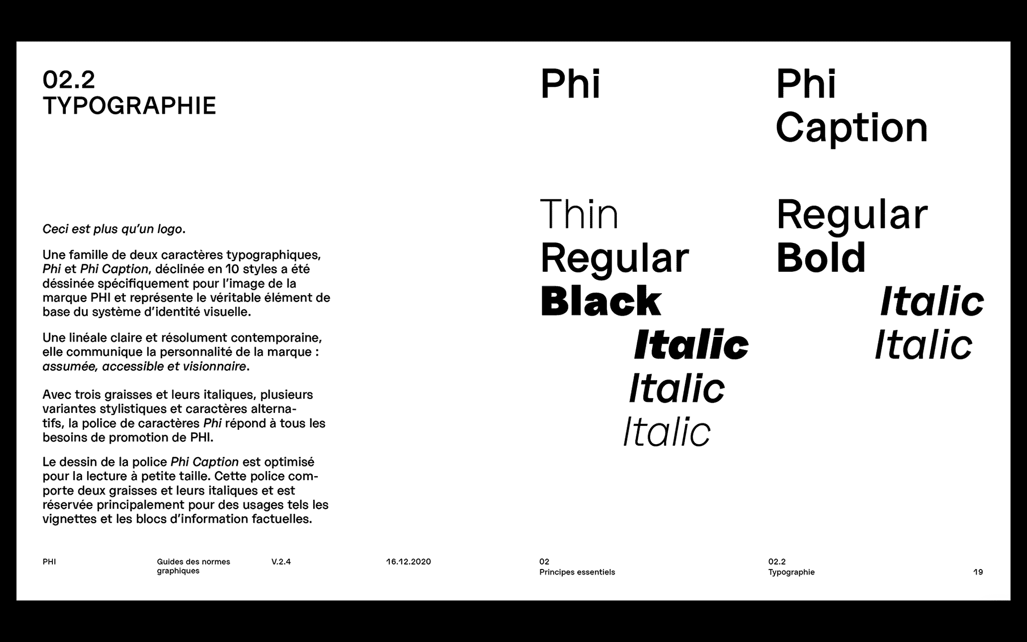
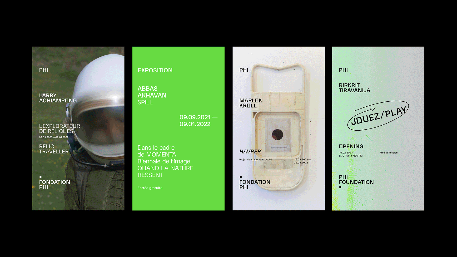
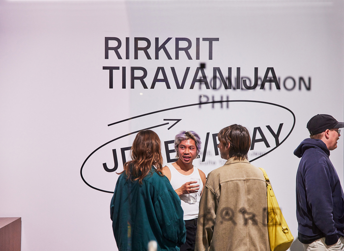
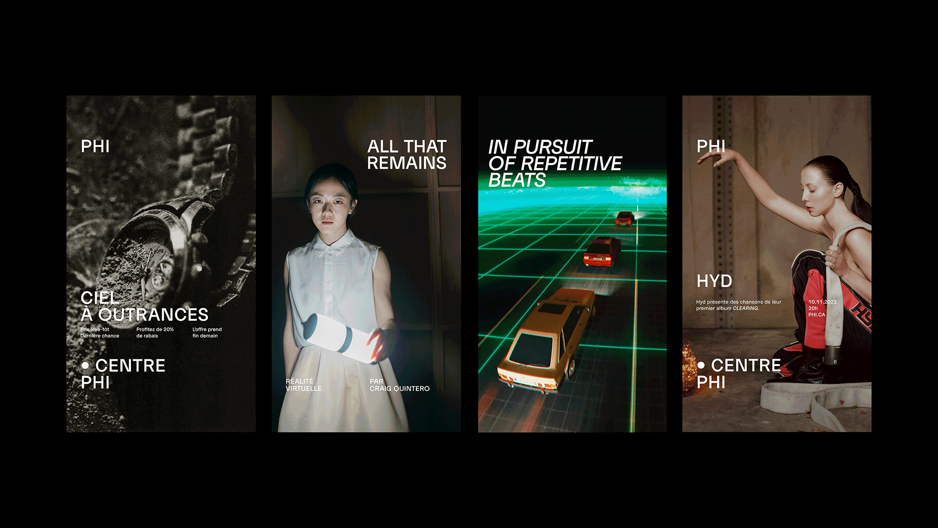
To meet this intention, Feed Studio established type as the foundation of the visual system. Anouk Pennel and Romain Grucker designed Phi, a clear and versatile bespoke typeface available in three weights with italics, complemented by Phi Caption, an optimized version that improves readability at small sizes. Used across all communication formats, from large-scale wall texts to social media assets, all applications follow a grid system based on the typeface’s proportions.
Feed Studio. License: All Rights Reserved.
PHI's brand guide.
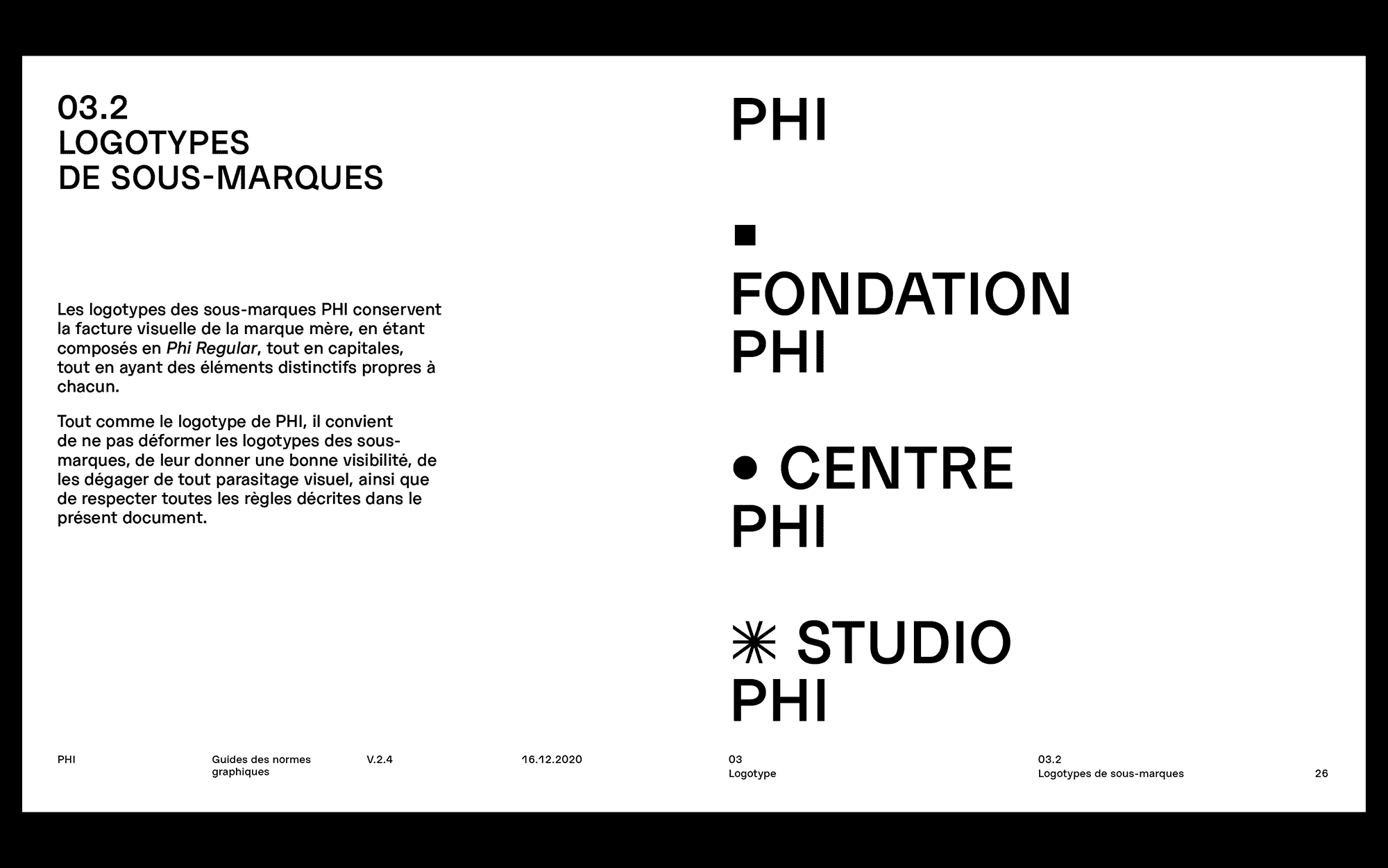
But how do you differentiate the entities if they all share the same typeface and grid? Studio Feed introduced subtle variations, beginning with a set of symbols for the logos: a circle for the Centre, a square for the Foundation, and a star for the Studio.
The system extends beyond these visual cues, featuring custom alternate characters. The Centre features circled O, Q, dot-based punctuation and diacritics, while the Foundation adopts squared O, U, o and u. As for the Studio, it relies exclusively on the standard alphabet set, since it has no need for promotional materials.
Feed Studio. License: All Rights Reserved.
PHI's brand guide.
With these sets of alternate characters, Feed Studio built a solid visual identity that reflects PHI’s ecosystem. It orchestrates all entities into a harmonious system, while allowing each to play its own voice.
Following the delivery of the 142-page brand guide, art director Michel Ouellette and graphic designer Juliette Duhé became the guardians of PHI’s visual identity. They implemented the design across all formats and entities, maintaining cohesion throughout the system.
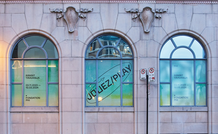
In 2025, PHI Foundation and PHI Centre unify under a single entity and sign their first exhibition under the name of PHI, with the mission of becoming a centre for artistic creation and innovation. The typeface remains unchanged, preserving the visual continuity of the identity, and simplifying the system by removing the alternate characters.
PHI. License: All Rights Reserved.
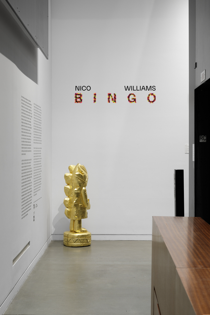
Nico Williams: Bingo, PHI, Montreal, 2025. For this exhibition, the title adopts a new typographic variation: letters adorned with colored fingertips, reminiscent of the pearls the artist uses in his artworks.
Over the past 20 years, PHI has continually evolved, relying on a solid identity system to ensure consistency throughout transformations. Today, it is stepping into its next chapter with the PHI Contemporary, set to open in 2029. With a revised name and mission, the visual system enters a stage poised to stretch, reshape, and spark unexpected synergies.
This post was originally published at Fonts In Use