Hålogaland Revisjon
Published March 19, 2026
By FontsInUse
Contributed by Store Norske Skriftkompani
Source: riktigspor.no License: All Rights Reserved.


Source: riktigspor.no License: All Rights Reserved.
Source: riktigspor.no License: All Rights Reserved.
Source: riktigspor.no License: All Rights Reserved.
Source: riktigspor.no License: All Rights Reserved.
Source: riktigspor.no License: All Rights Reserved.
Source: riktigspor.no License: All Rights Reserved.
Source: riktigspor.no License: All Rights Reserved.
Source: riktigspor.no License: All Rights Reserved.
Source: riktigspor.no License: All Rights Reserved.
Source: riktigspor.no License: All Rights Reserved.
This post was originally published at Fonts In Use
Source: riktigspor.no License: All Rights Reserved.
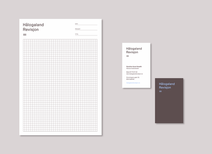
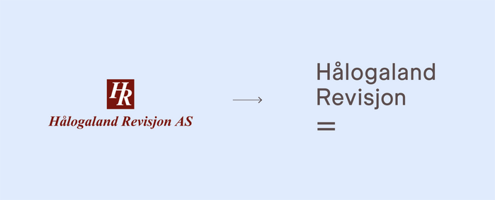
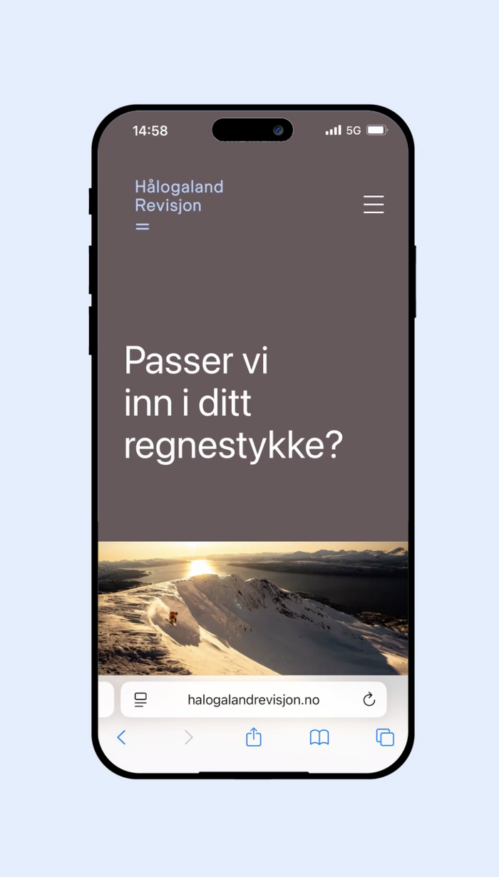
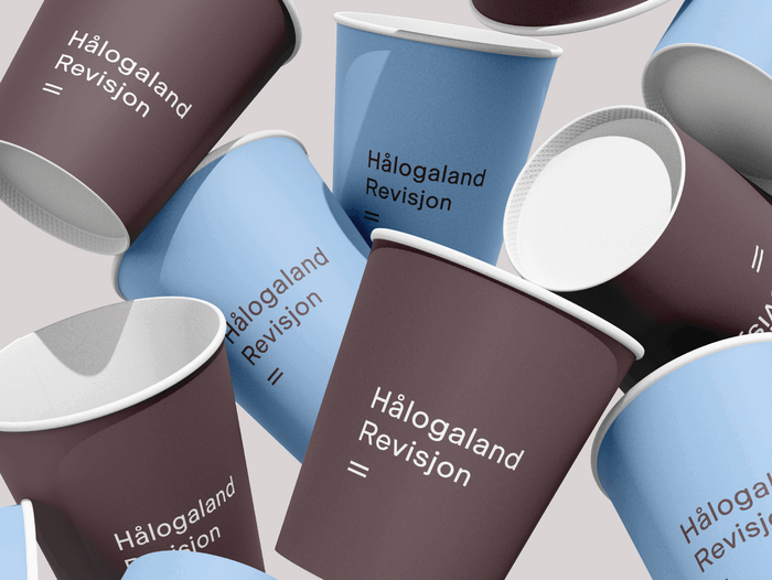
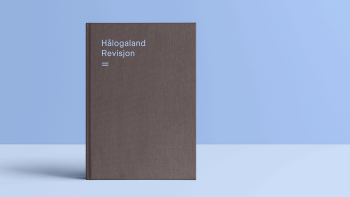
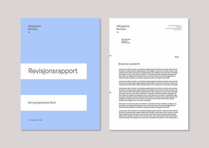
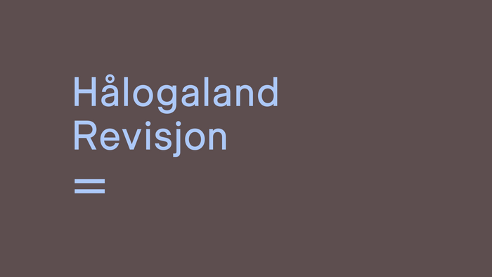
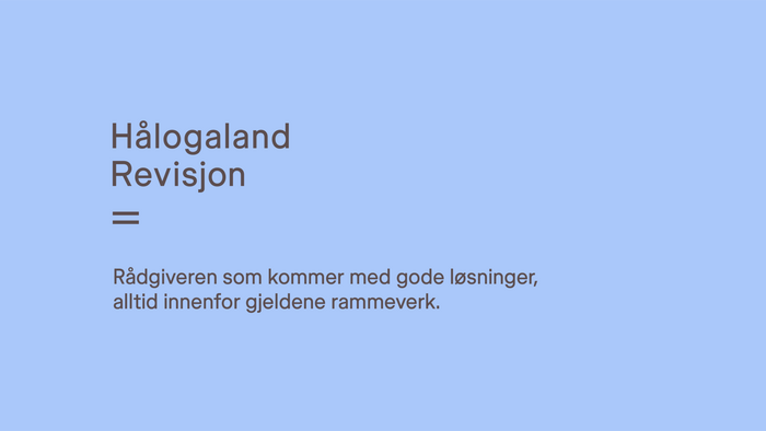
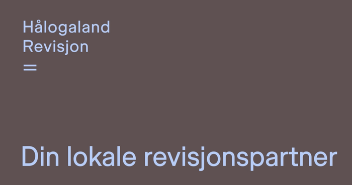
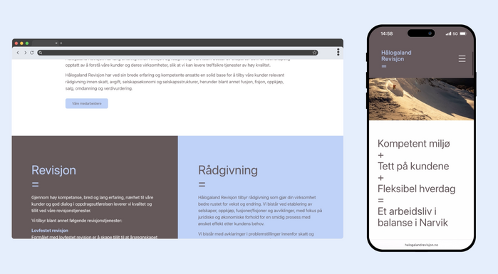
Hålogaland Revisjon is a long-standing audit firm in Northern Norway with an updated visual identity and website designed by Riktig Spor. The redesign centres on a simple equals sign as the main symbol, used as a mark of balance and as a visual shorthand for “two lines under the answer”.
The identity extends into a communication concept built around small “equations”, and it is applied across a compact one-page website and a separate recruitment page.
The typeface used is Store Norske Ja from Skriftkompani.
Source: riktigspor.no License: All Rights Reserved.
Source: riktigspor.no License: All Rights Reserved.
Source: riktigspor.no License: All Rights Reserved.
Source: riktigspor.no License: All Rights Reserved.
Source: riktigspor.no License: All Rights Reserved.
Source: riktigspor.no License: All Rights Reserved.
Source: riktigspor.no License: All Rights Reserved.
Source: riktigspor.no License: All Rights Reserved.
Source: riktigspor.no License: All Rights Reserved.
Source: riktigspor.no License: All Rights Reserved.
This post was originally published at Fonts In Use
Read full story.
WRITTEN BY
FontsInUse
An independent archive of typography.