Hotel Wine Fest
Source: www.esiete.com License: All Rights Reserved.
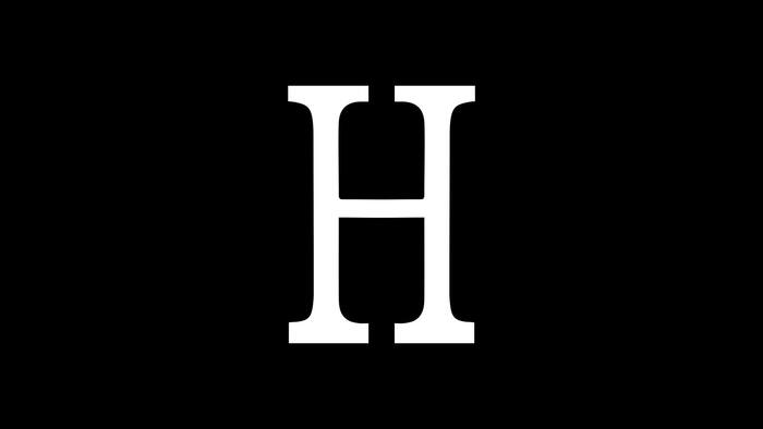
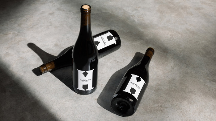
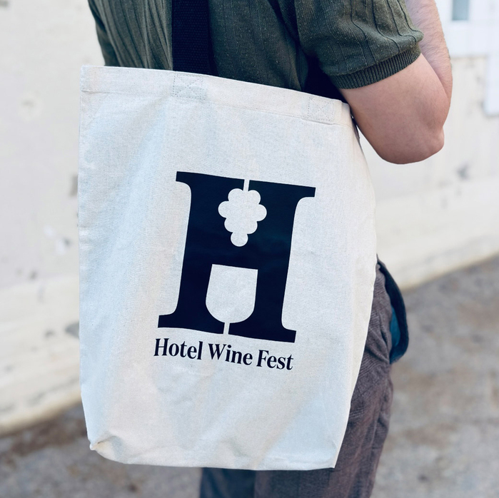
The dyamic logo is custom drawn.


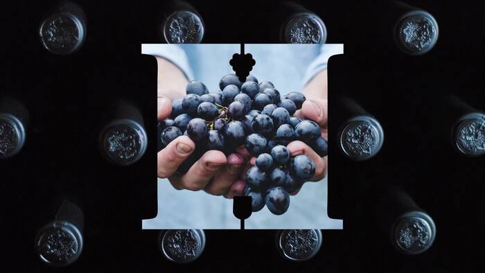
ESIETE created a brand for Hotel Wine Fest that merges elements of the wine world with typography, creating an icon that is easy to recognize and remember. The dynamic logo adapts to both online and offline formats and applications.
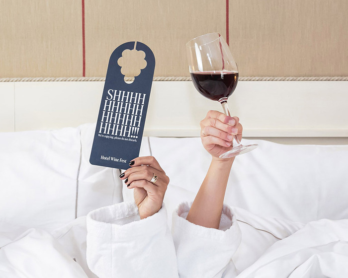
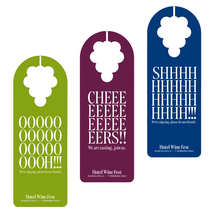
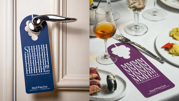
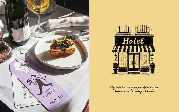
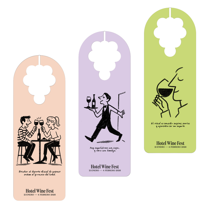
The first campaign reinterprets a distinctive element of the hotel, the hanger, transforming it into a piece with double meanings that invites, with elegance and a casual touch, to enjoy the event.
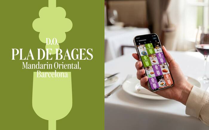
For the Hotel Wine Fest’s 3rd edition, we developed the campaign’s visual framework for a city-wide festival staged across Barcelona’s landmark hotels. The system builds on the award-winning format of earlier editions (ADG Laus Silver 2025, Logo) and updates it with a new “blend”: lighter, more playful messaging and a flexible layout logic designed to travel across formats—from posters and digital banners to on-site applications. Taking a more illustrative approach compared to previous years, which were driven by typography.
Source: www.esiete.com License: All Rights Reserved.
Source: www.esiete.com License: All Rights Reserved.
Source: www.esiete.com License: All Rights Reserved.
Source: www.esiete.com License: All Rights Reserved.
Source: www.esiete.com License: All Rights Reserved.
Source: www.esiete.com License: All Rights Reserved.
Source: www.esiete.com License: All Rights Reserved.
Source: www.esiete.com License: All Rights Reserved.
Source: www.esiete.com License: All Rights Reserved.
This post was originally published at Fonts In Use