Orquesta Típica de la Ciudad de México concert posters 2025


During 2025, the Orquesta Típica de la Ciudad de México (OTCM) offered a series of free concerts throughout the capital, for which these promotional poster was created.
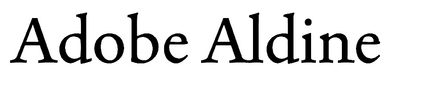
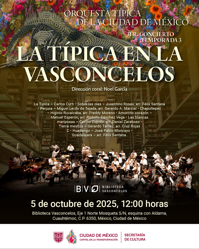
The layout of the elements follows a vertical or radial hierarchy where photographs of musicians or instruments—such as the salterio or the marimba—act as indices of Mexico City’s sonic tradition. The use of illustrations or flat color shapes aims to modernize the Orchestra’s image, moving it away from a static perception and bringing it closer to a dynamic urban audience. Furthermore, the color palette likely aligns with the institutional identity of the Secretariat of Culture, applied with high contrasts to ensure legibility in public spaces. A system of visual weights was established where the OTCM name stands out above the time and location details, allowing for quick scanning. The typographic selection likely includes a seriffed, calligraphic typeface—Adobe Aldine—for headlines to evoke the history and elegance of an orchestra with over 140 years of heritage, complemented by sans-serif typefaces—Roboto and Cabin—for technical data to ensure clear readability at various distances. Finally, the management of leading and tracking is optimized to avoid dense typographic blocks, maintaining an “air” that allows the design to breathe.
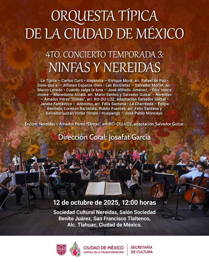
The poster for the Ninfas y Nereidas concert represents a transition towards a more layered and atmospheric visual language. The background is a rich, impressionistic tapestry of warm-toned flowers that anchors the composition, reflecting the floral tradition of the San Francisco Tlaltenco area.
The typographic system introduces Gabriola, whose fluid, stylistic alternates and elongated swashes mirror the “aquatic” and mythological theme of the Nereids. This expressive display face is used for the concert title, creating a sharp contrast with the structured, institutional presence of Adobe Aldine at the top. For the more complex information—such as the extensive repertoire list and venue details—Roboto and Cabin are again used to maintain high legibility against the textured background. The layout balances a large, centered photograph of the full orchestra with a clear, white footer for institutional logos, ensuring that the decorative elements do not compromise the informational clarity.
Sebastian Vigueras. License: All Rights Reserved.
Ritmos de Otoño, 19 October 2025
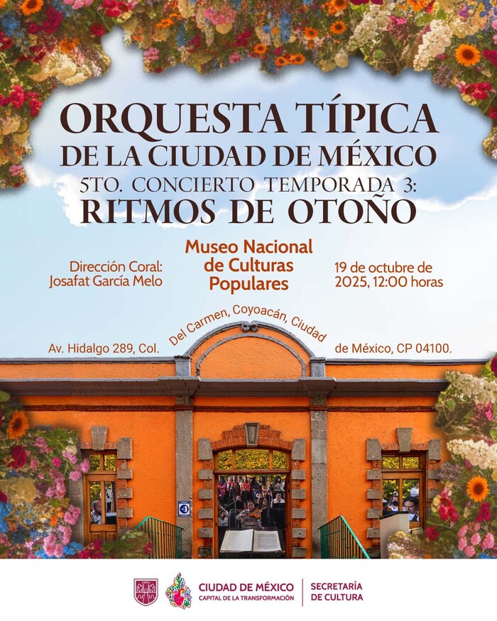
The poster for the Ritmos de Otoño (“Autumn Rhythms”) concert features a frame-within-a-frame composition that emphasizes the relationship between the venue and the season. The top of the layout is dominated by a lush, colorful floral arrangement that creates an organic border, contrasting with the bright blue sky.
The typographic hierarchy is centered and highly structured. The concert title is set in Adobe Aldine’s Display size, utilizing its graceful, flaring terminals to reflect the organic nature of the floral motifs. It is used for the “Orquesta Típica” name at the top, providing a stable, classical anchor for the design. A distinctive detail is the venue address, which is set in an arch following the architectural curve of the museum’s orange facade, effectively integrating the text with the photographic image of the building’s entrance.
Sebastian Vigueras. License: All Rights Reserved.
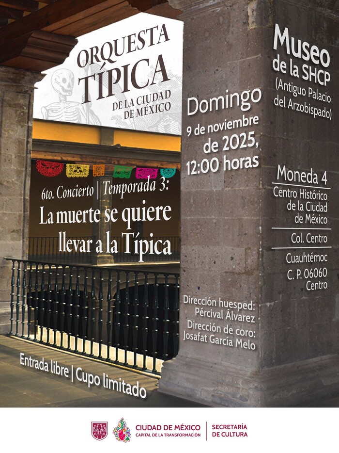
La muerte se quiere llevar a la Típica, 9 November 2025
This poster for the Día de Muertos special concert, titled La muerte se quiere llevar a la Típica, showcases a sophisticated integration of typography and architectural photography. The composition uses a diagonal perspective provided by the museum’s historic stone columns, creating a sense of depth that guides the eye toward the papel picado and the dark interior where the concert title is placed.
The typographic system relies on a high-contrast hierarchy to manage a large amount of information. The main header and the concert title are once more set in Adobe Aldine Display, whose classical serif structure is paired with a hand-drawn illustration of a skeleton, evoking the iconic style of José Guadalupe Posada. This choice reinforces the cultural heritage of the celebration. To balance the ornate title, venue details and technical data are organized using Roboto and Cabin, utilizing different weights and sizes to maintain clarity. A notable design choice is the placement of the location details on the stone pillar, treating the text as a physical part of the architecture. The color palette is somber yet accented by the vibrant colors of the traditional papel picado, ensuring the poster captures the festive yet solemn spirit of the season.
This post was originally published at Fonts In Use