The Face magazine, issue 26

Jonny Lu Studio. License: All Rights Reserved.
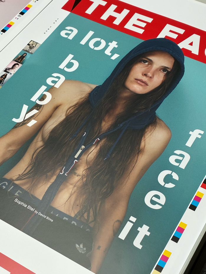
The Face was born in London in 1980 and published music, fashion, and culture content until 2004. In 2019, The Face was reborn for a new generation. A final print issue was issued in spring 2026. For this issue titled “A lot, baby, face it”, The Face commissioned two custom typefaces.
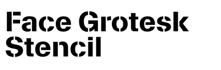
KMR Face Grotesk Stencil is a stencil typeface created by kimera based on the retail typeface KMR Waldenburg. It was developed in collaboration with Jonny Lu Studio, Lara Zettl and Daniel Johns based on a study of archival issues and their iconic use of Berthold’s stencil version of Akzidenz Grotesk. Face Grotesk Stencil contains a display cut and a text cut featuring more pronounced stencil gaps, increasing flexibility across sizes and applications. It used alongside the solid KMR Waldenburg, here dubbed Face Grotesk.
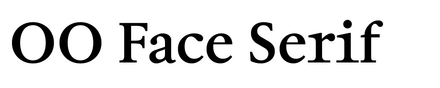
OO Face Serif was created by Outline Online (Samira Schneuwly, Laura Csocsán) and is used equally in body text and titles. Under the creative direction of Jonny Lu Studio, OO Face Serif was inspired by historical observations of Sabon and further modernised to meet the requirements of contemporary use.
To add another layer to these compositions, one of OO Face Serif’s features includes letterforms that resemble a monospace design. Though the typeface itself is proportional, these extended or compressed shapes give it a distinctive, fresher character and a more extreme look compared to closer interpretations of the source. These mono-like shapes also create an unexpected rhythm throughout the flow of the design in the layout. This idea became a defining feature for the typeface, giving the magazine a contemporary character and a more expressive voice through the typeface, without compromising readability. As an addition, the classic proportional style is also available within the set through OpenType stylistic sets.

Jonny Lu Studio. License: All Rights Reserved.

kimera. License: All Rights Reserved.
Partial glyph set of Face Grotesk Stencil Bold

kimera. License: All Rights Reserved.
Style range of Face Grotesk Stencil and Face Grotesk

Jonny Lu Studio. License: All Rights Reserved.

Jonny Lu Studio. License: All Rights Reserved.

Outline Online. License: All Rights Reserved.

Outline Online. License: All Rights Reserved.

Outline Online. License: All Rights Reserved.

Outline Online. License: All Rights Reserved.

Jonny Lu Studio. License: All Rights Reserved.

Outline Online. License: All Rights Reserved.

Outline Online. License: All Rights Reserved.

Outline Online. License: All Rights Reserved.

Outline Online. License: All Rights Reserved.

Jonny Lu Studio. License: All Rights Reserved.

Jonny Lu Studio. License: All Rights Reserved.
This post was originally published at Fonts In Use