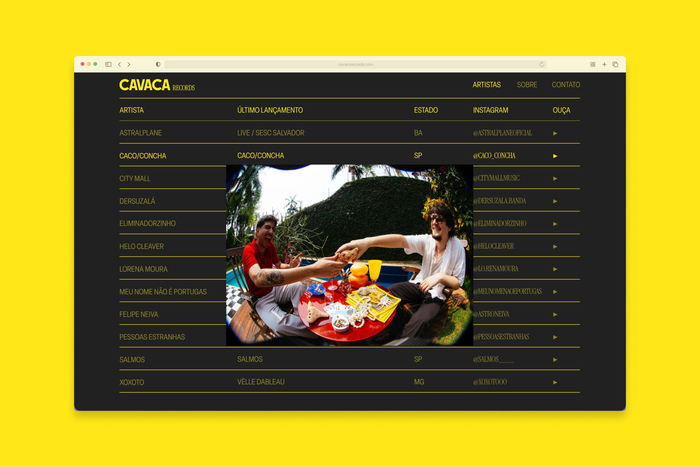
Cavaca Records
Bruno Faiotto. License: All Rights Reserved.


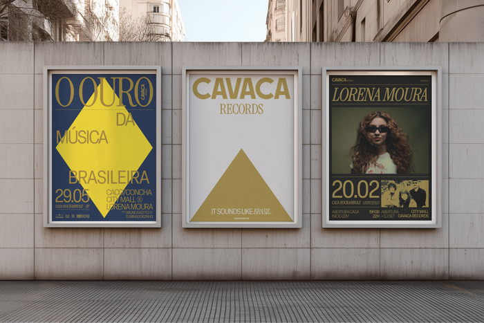
Cavaca Records is an independent Brazilian record label that, after a decade of history, sought a visual identity capable of reflecting its maturity and the motto defined by its founders: “It sounds like Brasil.” The challenge was to translate this sentiment into a professional, timeless system that avoids tropical clichés while remaining deeply rooted in the country’s cultural essence.
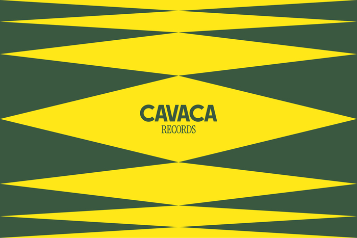
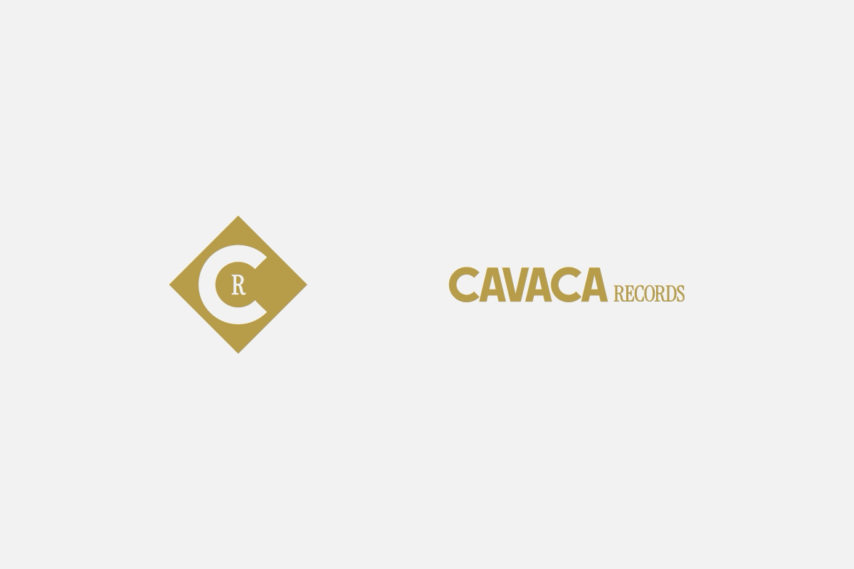
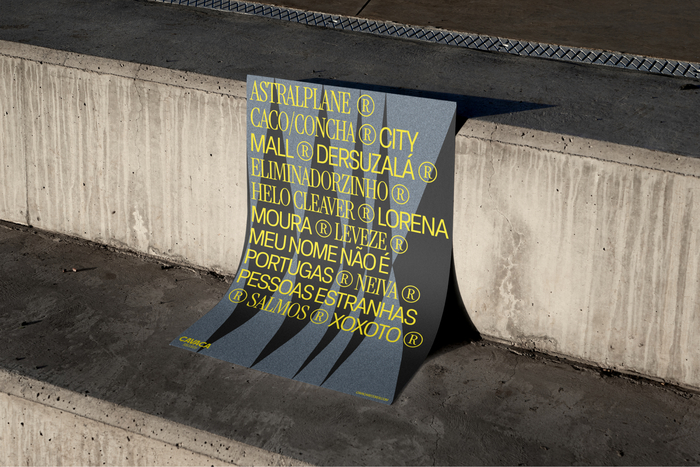
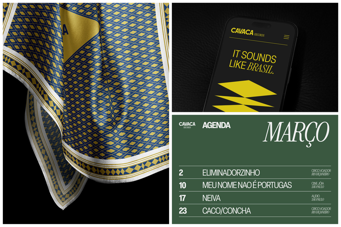
The visual identity finds its core in Brazilian Modernism, using the geometric shapes of the national flag—circles, rhombuses, and rectangles—as the building blocks for a modular and dynamic system. These shapes are reconfigured into patterns that reference both textile prints and audio frequencies, bridging the gap between national identity and sound. The color palette reinforces this connection, balancing sober greens and blues with a dual use of yellow: a matte gold representing the artists as “local gold nuggets” and a vibrant neon for digital freshness. Neutral off-white and washed black tones act as a visual connector, allowing the diverse photographic styles of the label's artists to coexist harmoniously.
The concept of modularity and movement is central to the typography. The custom-drawn Cavaca logo was built manually from the flag’s geometry, featuring a modular architecture where the suffix “Records” can be substituted for future business units like “Festival” or “Store“. This structural solidity is contrasted by the refined, hand-adjusted ligatures of Instrument Serif, used for the logo’s subtitle and secondary communication to add elegance. To anchor the system, Elza—a Brazilian neo-grotesque—serves as the primary typeface, providing a modern and local character. Together with a circular animation behavior for the logo and icon that mimics a spinning record, the identity stands as a proprietary system designed for continuous growth.
Bruno Faiotto. License: All Rights Reserved.
Bruno Faiotto. License: All Rights Reserved.
Bruno Faiotto. License: All Rights Reserved.
Bruno Faiotto. License: All Rights Reserved.
Bruno Faiotto. License: All Rights Reserved.
This post was originally published at Fonts In Use