The Beatles – “Hey Jude” / “Revolution” Dutch single cover
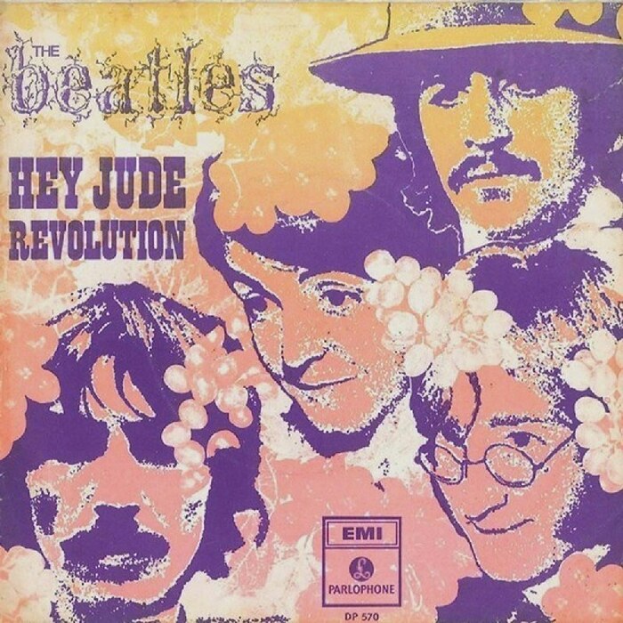
Source: www.flickr.com Uploaded to Flickr by Horst AdoSoft. License: All Rights Reserved.
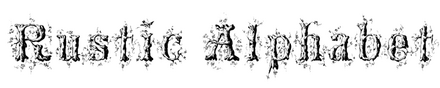



In the 19th century, lettering artists fancied to show off their skills by drawing intricate alphabets made of branches and shrubbery. We’ve recently seen Alphabet Forestier by Silvestre and Girault (1843) and Rustic by Hermann Esser (1877).
The version seen here – with lowercase – was conceived by Louis Prang (1824–1909). Born in Breslau – then in Prussian Silesia, now in southwestern Poland and named Wrocław – he emigrated to the United States in 1850, settling in Boston. Prang worked as a printer, lithographer, and publisher, and is probably best known as the “father of the American Christmas card”.
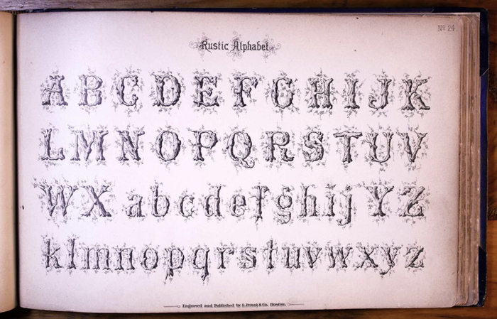
His Rustic Alphabet was shown in Prang’s Standard Alphabets, published in 1878. It was reproduced in the Swiss source book Lettera 2 from 1961. This is probably where the uncredited designer of the Dutch single cover for “Hey Jude” / “Revolution” discovered it, using it alongside Playbill.
Solotype had a phototype adaptation of Prang’s Rustic Alphabet under the alias Hedgerow. In 2015, Oliver Weiss of Walden Font Company digitized the face as WF Rebstock, using the German word for grapevine.
Source: luc.devroye.org License: All Rights Reserved.
Rustic Alphabet as shown in Prang’s Standard Alphabets (1878)
Source: www.flickr.com Uploaded to Flickr by Horst AdoSoft. License: All Rights Reserved.
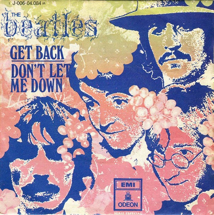
In 1969, EMI/Odeon reused the sleeve design with slightly different colors and Windsor Elongated instead of Playbill for the Spanish release of “Get Back” / “Don’t Let Me Down”. [More info on Discogs]
This post was originally published at Fonts In Use