Ambar Lucid – El Jardín de Lágrimas EP and merch
Source: www.instagram.com Ambar Lucid. License: All Rights Reserved.


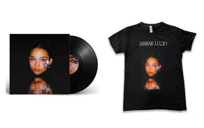
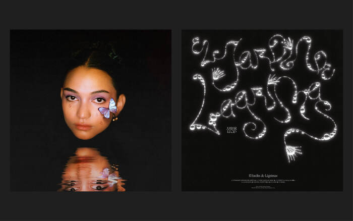
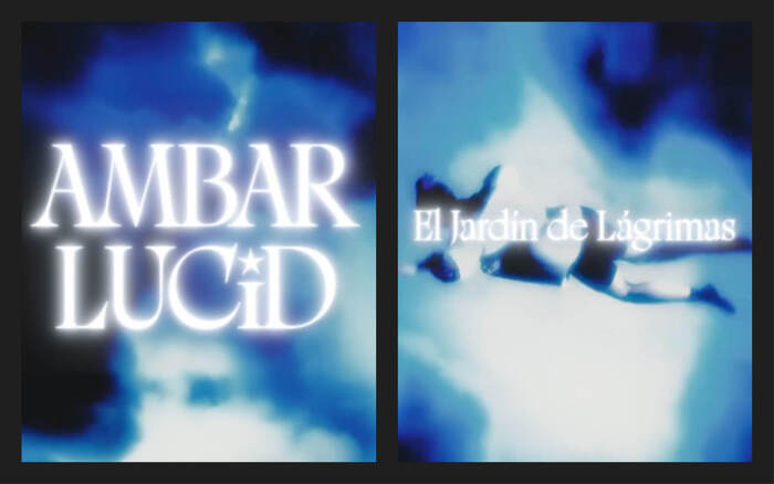
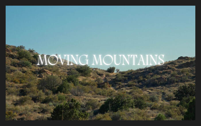
Ambar Lucid’s new EP is supported by a clear and cohesive communication strategy that extends beyond the music itself. The release is accompanied by a set of physical and visual products – vinyl, posters, and apparel – designed to strengthen the album’s identity and visibility. The typeface Rosalie, by My-Lan Thuong and available at Sharp Type, is used on all the supports. For the singer’s name, the capital I was replaced by a lowercase i and a star was used for the dot. The typeface has a blurry and shinning effect for the song titles on the videos.
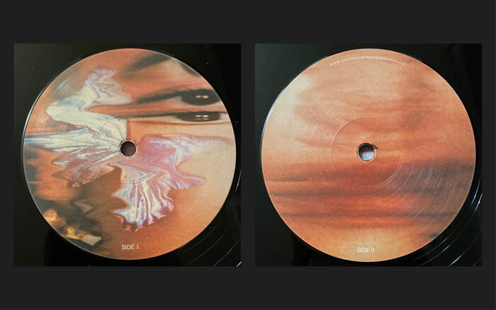
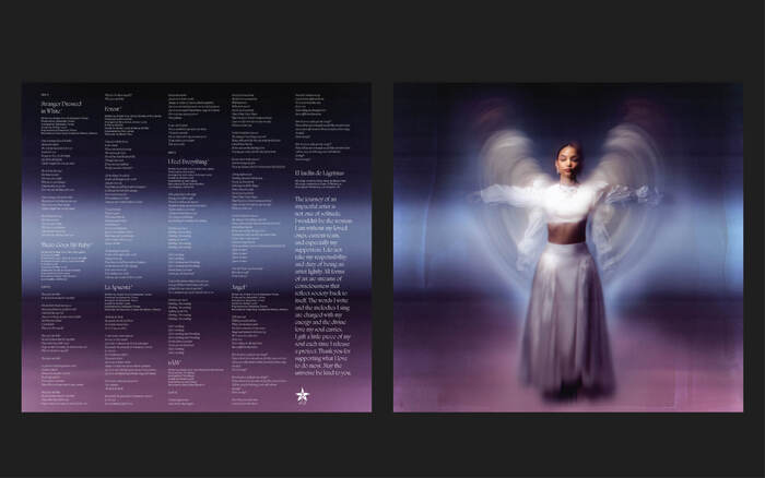
The vinyl record design is composed of four panels; with the front cover showing the main photo artwork that’s also used on the T-shirt. The back cover has lettering with the title of the EP, El Jardín de Lágrimas, and finally the inside contains the lyrics and a photo of the artist as an angel.
Together, these items create a unified promotional ecosystem: digital platforms introduce the music, while physical products reinforce the branding and extend the EP’s presence into the fan community. The visual identity of El Jardín de Lágrimas is not officially credited publicly, at least in the usual metadata and merch sources.
Source: www.instagram.com Ambar Lucid. License: All Rights Reserved.
Source: www.instagram.com Ambar Lucid. License: All Rights Reserved.
Source: www.instagram.com Ambar Lucid. License: All Rights Reserved.
Source: www.instagram.com Ambar Lucid. License: All Rights Reserved.
Source: www.instagram.com Ambar Lucid. License: All Rights Reserved.

Source: www.instagram.com Ambar Lucid. License: All Rights Reserved.
Source: www.instagram.com Ambar Lucid. License: All Rights Reserved.
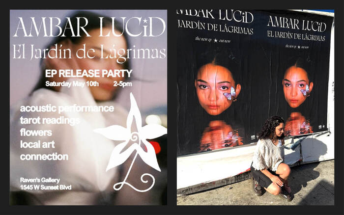
The poster for the release party additionally uses what appears to be a blurred version of Arial.
This post was originally published at Fonts In Use