Woal
Published September 5, 2025
By FontsInUse
Contributed by Michele Galluzzo

woal. License: All Rights Reserved.


Source: www.woal.it woal. License: All Rights Reserved.

woal. License: All Rights Reserved.

Source: www.woal.it woal. License: All Rights Reserved.

woal. License: All Rights Reserved.

Source: www.woal.it woal. License: All Rights Reserved.

woal. License: All Rights Reserved.

Source: www.woal.it woal. License: All Rights Reserved.

woal. License: All Rights Reserved.
woal. License: All Rights Reserved.
This post was originally published at Fonts In Use
woal. License: All Rights Reserved.
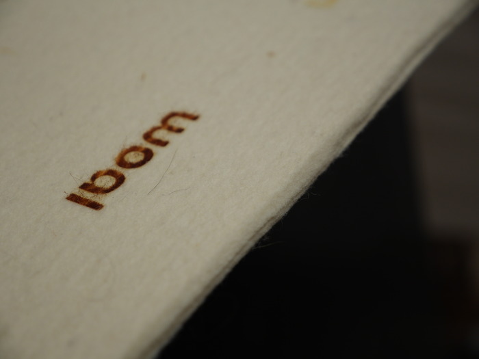
WOAL is a project/brand related to the combination of ‘wool’ the material, and ‘wall’, the space that welcomes. WOAL comes from the experimentation and intuition of Maddalena Selvini, a Milanese designer, and the creativity of Anna Bodini, who has imagined a world made up of special spaces.
For the visual identity of the project Selvini mainly used two typefaces: Baustraße by Fantasia Type and Arial by Monotype. From their website:
Source: www.woal.it woal. License: All Rights Reserved.
woal. License: All Rights Reserved.
Source: www.woal.it woal. License: All Rights Reserved.
woal. License: All Rights Reserved.
Source: www.woal.it woal. License: All Rights Reserved.
woal. License: All Rights Reserved.
Source: www.woal.it woal. License: All Rights Reserved.
woal. License: All Rights Reserved.
woal. License: All Rights Reserved.
This post was originally published at Fonts In Use
Read full story.
WRITTEN BY
FontsInUse
An independent archive of typography.