Welt ohne Wahrheit by Clemens Pig
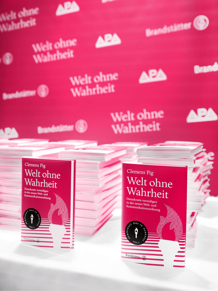
Source: www.apa-fotoservice.at APA / APA-Fotoservice / Ludwig Schedl. License: All Rights Reserved.

Welt ohne Wahrheit (“A World Without Truth”) is the second volume in Clemens Pig’s Democracy Dies in Darkness series. Pig was serving as CEO of APA—Austria Presse Agentur, Austria’s national news agency, when the book was published (he was subsequently elected director general of ORF, Austria’s public broadcaster). The book examines how autocrats, tech populists, digital platforms, disinformation, and largely unregulated AI systems are changing the conditions of democratic public discourse. Pig outlines a European information order centered on stronger media institutions, digital sovereignty, the regulation of social networks, and a more active role for users in democratic communication. The book includes interviews with Maria Ressa, Jeff Jarvis, Carlo Masala, Maria Scholl, Martin Andree, and Dmitry Shishkin.
I designed the first volume in the series using Calluna by Jos Buivenga, a typeface I greatly admire for its warmth, character, and readability. For the second volume, I switched to APN Chora, my own text typeface. APN Chora retains the humanist warmth and reading comfort I valued in Calluna, while lending the typography a more formal presence and an austere elegance. Originally conceived under the working title Wiener Buchschrift (“Viennese Book Typeface”), it felt naturally suited to a book about public institutions and democratic communication by an Austrian media executive.
The book’s design conveys a sense of urgency while remaining attentive to its readership and to the practical realities of the project’s schedule, budget, and the publisher’s requirements. Its visual language is built on a restrained editorial framework that synthesizes classical book-typographic conventions with modernist clarity, punctuated by emphatic chapter openers and imagery. The series’ recurring torch emblem represents enlightenment, democratic freedom, and the transmission of knowledge. In an Austrian context, it also alludes to Karl Kraus’s journal Die Fackel (“The Torch”). The interior is printed entirely in black, while the cover and endpapers feature a vivid hue between magenta and red that I call “kinetic magenta.”
APN Chora Regular and Italic are used throughout, with Bold appearing sparingly. The body text is set at 11 pt, with 9 pt and 7 pt used for secondary levels and larger sizes reserved for headings and display text.
Published by Brandstätter Verlag on April 29, 2026. 216 pages, hardcover with dust jacket, 13.5×21 cm, printed on Salzer EOS book wove paper (1.5 bulk; FSC®- and PEFC-certified). ISBN 978-3-7106-0962-6.
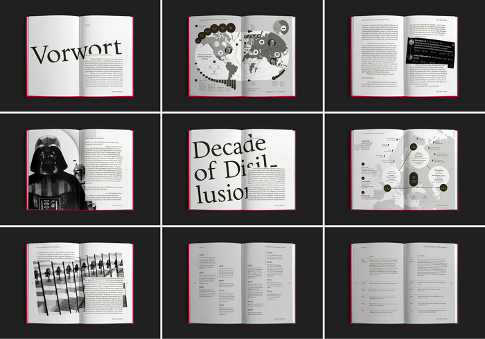
Photo: Patrick Nell. License: All Rights Reserved.
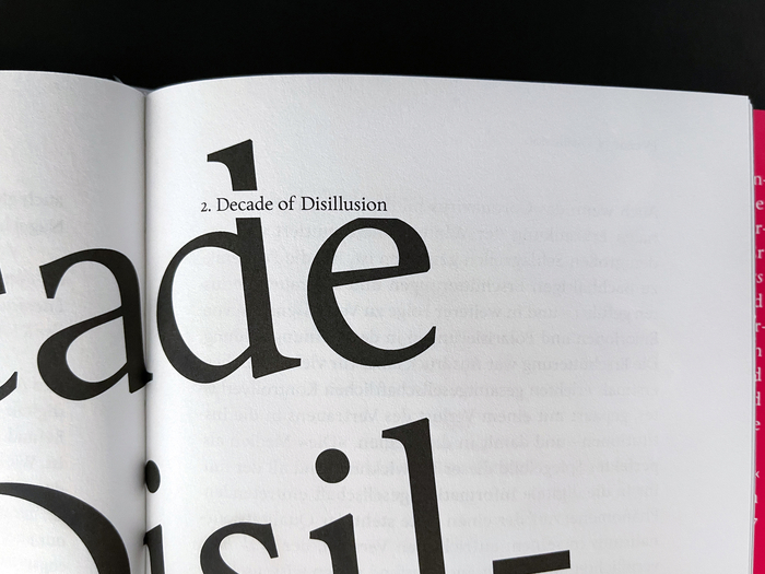
Photo: Patrick Nell. License: All Rights Reserved.
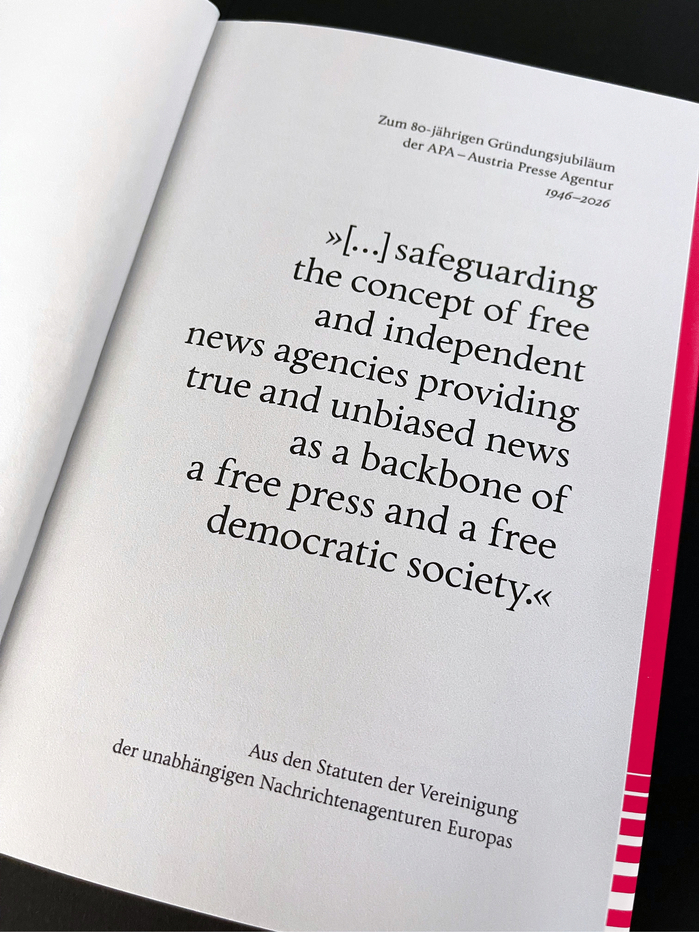
Photo: Patrick Nell. License: All Rights Reserved.
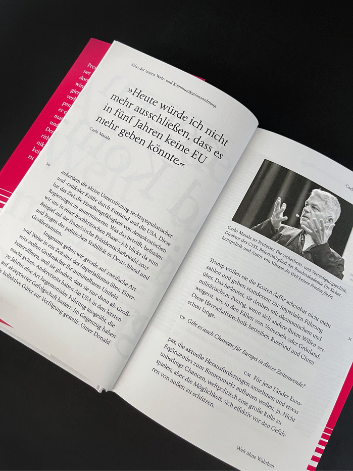
Photo: Patrick Nell. License: All Rights Reserved.
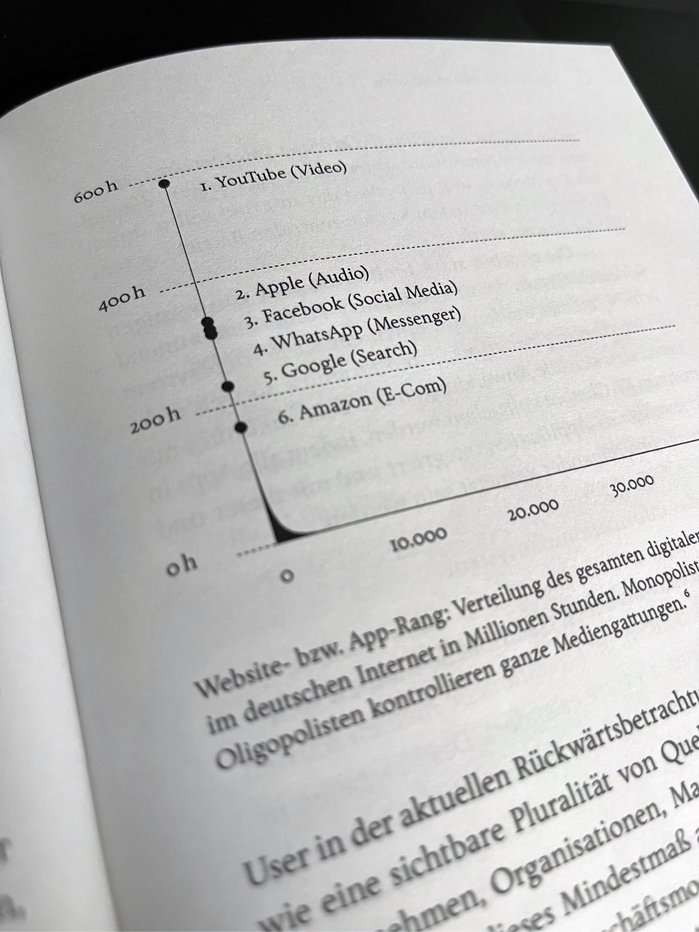
Photo: Patrick Nell. License: All Rights Reserved.
This post was originally published at Fonts In Use