raye the store 14
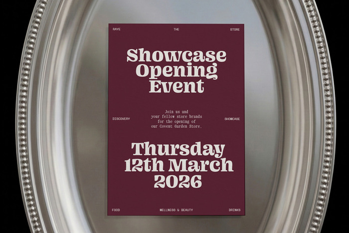
Photo: Studio Böreck. License: All Rights Reserved.


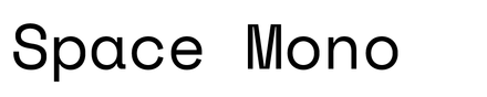
Raye the Store is a traveling pop-up shop showcasing a curated selection of innovative food, drink, and wellness brands. Based on a minimal grid system, the identity evolves from edition to edition through a signature color and typeface, giving each store its own distinct character while remaining recognizably Raye.
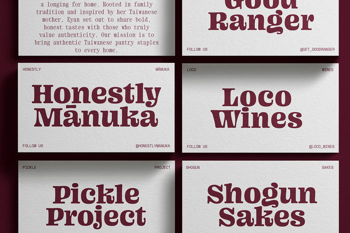
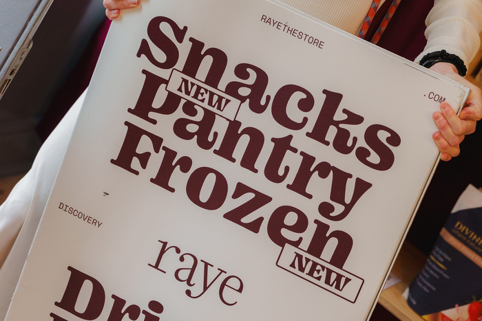
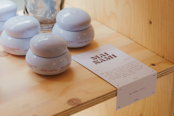
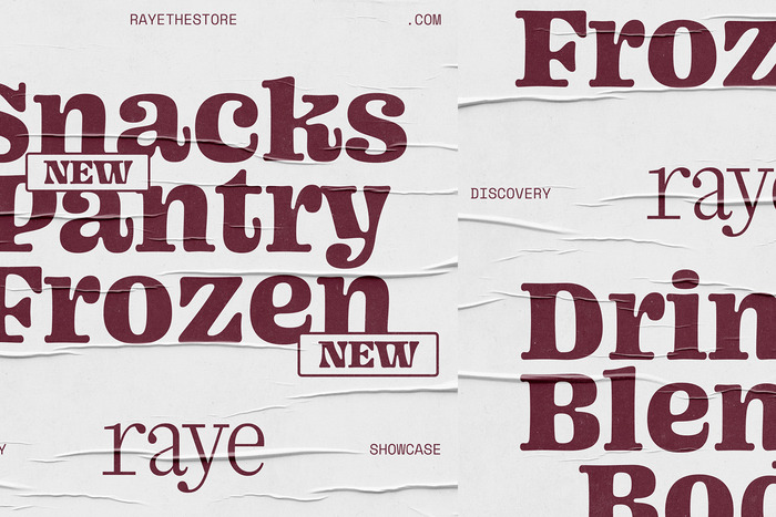
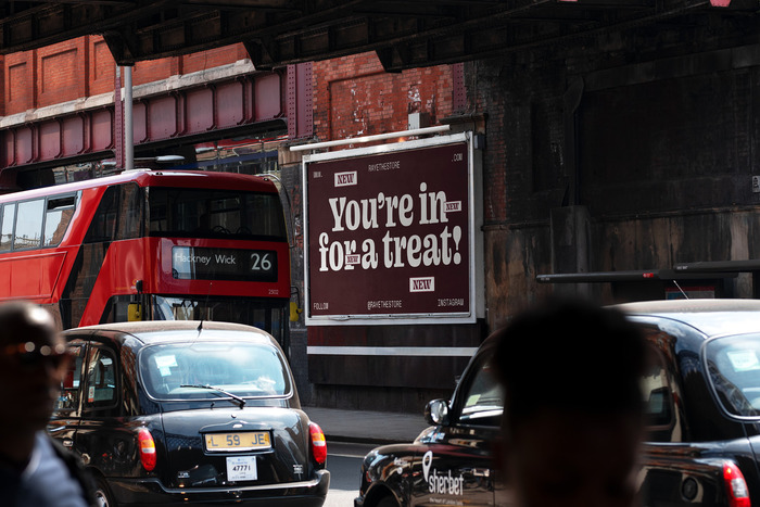
For Edition 14, the identity is defined by a rich Mulberry tone and the bold display typeface Ohno Blazeface. With its chunky proportions, soft curves, and highly characteristic letterforms, Blazeface brings a playful and friendly quality to the space while retaining a strong graphic presence.
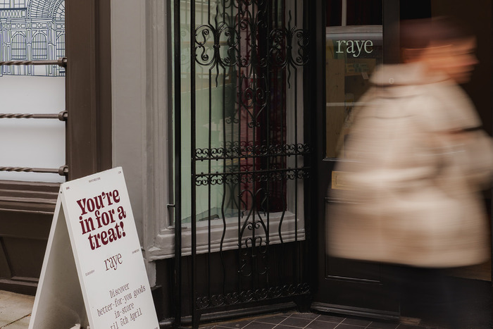
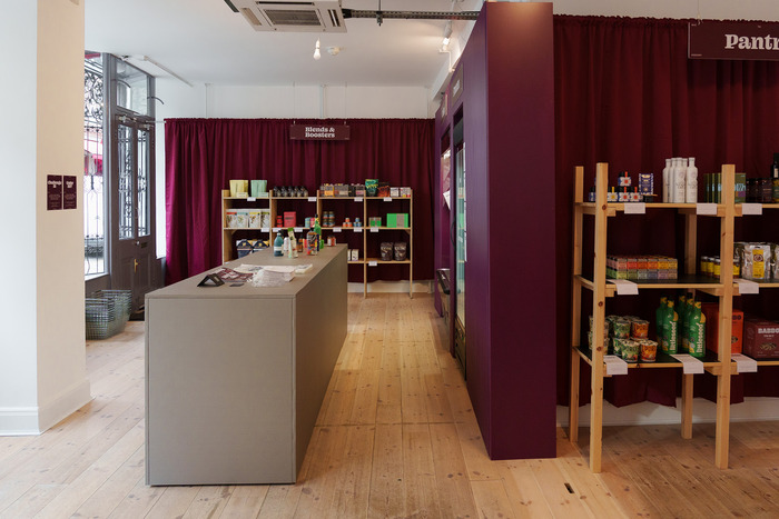
Used confidently at large scale throughout the store, the expressive typography contrasts with the reduced, monochromatic color system. The deep Mulberry backdrop brings warmth and depth, while allowing the type to become the main visual element across signage, windows, and printed applications.
Together, Mulberry and Oh No Blazeface give Edition 14 a bold, warm, and distinctive character — continuing Raye’s flexible identity system through a new combination of color and type.
License: All Rights Reserved.
License: All Rights Reserved.
License: All Rights Reserved.
License: All Rights Reserved.
License: All Rights Reserved.
License: All Rights Reserved.
License: All Rights Reserved.
This post was originally published at Fonts In Use