Vienna Art Week (2019–)
Published August 3, 2023
By FontsInUse
Contributed by David Einwaller
Proxi Design. License: All Rights Reserved.

Proxi Design. License: All Rights Reserved.

Proxi Design. License: All Rights Reserved.
Proxi Design. License: All Rights Reserved.
Proxi Design. License: All Rights Reserved.
Proxi Design. License: All Rights Reserved.

Proxi Design. License: All Rights Reserved.
Proxi Design. License: All Rights Reserved.
Proxi Design. License: All Rights Reserved.
Source: www.viennaartweek.at Proxi Design. License: All Rights Reserved.

Source: www.viennaartweek.at Proxi Design. License: All Rights Reserved.
Source: www.viennaartweek.at Proxi Design. License: All Rights Reserved.
Source: www.viennaartweek.at Proxi Design. License: All Rights Reserved.
Source: www.viennaartweek.at Proxi Design. License: All Rights Reserved.
This post was originally published at Fonts In Use
Proxi Design. License: All Rights Reserved.
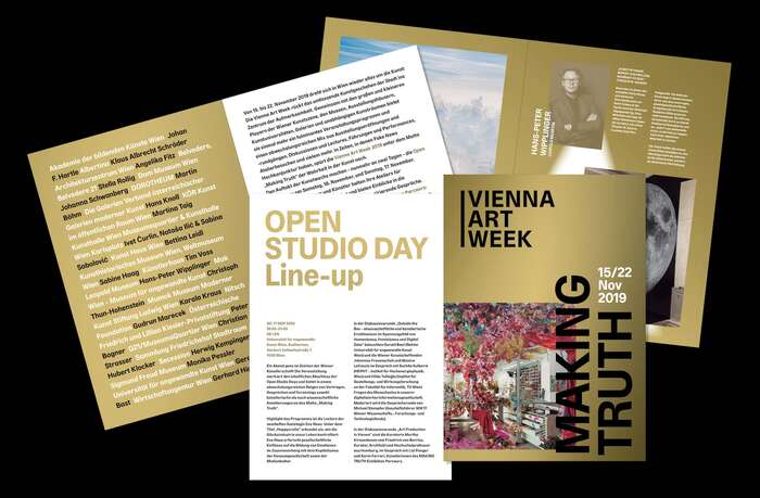
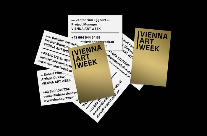
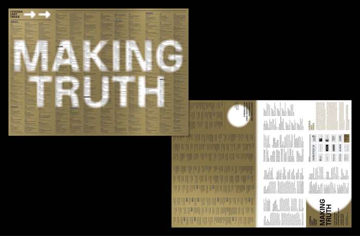
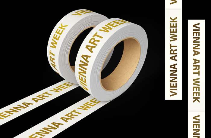
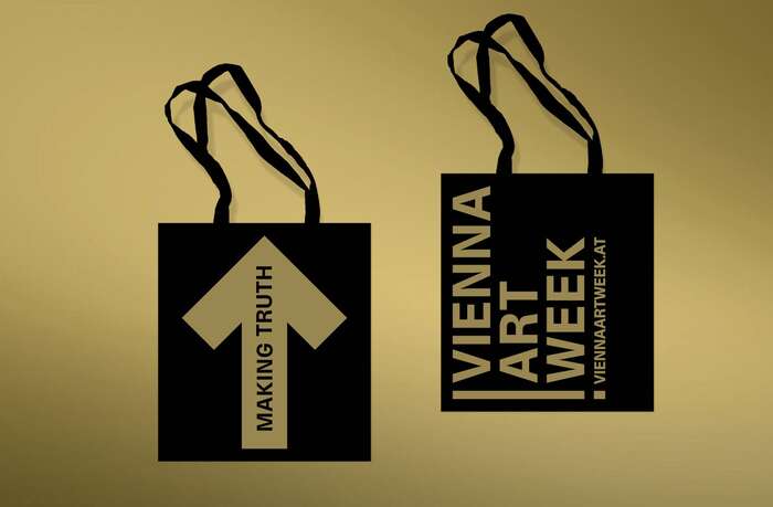
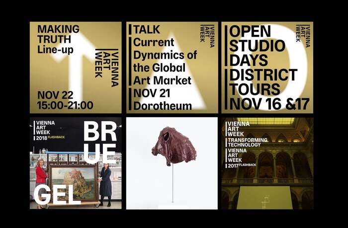
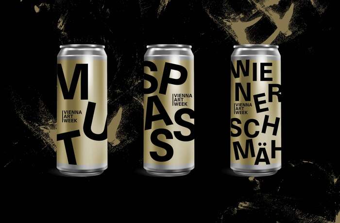
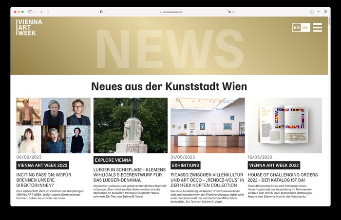
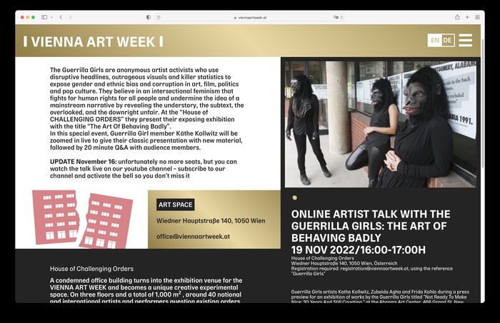
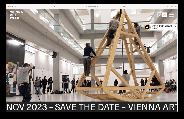
The 2019 edition of Vienna Art Week saw a complete redesign of the annual art event, set entirely in Delphia. Proxi, a studio with offices in in Barcelona, Berlin and Austria, used the bold weight for the new logotype and mixed in some lighter weights and Italics for smaller text cases to create a solid corporate identity.
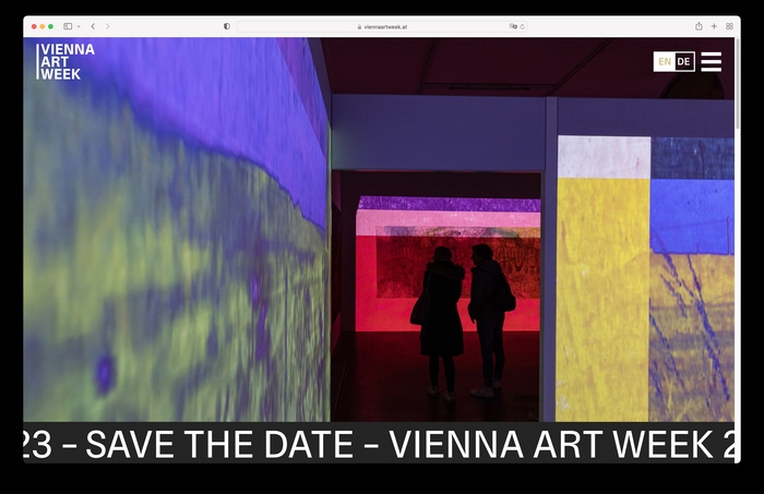
Throughout the years, multiple weights and styles have been used in a wide range of cases. The typeface was applied throughout the whole event which included facade banners, signs, balloons, bags, posters, booklets, the website and many more – most of them printed with Pantone Gold.
Proxi Design. License: All Rights Reserved.
Proxi Design. License: All Rights Reserved.
Proxi Design. License: All Rights Reserved.
Proxi Design. License: All Rights Reserved.
Proxi Design. License: All Rights Reserved.
Proxi Design. License: All Rights Reserved.
Proxi Design. License: All Rights Reserved.
Proxi Design. License: All Rights Reserved.
Source: www.viennaartweek.at Proxi Design. License: All Rights Reserved.
Source: www.viennaartweek.at Proxi Design. License: All Rights Reserved.
Source: www.viennaartweek.at Proxi Design. License: All Rights Reserved.
Source: www.viennaartweek.at Proxi Design. License: All Rights Reserved.
Source: www.viennaartweek.at Proxi Design. License: All Rights Reserved.
This post was originally published at Fonts In Use
Read full story.
WRITTEN BY
FontsInUse
An independent archive of typography.