Ras l’Bock brewery rebranding
Published August 3, 2023
By FontsInUse
Contributed by Frédéric Dupuis
Source: www.behance.net Fred Dupuis. License: All Rights Reserved.


Source: www.behance.net Fred Dupuis. License: All Rights Reserved.
Source: www.behance.net Fred Dupuis. License: All Rights Reserved.
Source: www.behance.net Fred Dupuis. License: All Rights Reserved.
Source: www.behance.net Fred Dupuis. License: All Rights Reserved.
Source: www.behance.net Fred Dupuis. License: All Rights Reserved.
This post was originally published at Fonts In Use
Source: www.behance.net Fred Dupuis. License: All Rights Reserved.
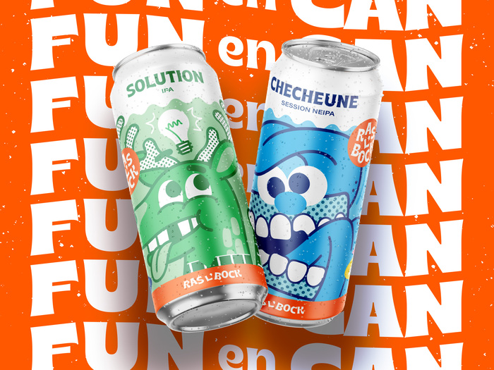
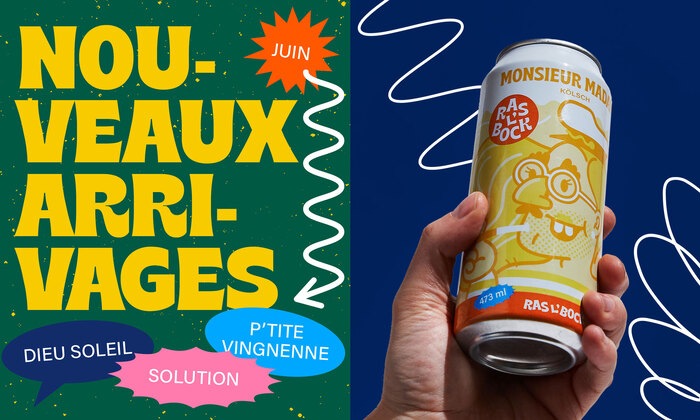
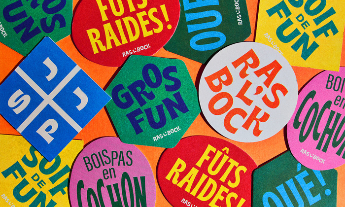
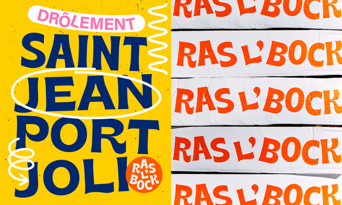
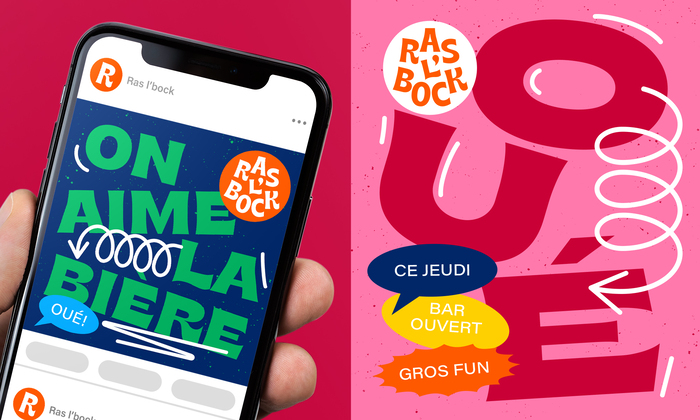
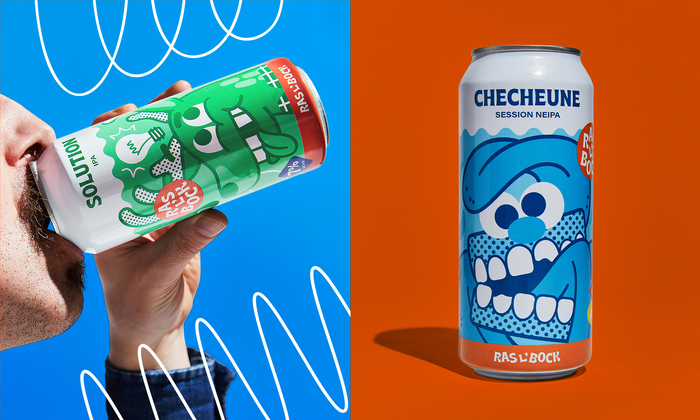
For the identity revamp of Ras l’Bock, a microbrewery from eastern Quebec, we knew we had to tap into what the brand is known for: good times. Its fun loving boldness called for strong colors, amusing characters and a funky font. The brand uses Brice and counterbalances it with Acumin in multiple width-weight combinations.
A fun brand deserves a fun positioning that reflects its reason to be! Cheers!
Source: www.behance.net Fred Dupuis. License: All Rights Reserved.
Source: www.behance.net Fred Dupuis. License: All Rights Reserved.
Source: www.behance.net Fred Dupuis. License: All Rights Reserved.
Source: www.behance.net Fred Dupuis. License: All Rights Reserved.
Source: www.behance.net Fred Dupuis. License: All Rights Reserved.
This post was originally published at Fonts In Use
Read full story.
WRITTEN BY
FontsInUse
An independent archive of typography.