Victory Edition cider
Source: www.hono.at License: All Rights Reserved.


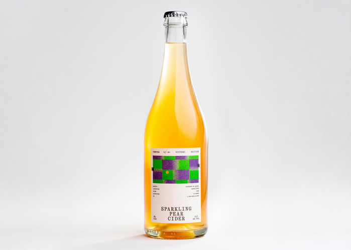
Five sets, nearly five hours of play, and two legends face-to-face: the 2008 Wimbledon final between Roger Federer and Rafael Nadal remains one of the most iconic matches in sports history. It is this legendary sequence that the Victory Edition celebrates—a project by Temper, a Vienna-based studio combining art, design, and sports culture to create exceptional objects with rigorous attention to detail.
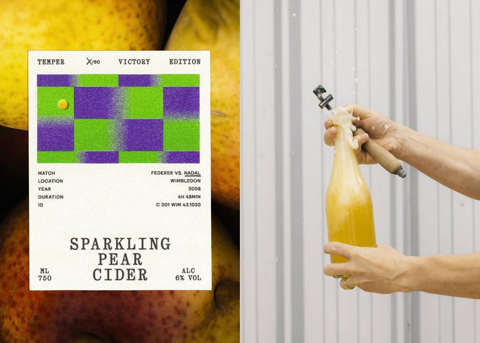
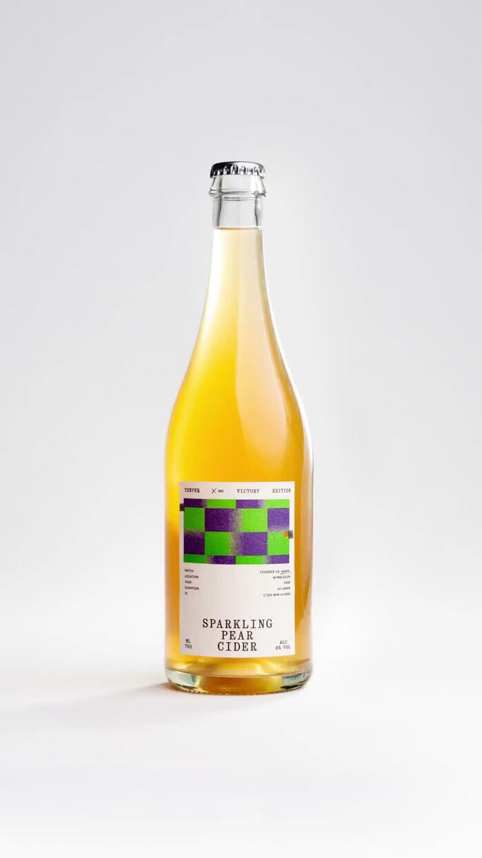
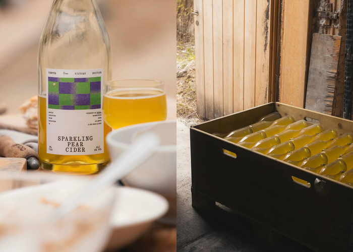
For this limited edition, Austrian studio Hono broke the final five seconds of the match into 60 individual frames. Munich-based print shop Herr & Frau Rio produced each visual using Risograph printing in Wimbledon’s signature green and purple color palette. Each label features a specific frame of the match point, acting as a physical flipbook: when all 60 bottles are lined up side by side, the winning rally plays out frame by frame.
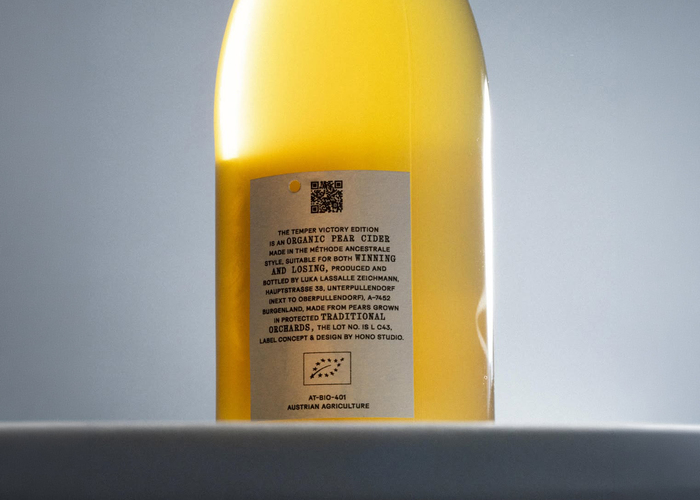
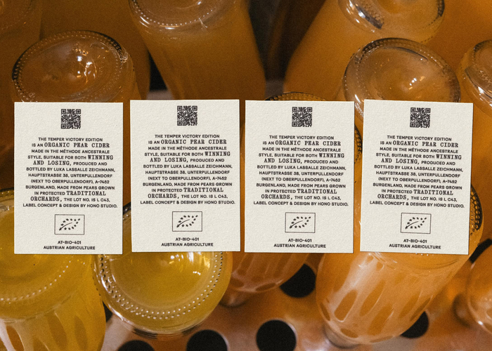
The typographic layout relies on the geometric sans-serif Surt (Blaze Type) paired with Quadrant Text from Matter of Sorts. The design wraps an organic sparkling pear cider crafted by Austrian winemaker Luka Zeichmann, transforming a landmark moment in tennis into a series of unique, collectible items.
Source: www.hono.at License: All Rights Reserved.
Source: www.hono.at License: All Rights Reserved.
Source: www.hono.at License: All Rights Reserved.
Source: www.hono.at License: All Rights Reserved.
Source: www.hono.at License: All Rights Reserved.
This post was originally published at Fonts In Use