Ami Ami
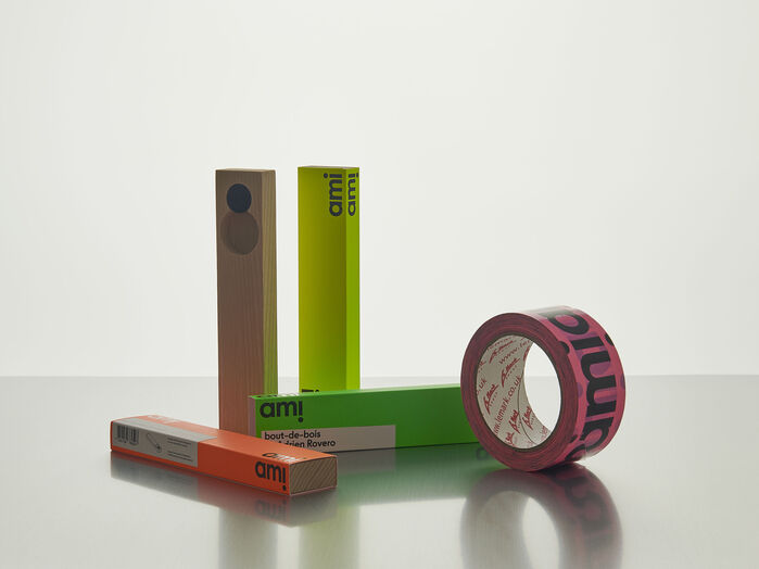
Photo: ToStudio. License: All Rights Reserved.

AmiAmi is a swiss brand founded by Jean-Sébastien Amiguet, whose purpose is to support the work of local independent industrial designers by producing their objects in limited editions. It is a passion-driven project in which all the profits are reinvested into the fabrication of new items.
Jean-Sébastien asked me (Tancrède Ottiger, ToStudio) to come up with a proposal for the graphic identity of the brand. First, I proposed to set the word mark in an altered version of ToTemper within which the original a is replaced by a single story version. The purpose of this alteration was to reinforce the geometric construction of the letters in order for them to echo more vividly with the playfullness of the objects curated by the brand.
The logotype is built on the repetition of the word “ami”, in order for the i to represent silhouettes looking at one another. On the various packagings, the logotype is positioned systematically in the corner so that it appears only when viewed from an angle.
All the visual communication is set in ToTemper. The typeface provides a nuanced alternative to modular letterforms without sacrificing graphical impact. It is constructed on primitive shapes free of sharp angles. Nevertheless, it displays a strong contrast between letter’s widths and features a uniform stroke distribution like a classical geometric typeface.

Photo: ToStudio. License: All Rights Reserved.

Photo: ToStudio. License: All Rights Reserved.

Photo: ToStudio. License: All Rights Reserved.

Photo: ToStudio. License: All Rights Reserved.

Photo: ToStudio. License: All Rights Reserved.
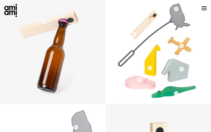
Source: www.amiami.ch Photo: ToStudio. License: All Rights Reserved.
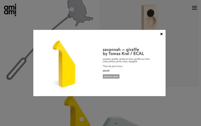
Source: www.amiami.ch Photo: ToStudio. License: All Rights Reserved.
This post was originally published at Fonts In Use