By No Means
Published October 24, 2026
By FontsInUse
Contributed by Tom Watkins
https://lukerobertson.studio. License: All Rights Reserved.

https://lukerobertson.studio. License: All Rights Reserved.

https://lukerobertson.studio. License: All Rights Reserved.

https://lukerobertson.studio. License: All Rights Reserved.
https://lukerobertson.studio. License: All Rights Reserved.

https://lukerobertson.studio. License: All Rights Reserved.
https://lukerobertson.studio. License: All Rights Reserved.
This post was originally published at Fonts In Use
https://lukerobertson.studio. License: All Rights Reserved.
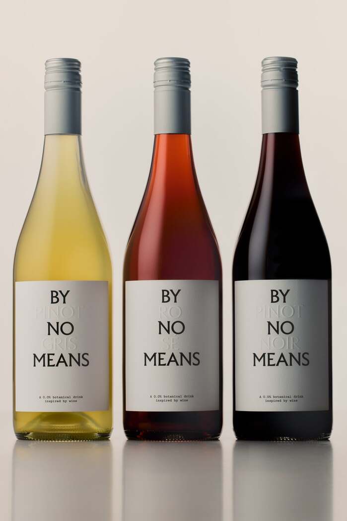
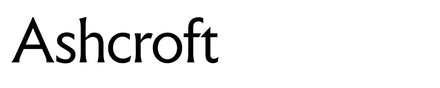
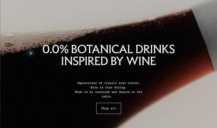
Ashcroft forms the stacked wordmark for By No Means, an Australian range of alcohol-free botanical drinks inspired by wine. Luke Robertson Studio developed the visual identity, packaging and art direction.
The uppercase logo gives the bottles a distinctive presence, while blind-embossed varietal names sit between the lines of the wordmark. This treatment carries the idea of a wine “impression” into the physical label. A grape-like emblem, derived from an inverted typographic asterism, appears on the bottle caps.
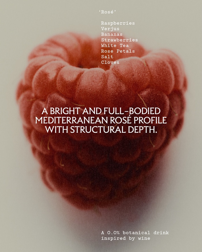
The identity extends to business cards and ingredient-led imagery.
https://lukerobertson.studio. License: All Rights Reserved.
https://lukerobertson.studio. License: All Rights Reserved.
https://lukerobertson.studio. License: All Rights Reserved.
https://lukerobertson.studio. License: All Rights Reserved.
https://lukerobertson.studio. License: All Rights Reserved.
https://lukerobertson.studio. License: All Rights Reserved.
This post was originally published at Fonts In Use
Read full story.
WRITTEN BY
FontsInUse
An independent archive of typography.
More from FontsInUse