Venice Art Biennale Italian Pavilion visual identity and publications
Source: www.studiofolder.it Studio Folder. License: All Rights Reserved.
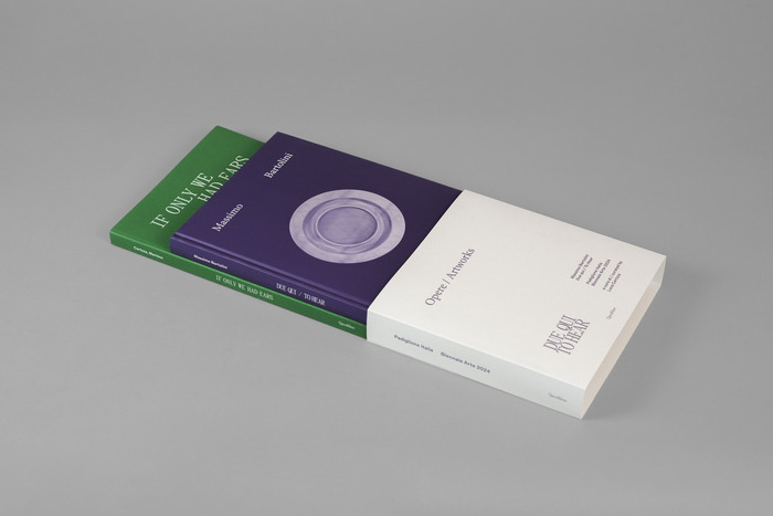
Exhibition catalog and public program reader


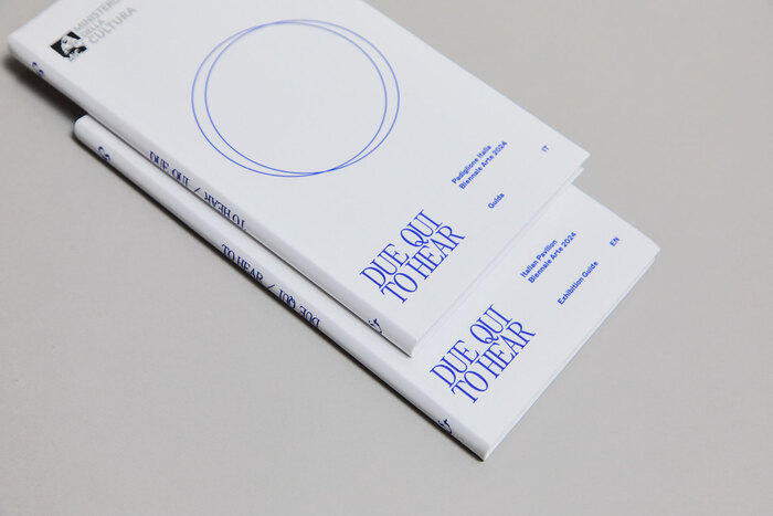
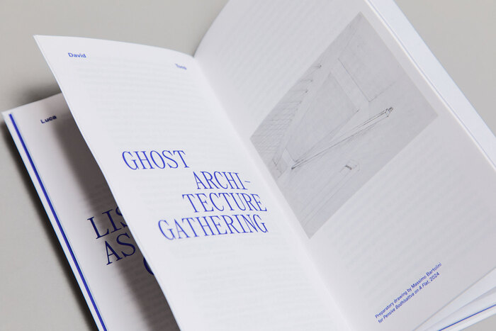
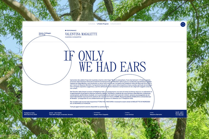
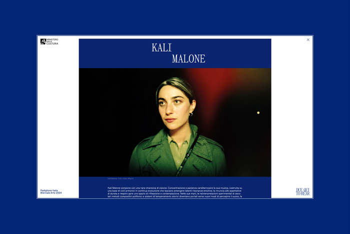
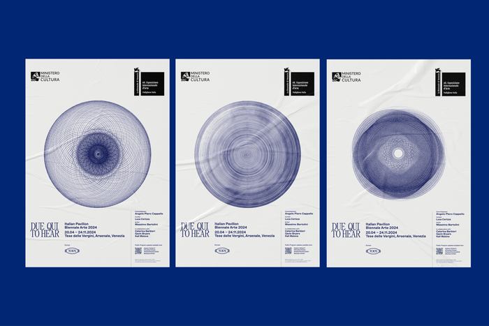
The visual identity for Due qui / To hear, the Italian Pavilion at the Biennale Arte 2024, is built on a strong typographic presence, the image of two converging and fluctuating circles, and two colours—a dark blue and a warm white.
The two typefaces (Panama by Roman Gornitsky, and ABC Marfa by Dinamo), in their variations, organize the ample body of texts into a well-defined hierarchy, while the two circles orbit around the same centre, attracting and moving away from each other along ever-changing trajectories. The circle is a recurring element, both geometrically and symbolically, in the work of Massimo Bartolini presented within the Italian Pavilion. The animation of the two circles embodies the dynamic experience of the visit, as well as the search of the Other in the dimension of listening, the founding theme of Due qui / To hear. The colour is an homage to Kandinsky’s theories in Point and Line to Plane, in which—according to the association between geometric shapes and primary colors—blue corresponds to the circle.
See more on Studio Folder’s website.
Source: www.studiofolder.it Studio Folder. License: All Rights Reserved.
Source: www.studiofolder.it Studio Folder. License: All Rights Reserved.
Source: www.studiofolder.it Studio Folder. License: All Rights Reserved.
Source: www.studiofolder.it Studio Folder. License: All Rights Reserved.
Source: www.studiofolder.it Studio Folder. License: All Rights Reserved.
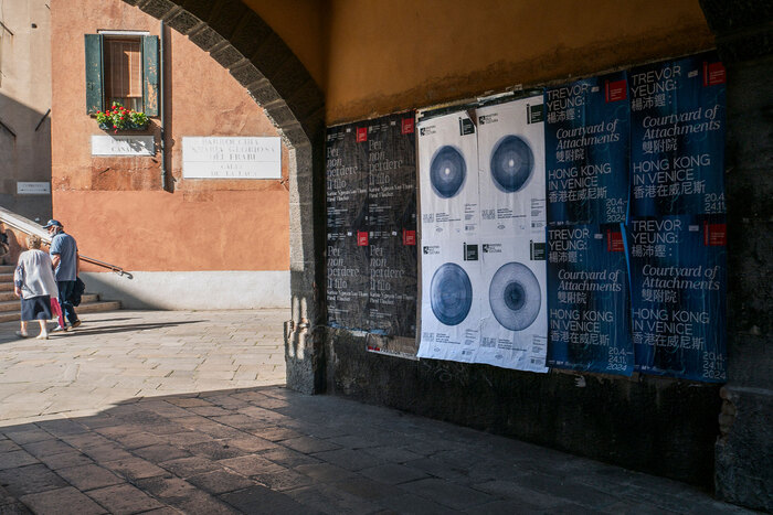
Posters in the city of Venice
Source: www.studiofolder.it Studio Folder. License: All Rights Reserved.
Posters in the city of Venice
This post was originally published at Fonts In Use