Deutsche Oper am Rhein premiere posters 2026/27
Neusitzer Brand Identity. License: All Rights Reserved.


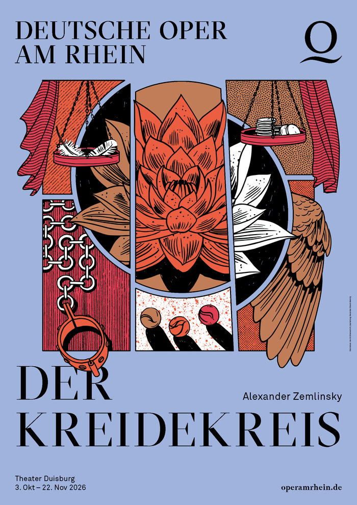
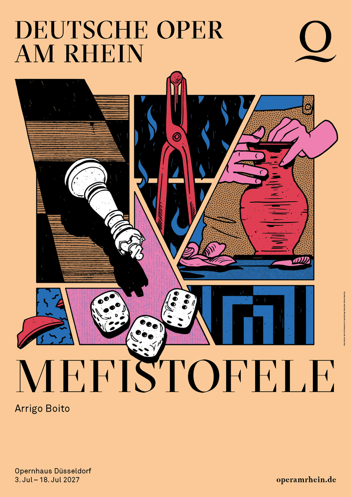
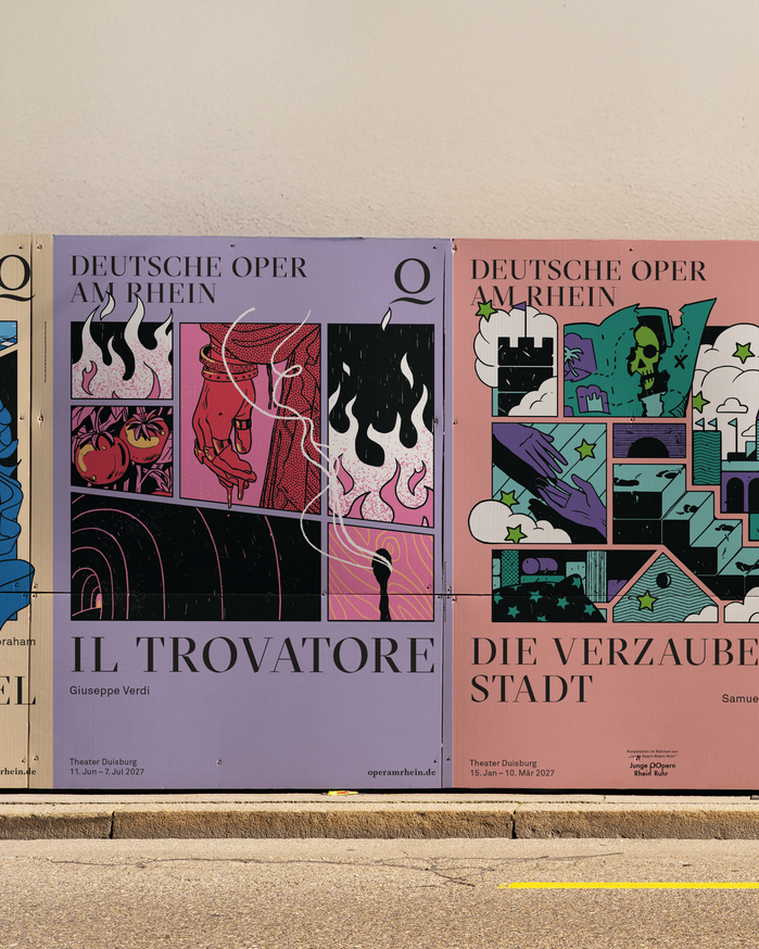
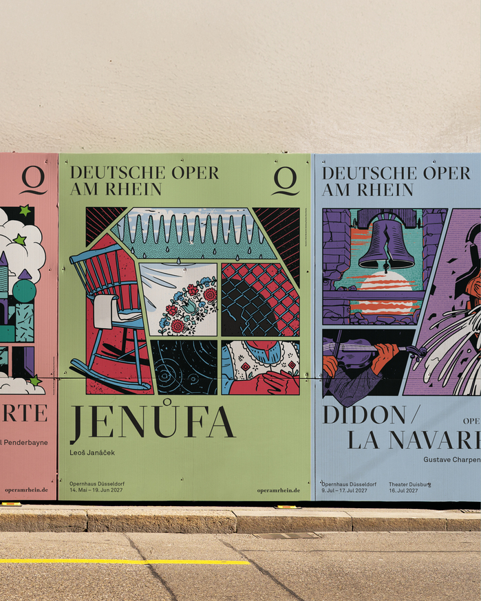
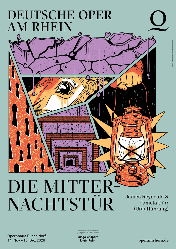
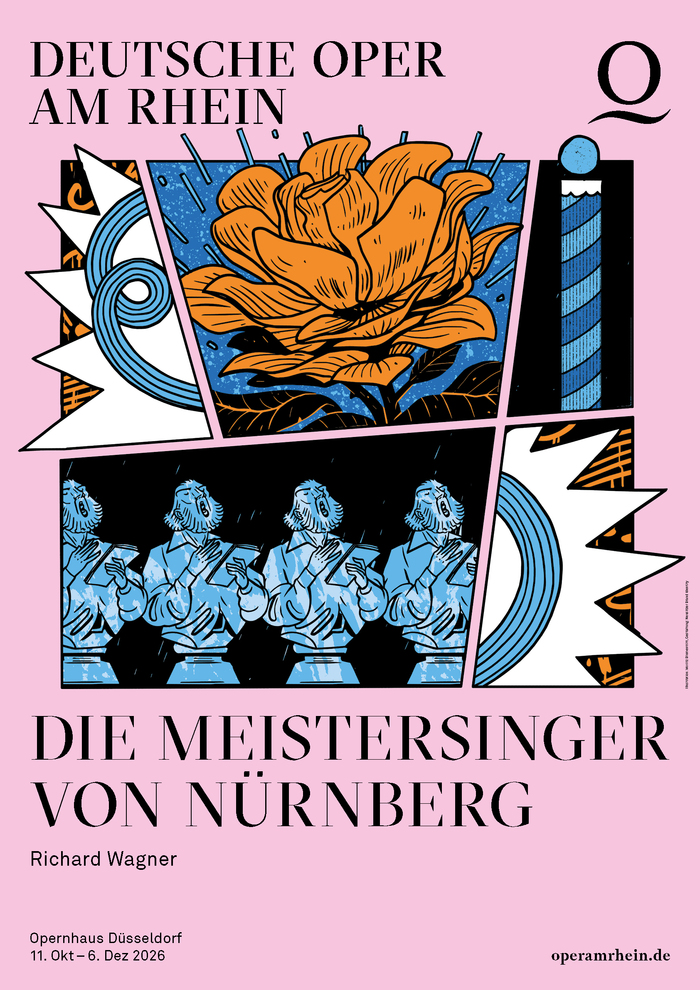
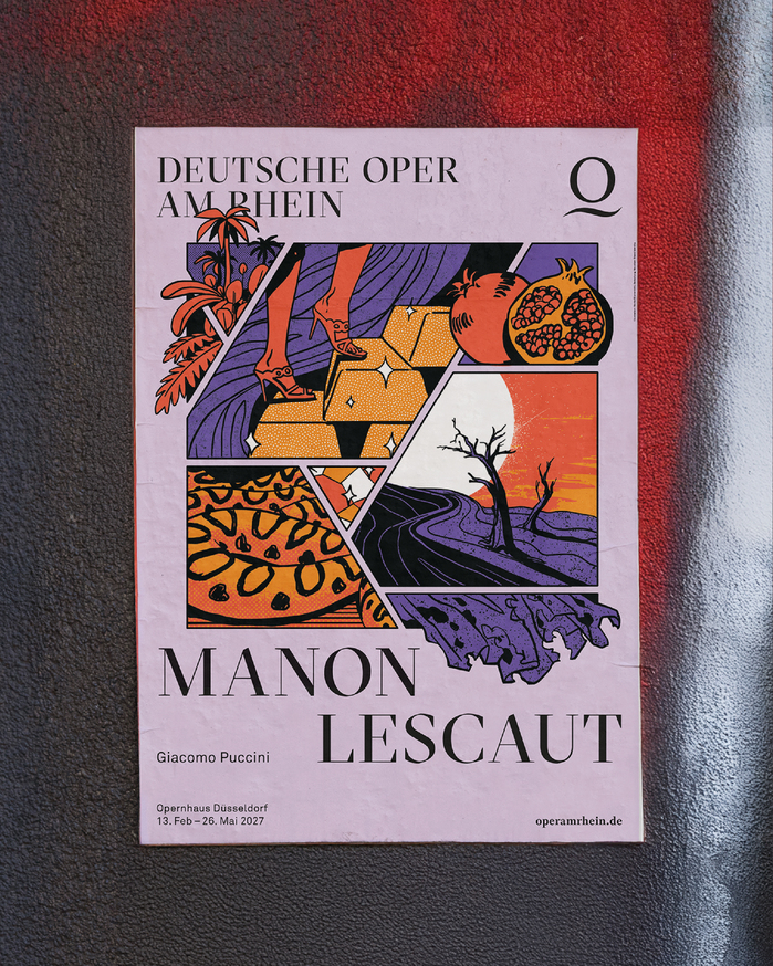
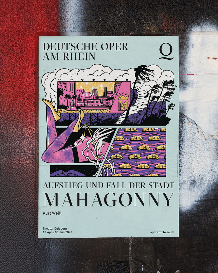
The premiere posters for Deutsche Oper am Rhein Düsseldorf Duisburg introduce a new visual language for the 2026/27 season. At the heart of the series are comic-style illustrations by Moritz Blumentritt that reinterpret well-known operas in an unexpected way, combining the aesthetics of classical opera with a contemporary, pop culture-inspired visual world. Bold outlines, flat colour fields and a reduced design give each poster a distinctive identity.
A deliberate contrast to the expressive illustrations is created by the use of GT Sectra, the company’s house typeface. This striking serif typeface combines a classical appearance with a contemporary character, creating a dynamic interplay between tradition and modernity. Its distinctive forms and pronounced contrast provide a calm typographic counterpoint to the energetic imagery, defining the visual identity of the series.
Typography and illustration are seamlessly integrated, establishing a clear visual hierarchy. Designed by Neusitzer Brand Identity, the result is a memorable poster series with a strong visual identity that captures the character of each production while giving the 2026/27 season a distinctive graphic profile.
Neusitzer Brand Identity. License: All Rights Reserved.
Neusitzer Brand Identity. License: All Rights Reserved.
Neusitzer Brand Identity. License: All Rights Reserved.
Neusitzer Brand Identity. License: All Rights Reserved.
Neusitzer Brand Identity. License: All Rights Reserved.
Neusitzer Brand Identity. License: All Rights Reserved.
Neusitzer Brand Identity. License: All Rights Reserved.
This post was originally published at Fonts In Use