Uniplay
Source: www.gardedesign.com License: All Rights Reserved.

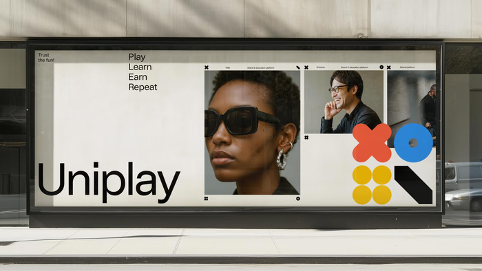
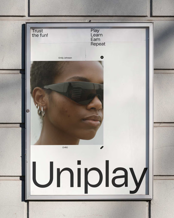
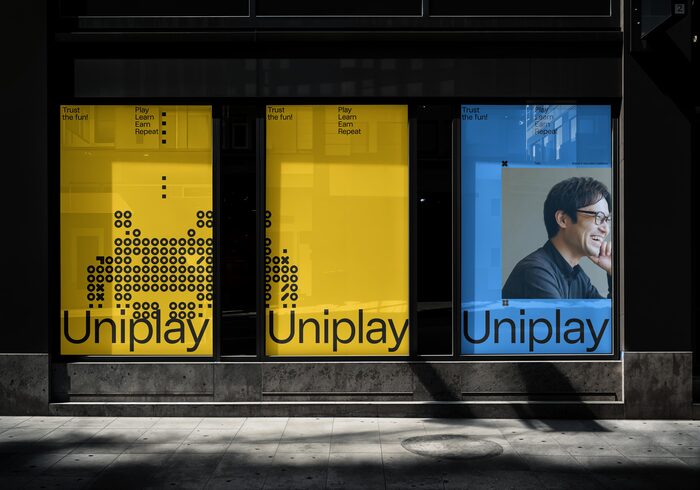
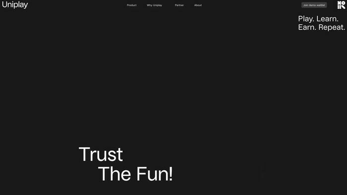
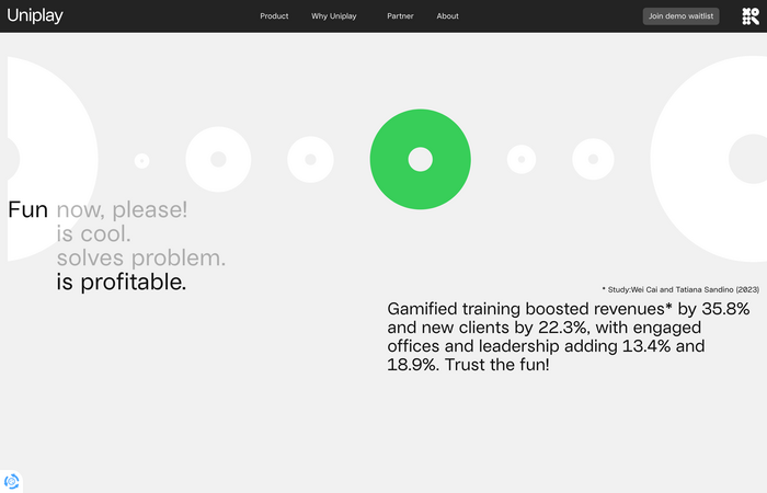
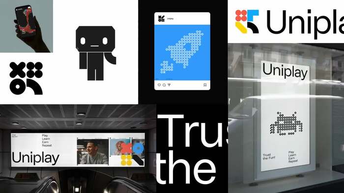
Uniplay was developed to rethink corporate learning as something engaging rather than obligatory. Rather than functioning as a static archive for brand assets and training material, the platform frames learning as play – interactive, rewarding, and designed to encourage return and participation. Gärde Design Studio was commissioned to reposition and rebrand Uniplay, developing the visual identity and its key digital touchpoints, including the website, applications, and core communication assets.
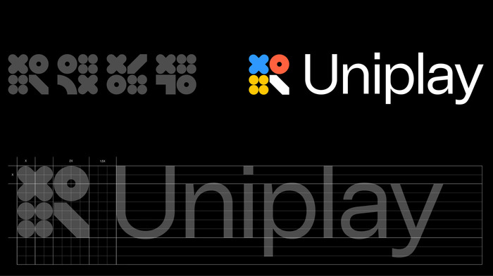
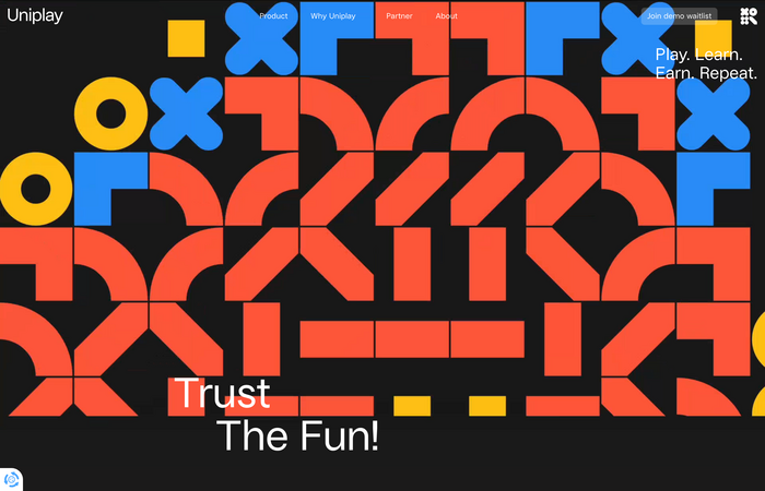
This idea shaped the visual identity, guided by the principle “Trust the Fun!”. A system of four game-inspired geometric shapes expands across logotype, illustrations, and interface elements. To ensure consistency while allowing variation, a custom Processing-based tool generates both the logo and the broader visual language.
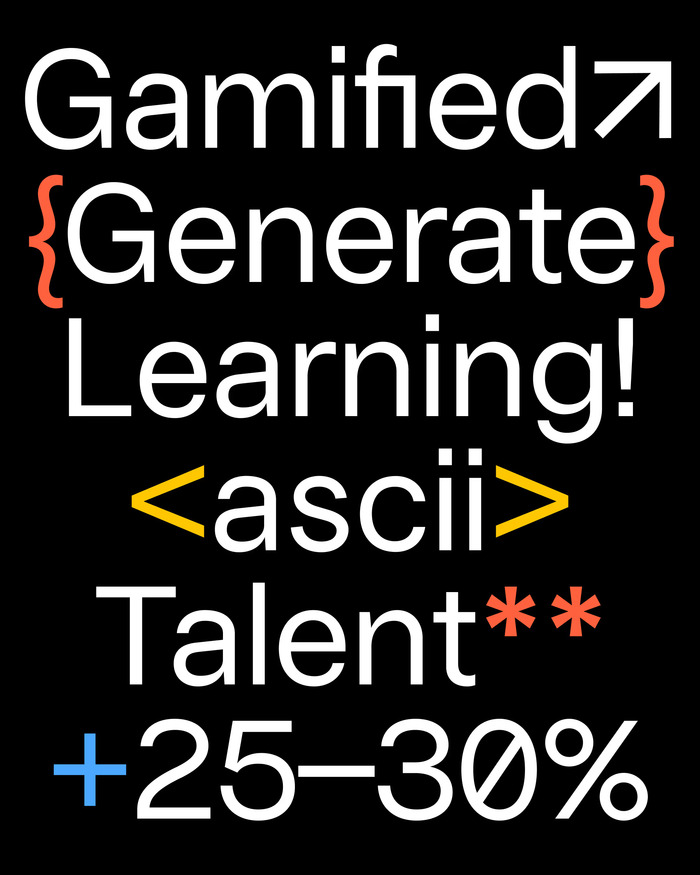
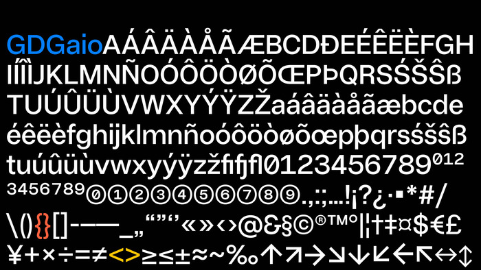
Typography is intentionally restrained. Uniplay uses GD Gaio as its primary typeface – a neutral design rooted in the tradition of ‘normal’ typefaces that prioritize clarity over expression. Optimized for screen use and supporting over 200 languages, Gaio functions as an invisible framework throughout the platform, allowing content and interaction to take precedence. By disappearing, it enables meaning to appear.
Source: www.gardedesign.com License: All Rights Reserved.
Source: uniplay.io License: All Rights Reserved.
Source: www.gardedesign.com License: All Rights Reserved.
Source: www.gardedesign.com License: All Rights Reserved.
Source: uniplay.io License: All Rights Reserved.
Source: uniplay.io License: All Rights Reserved.
Source: www.gardedesign.com License: All Rights Reserved.
Source: www.gardedesign.com License: All Rights Reserved.
Source: www.gardedesign.com License: All Rights Reserved.
This post was originally published at Fonts In Use