Boucan restaurant-bar, Nantes
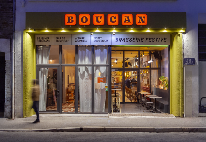
Photo: Ogaf studio. Ogaf Studio. License: All Rights Reserved.


A neighborhood neo-brasserie and festive bar, Boucan reinterprets the traditional codes of the bistro through a contemporary lens. The branding is built on a dialogue between visual heritage and modernity, conceived as a graphic reinterpretation of classic bistro references, turning the venue into a full experience rather than a simple destination.
The logo is developed through multiple variations, set in Ohno Blazeface by OH no Type Co. and Enfilade by JTD Type, reflecting the many facets of the space. The visual identity embraces bold graphic decisions, driven by expressive, sometimes playful type choices, most notably Grilli Type’s GT Haptik Rotalic, Animo by Heavyweight, and Roca by Elena Genova, which bring rhythm, movement, and character to the overall visual system.
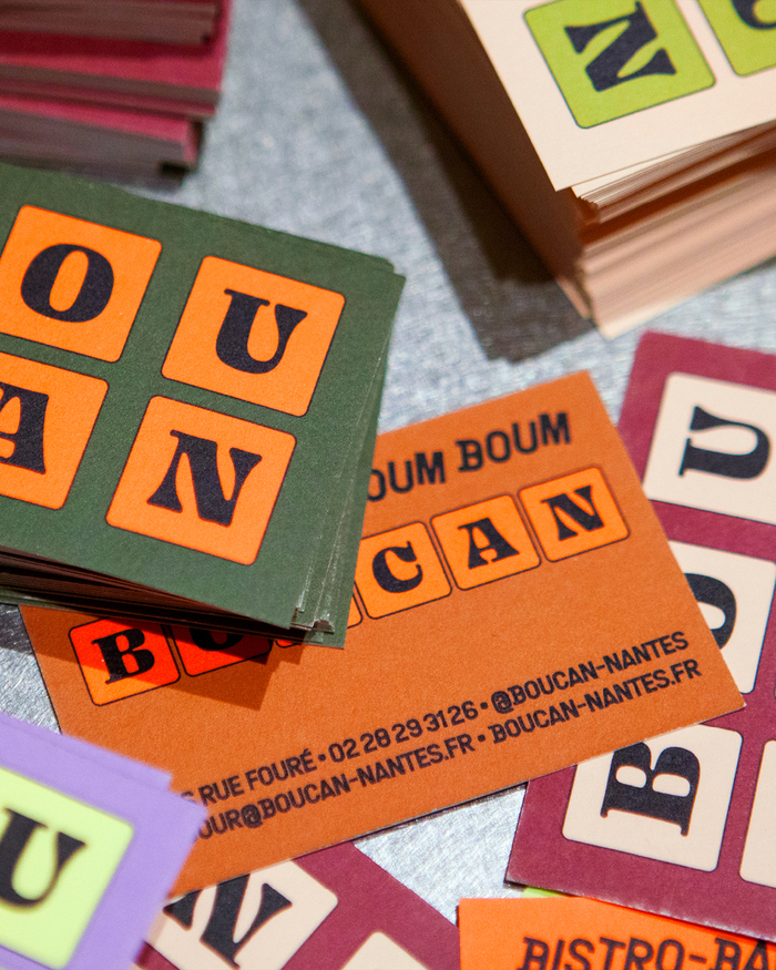
Photo: Ogaf studio. Ogaf Studio. License: All Rights Reserved.
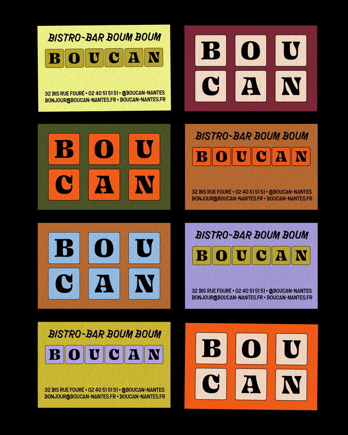
Photo: Ogaf studio. Ogaf Studio. License: All Rights Reserved.

Photo: Ogaf studio. Ogaf Studio. License: All Rights Reserved.
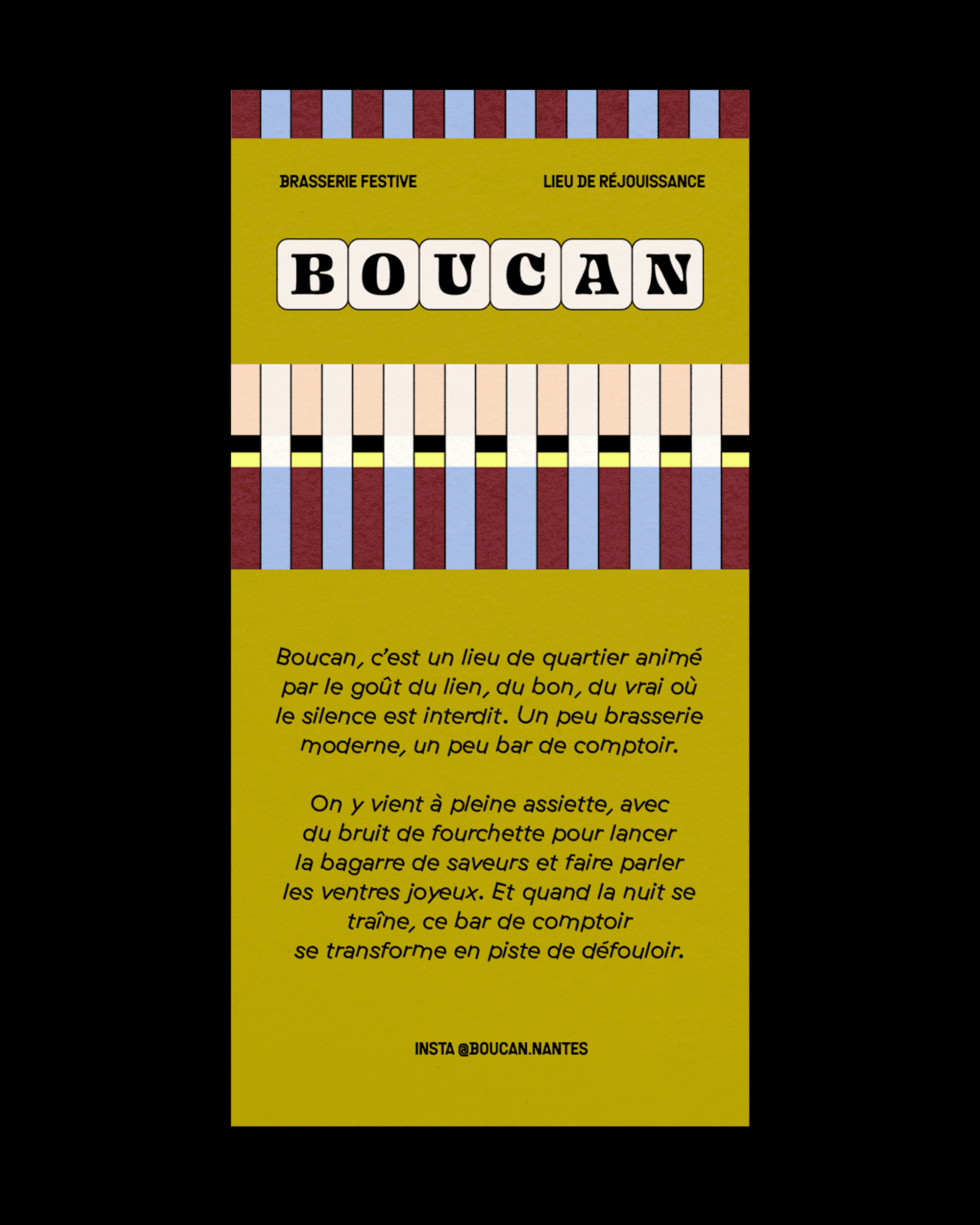
Photo: Ogaf studio. Ogaf Studio. License: All Rights Reserved.
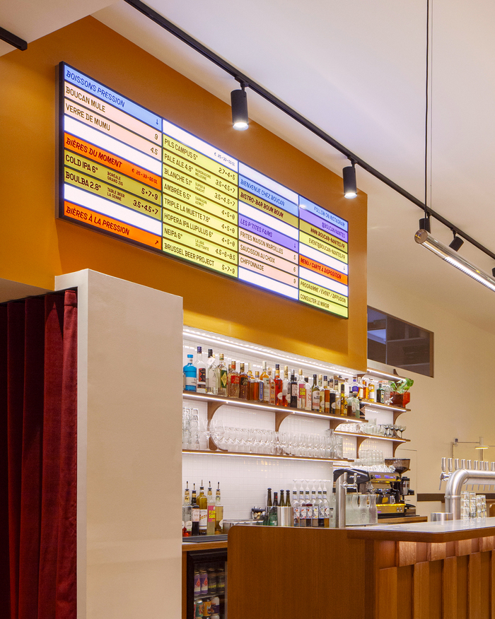
Photo: Ogaf studio. Ogaf Studio. License: All Rights Reserved.

Photo: Ogaf studio. Ogaf Studio. License: All Rights Reserved.
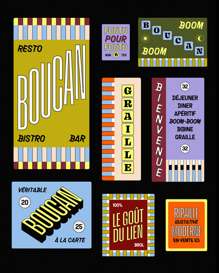
Photo: Ogaf studio. Ogaf Studio. License: All Rights Reserved.

Photo: Ogaf studio. Ogaf Studio. License: All Rights Reserved.

Photo: Ogaf studio. Ogaf Studio. License: All Rights Reserved.

Photo: Ogaf studio. Ogaf Studio. License: All Rights Reserved.
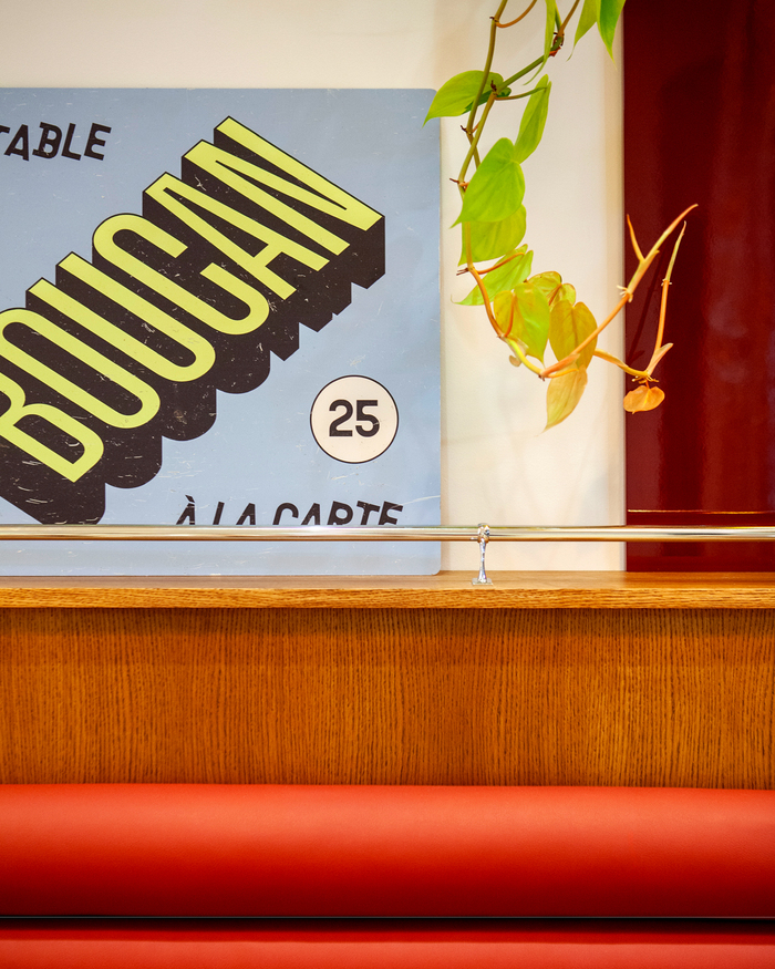
Photo: Ogaf studio. Ogaf Studio. License: All Rights Reserved.

Photo: Ogaf studio. Ogaf Studio. License: All Rights Reserved.
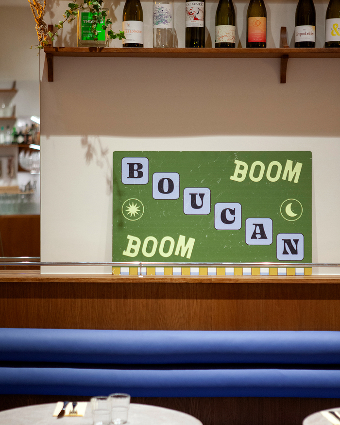
Photo: Ogaf studio. Ogaf Studio. License: All Rights Reserved.
This post was originally published at Fonts In Use