Opera Open 2024
Source: www.punkt.studio Studio Punkt. License: All Rights Reserved.


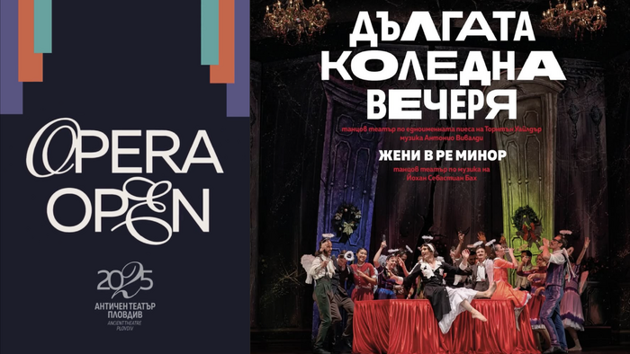
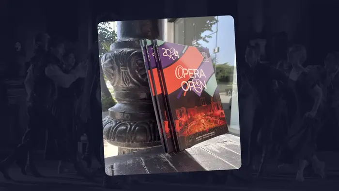
The visual identity for Opera Open 2024, the flagship festival of the State Opera Plovdiv, was designed by the Plovdiv-based Studio Punkt. Celebrating the 70th anniversary of the opera house, the branding was tasked with a delicate mission: balancing a deep respect for classical tradition with a vibrant, international spirit that appeals to modern ‘opera tourists’.
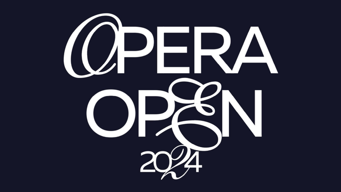
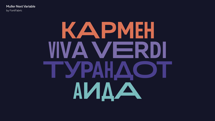
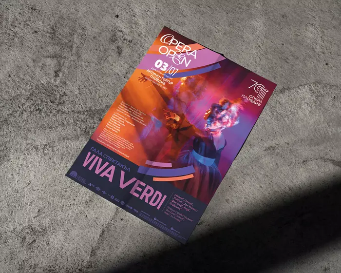
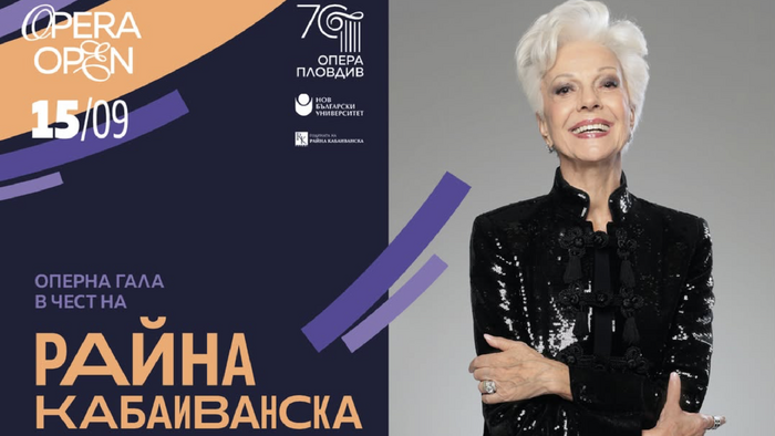
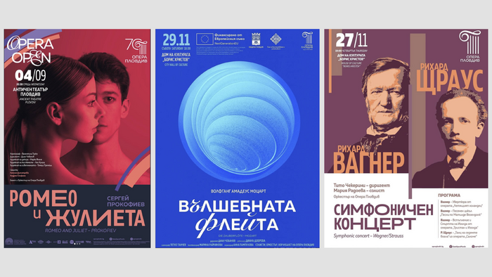
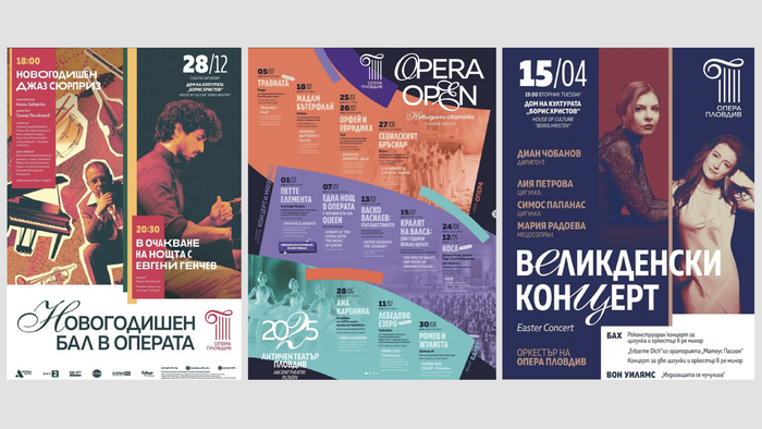
Punkt’s approach centers on a custom logo design where the O in Opera and E in Open are highlighted with script characters (either form a font, or custom lettering) to symbolize the ‘openness’ of the festival. This same ‘open’ treatment is repeated with a(nother) script typeface in the poster series. The primary typeface, Muller Next by Fontfabric, serves as the backbone of the identity. Its geometric clarity and smooth, modern aesthetic allow for seamless transitions across a massive range of formats, from high-impact street posters and space branding at the Ancient Theatre to digital platforms and sophisticated festival catalogs.
The color palette is anchored by deep blues and energized by coral, mint, and yellow accents reflects the dramatic, open-air atmosphere of Plovdiv’s UNESCO-listed Ancient Theatre. By utilizing the flexibility of a variable font, Punkt created a cohesive visual language that honors the history of the site while firmly positioning the festival as a contemporary, world-class cultural event.
Source: www.punkt.studio Studio Punkt. License: All Rights Reserved.
Source: www.punkt.studio Studio Punkt. License: All Rights Reserved.
Source: www.punkt.studio Studio Punkt. License: All Rights Reserved.
Source: www.punkt.studio Studio Punkt. License: All Rights Reserved.
Source: www.punkt.studio Studio Punkt. License: All Rights Reserved.
Source: www.punkt.studio Studio Punkt. License: All Rights Reserved.
Source: www.punkt.studio Studio Punkt. License: All Rights Reserved.
Source: www.punkt.studio Studio Punkt. License: All Rights Reserved.
This post was originally published at Fonts In Use