FT Weekend Magazine, 11 Oct 2025, “The Very Real Trials of Living with Misophonia”
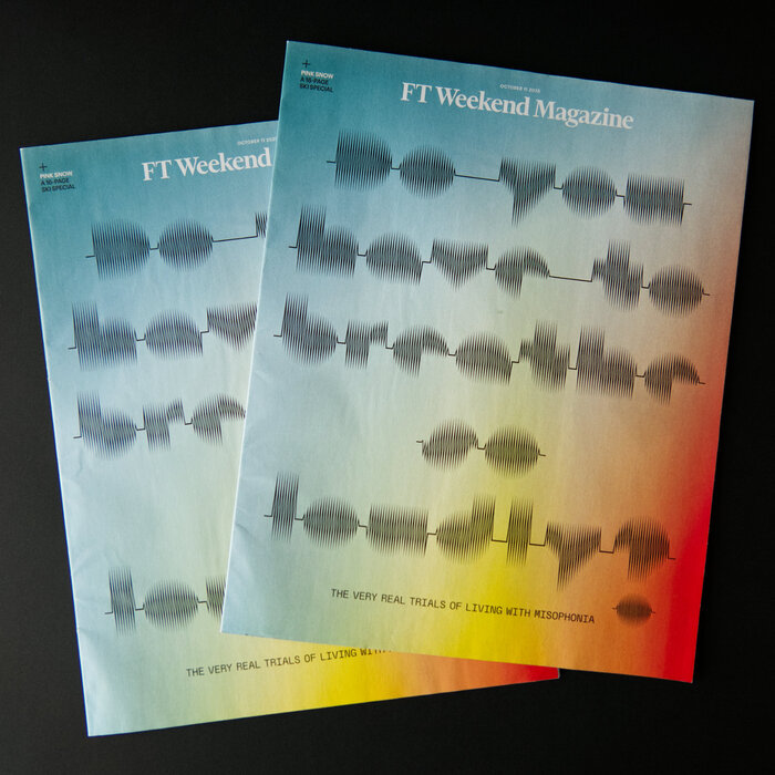
Photo: Edgar Walthert. License: All Rights Reserved.
In September 2025, Brian Saffer, Art Director at FT Weekend Magazine, reached out to me about the possibilities of using my typeface Sonic Waves. He was working on the cover design for an issue about a misophonia, a hatred of particular noises. Brian Saffer created an uppercase D and added a dot below the question mark, to increase readability.
At the release date of October 11th, an e-mail by a FT reader reached me, pointing out how a typeface I made for the love of music is now used for the opposite purpose. That is not unusual in type design, since we develop tools that are not finished products but will be applied for various purposes by their users.
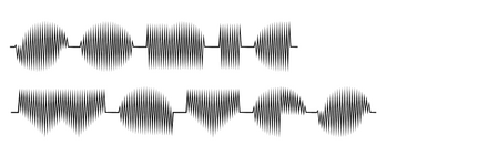
Sonic Waves was created in 2008 for the online and offline exhibition Into Infinity organised by dublab. As an occasional DJ and designer for the web radio station, I took it on to combine these two practices into one. Inspired by the spectrographic images that Aphex Twin embedded in some of his tracks and waveform art shared in early 2000s IDM forums, I was researching the possibilities of drawing or shaping sound waves into letters. A Mac OS 9 audio software that I was still able to run on my PowerBook enabled me to achieve this. In the mode that made it possible to manipulate the waves, the proportions were horizontal stretched. The process to create the shapes I needed was to work with elliptic outlines on transparent paper that I laid on top of the screen as templates to fill in. The typeface was accompanied by sound files in scales C, C#, B, D and H. The font comprised lowercase letters only, since many uppercase letters would have been difficult, impossible or proportionally awkward to make. The middle line lays at the centre of the x-height. This creates many restrictions which already forced met to set the numbers in italic. Without that trick, 0 and 8 would be indistinguishable.
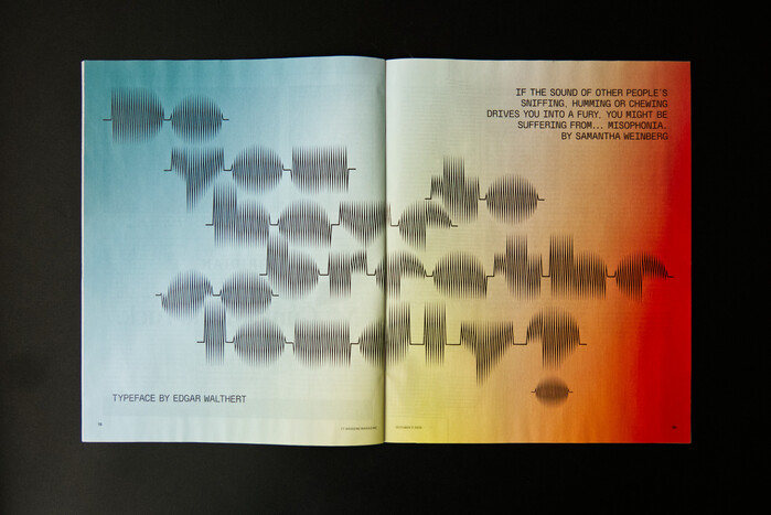
Photo: Edgar Walthert. License: All Rights Reserved.
Opening spread for the article by Samantha Weinberg
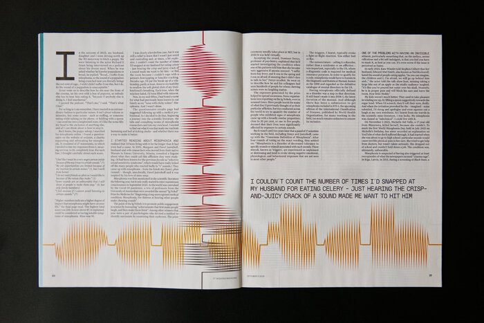
Photo: Edgar Walthert. License: All Rights Reserved.
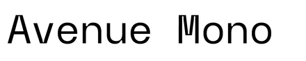
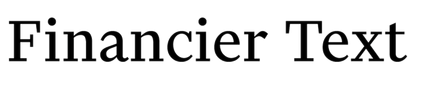
The other typefaces used alongside Sonic Waves are all-caps Avenue Mono and the FT’s standard Financier Text.
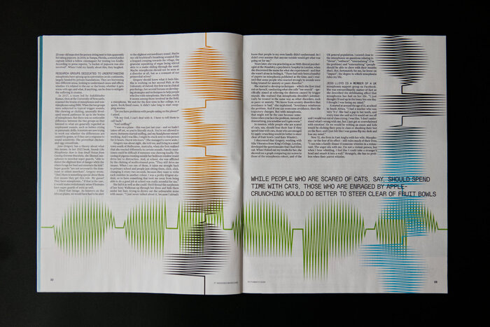
Photo: Edgar Walthert. License: All Rights Reserved.
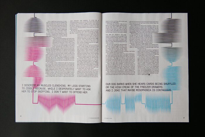
Photo: Edgar Walthert. License: All Rights Reserved.
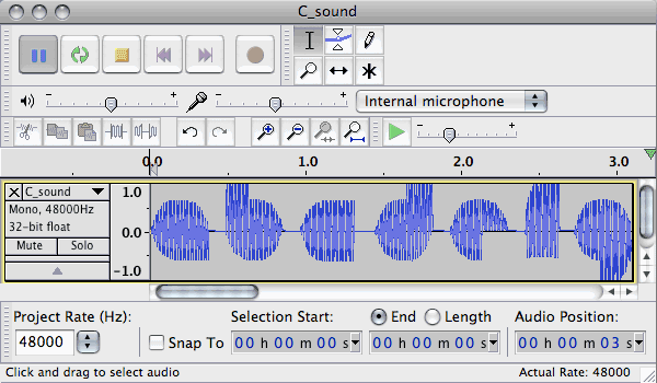
Photo: Edgar Walthert. License: All Rights Reserved.
A Mac OS 9 sound editor with the ability to draw sound waves manually

Photo: Edgar Walthert. License: All Rights Reserved.
Audio type specimen: here’s what Sonic Waves sounds like.
This post was originally published at Fonts In Use