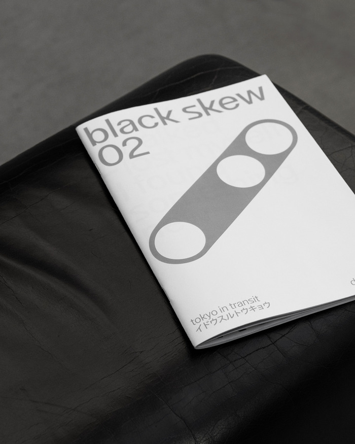
Black Skew 02, “Tokyo in Transit”
Source: www.instagram.com Black Skew, Dogma Studio. License: All Rights Reserved.


Launched during the Tokyo Art Book Fair 2025 at the MOT Contemporary Museum of Arts, this book is presented as follows by its designer Black Skew:
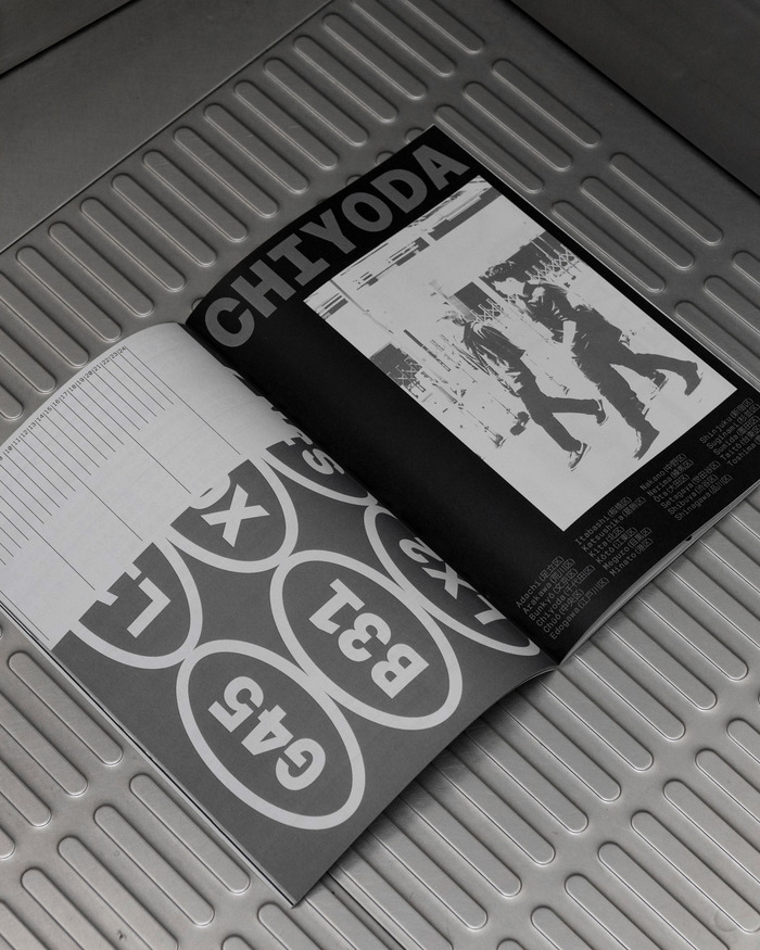
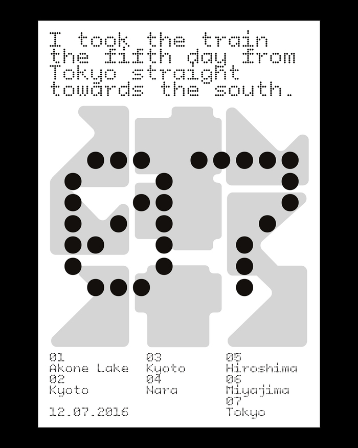
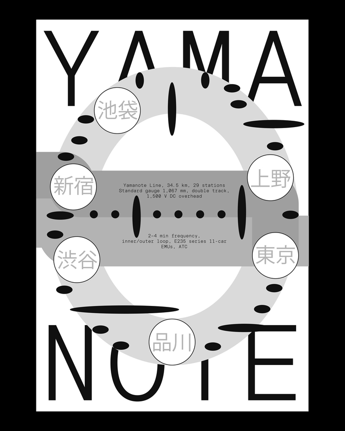
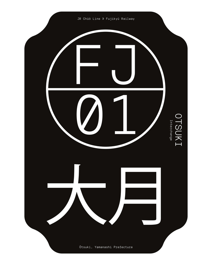
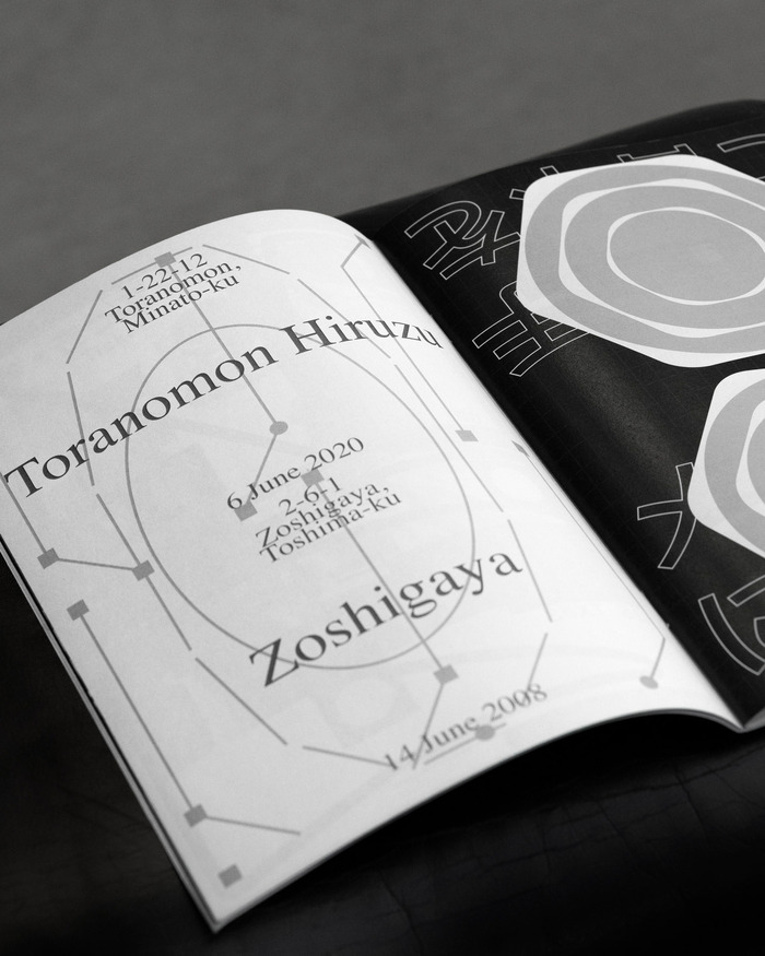
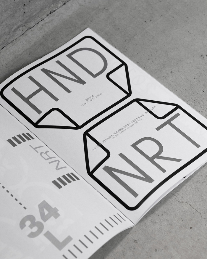
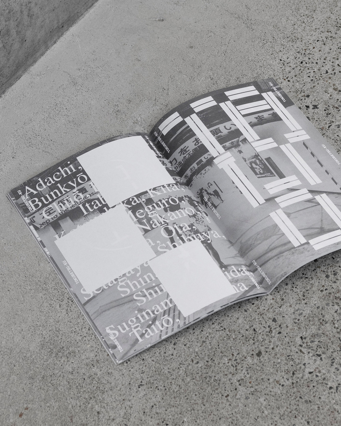
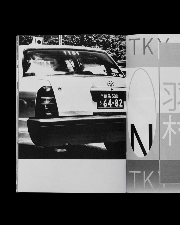
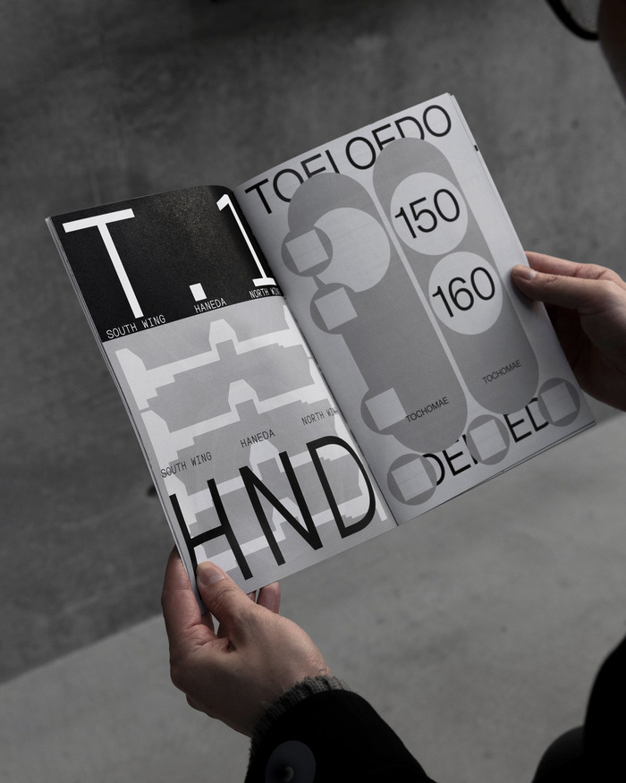
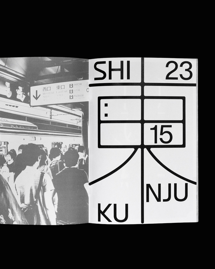
This second edition is a creative exploration of the everyday graphics of Tokyo and its surroundings, with a particular focus on the dense network of visual information in the capital’s transport system.
The issue examines the graphic systems that shape how we move through the city: from the micro-typography of subway maps and arrows on asphalt, to pedestrian-level signage, street-side billboards, bus and metro stops, airport signage, tactile paving, and multilingual instructional graphics. From metro signage to roadside warnings, it frames Tokyo not only as a city of buildings, but as a city of signals.
The project moves between visual research and reinvention.
The typefaces used are Lay Grotesk by Massimiliano Vitti (Due Studio), Ufficio Mono, DGM Composta and Ufficio Display by Giulia Boggio (Dogma Studio), as well as Kozuka Gothic for Japanese text and Times New Roman.
It was printed by Lasergraph in Milan, Italy, on Munken Print 90gsm. The book spans 48 pages and is bound with saddle stitch.
Source: www.instagram.com Black Skew, Dogma Studio. License: All Rights Reserved.
Source: www.instagram.com Black Skew, Dogma Studio. License: All Rights Reserved.
Source: www.instagram.com Black Skew, Dogma Studio. License: All Rights Reserved.
Source: www.instagram.com Black Skew, Dogma Studio. License: All Rights Reserved.
Source: www.instagram.com Black Skew, Dogma Studio. License: All Rights Reserved.
Source: www.instagram.com Black Skew, Dogma Studio. License: All Rights Reserved.
Source: www.instagram.com Black Skew, Dogma Studio. License: All Rights Reserved.
Source: www.instagram.com Black Skew, Dogma Studio. License: All Rights Reserved.
Source: www.instagram.com Black Skew, Dogma Studio. License: All Rights Reserved.
Source: www.instagram.com Black Skew, Dogma Studio. License: All Rights Reserved.
This post was originally published at Fonts In Use