Turley (2026 rebrand)
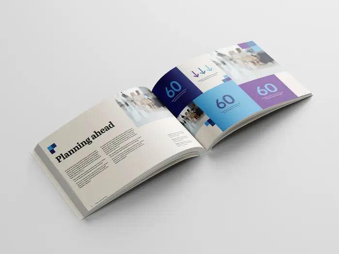
Photo: Chris Hemsley. Turley Creative Studio. License: All Rights Reserved.
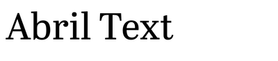
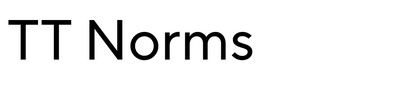
Turley’s in-house creative team undertook a rebranding exercise to align the company’s visual identity with its refreshed value proposition and strategic focus on People, Place and Planet. As part of this evolution, TT Norms was selected to replace Omnes as the primary brand typeface.
TT Norms brings a more human, functional quality, balancing warmth with clarity. Its neutral structure and contemporary proportions support clear communication across a wide range of applications, while its subtle character reinforces Turley’s people-first approach and professional credibility.
Abril Text is used sparingly for headings and pull quotes, introducing contrast and editorial emphasis. Its more expressive, serif form adds depth and moments of distinction, complementing TT Norms without competing with the overall clarity and accessibility of the system.

Photo: Chris Hemsley. Turley Creative Studio. License: All Rights Reserved.
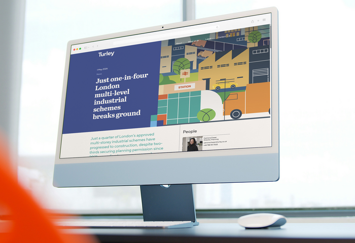
Photo: Chris Hemsley. Turley Creative Studio. License: All Rights Reserved.
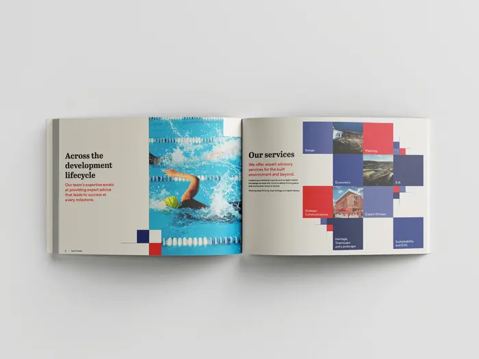
Photo: Chris Hemsley. Turley Creative Studio. License: All Rights Reserved.
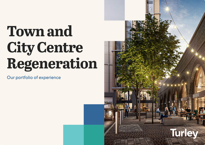
Photo: Chris Hemsley. Turley Creative Studio. License: All Rights Reserved.
This post was originally published at Fonts In Use