Thierry Mugler: Couturissime at Brooklyn Museum
Source: www.fairetype.com License: All Rights Reserved.

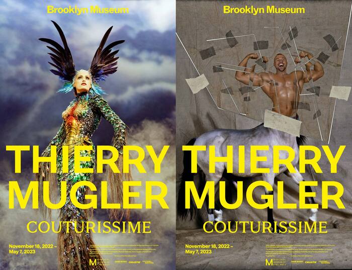
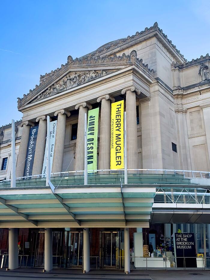
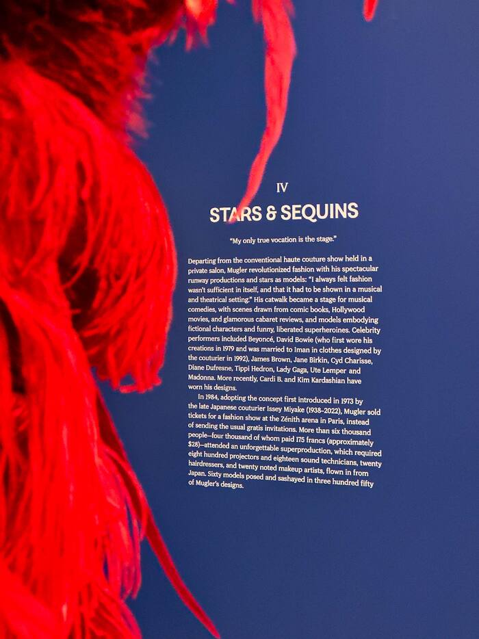
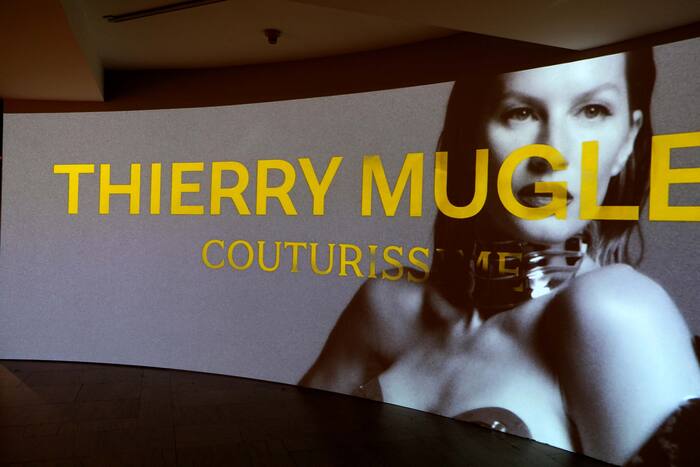
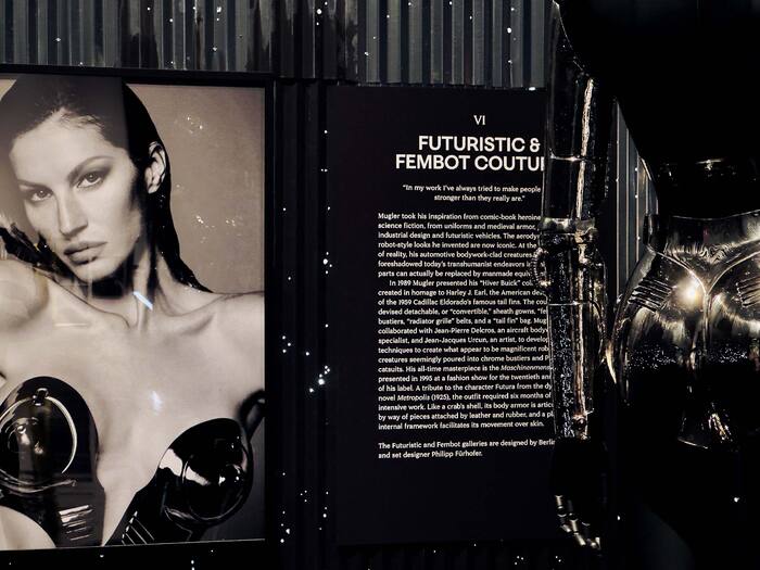
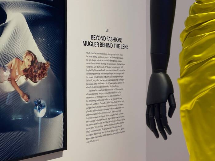
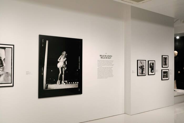
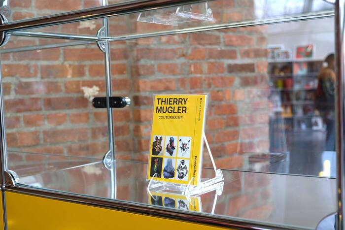
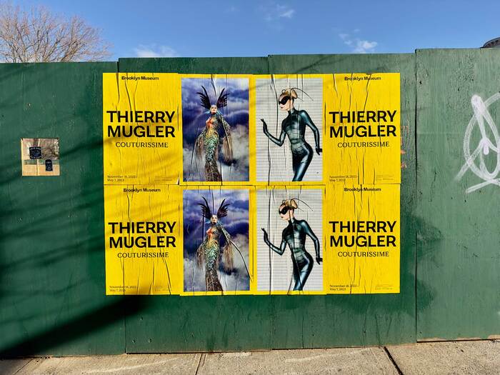
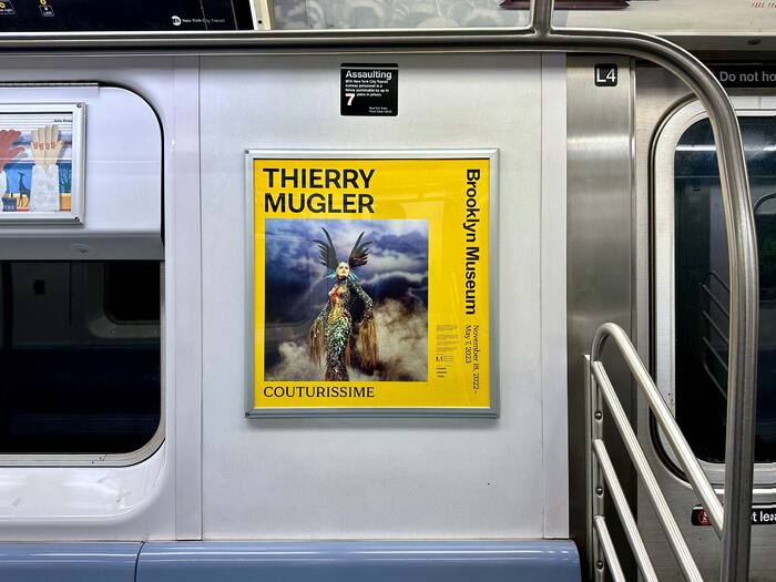
Couturissime, the retrospective of the life and career of French fashion designer Thierry Mugler, made its final stop at the Brooklyn Museum in 2022, where it received a new graphic identity treatment. The weight-modulated typography of the title, marketing, and didactics – set in the pairing of Faire Type’s Sprig and Sprig Sans – reflect the idiosyncratic humanist elegance present throughout Mugler’s work (even in his futuristic “Fembots”). Glossy, translucent wall labels wink at artifice and adapt to the frequent shifts in color and materiality in the many galleries of the exhibition. A bright yellow dominates the marketing materials, chosen specifically by Mugler before his passing. And wisps of smoke both reveal and obscure the title wall lettering, inspired by the clouded catwalk introduction of his masterpiece, “La Chimère” (Fall/Winter 1997–98).
Source: www.fairetype.com License: All Rights Reserved.
Source: www.fairetype.com License: All Rights Reserved.
Source: www.fairetype.com License: All Rights Reserved.
Source: www.fairetype.com License: All Rights Reserved.
Source: www.fairetype.com License: All Rights Reserved.
Source: www.fairetype.com License: All Rights Reserved.
Source: www.fairetype.com License: All Rights Reserved.
Source: www.fairetype.com License: All Rights Reserved.
Source: www.fairetype.com License: All Rights Reserved.
This post was originally published at Fonts In Use