Sun Baby
Source: www.mude.com.au Mude. License: All Rights Reserved.


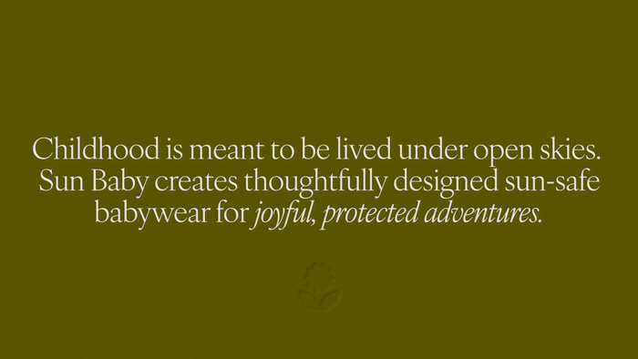
Sun Baby started with a problem every new parent knows too well: keeping your baby cool, safe, and comfortable in the harsh Australian sun.
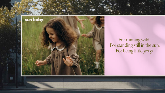
For founder Amy, that challenge sparked something bigger. A social enterprise built around protective clothing that doesn’t compromise on style or substance. We shaped a visual identity that reflects the world Amy is creating, where kids can play freely, and parents feel good about what they put on their child.
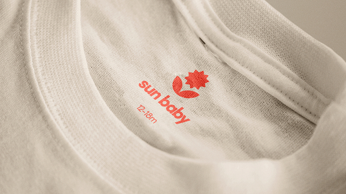
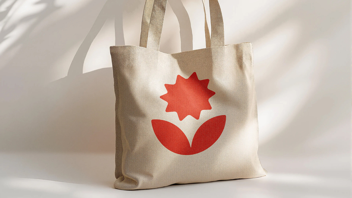
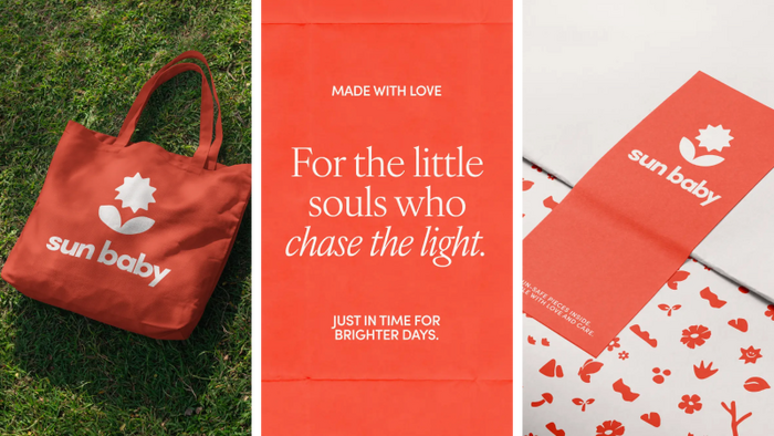
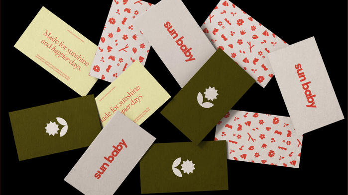
Whimsical illustrations nod to childhood without tipping into cute-for-cute’s-sake. A muted, nature-led colour palette gives the brand a little more maturity. And the logo is bold but soft, like the clothing itself. Sun Baby is for families who spend weekends outside. Who care where things come from. Who want their kid to look great in the group photo, and still be crawling through the grass five minutes later.
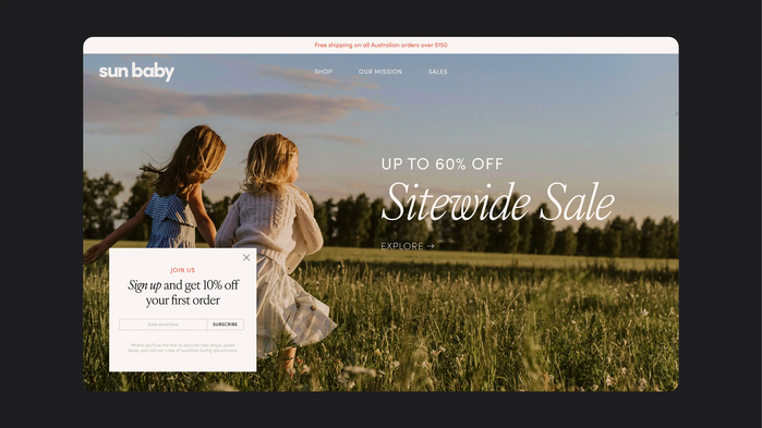
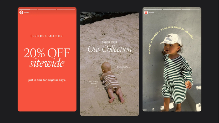
Typography pairs IvyOra Text, a serif with quiet historical weight, against Sofia Pro for body copy and labels, and we stayed mature on the type system on purpose. The category leans hard on novelty fonts, hand-lettering and rainbow display work, and a lot of the smaller brands rely on licensed-IP cartoon prints (Cookie Monster, Dora, Bluey) to do the personality work the brand itself should be doing. Holding the type closer to a fashion brand’s register – with Seed Heritage and Pure Baby as the comparable references parents already trusted – does more for Sun Baby’s price point than another playful font would, and frees the colour system and pattern to handle the warmth and play the brand needs.

Source: www.mude.com.au Mude. License: All Rights Reserved.
Source: www.mude.com.au Mude. License: All Rights Reserved.
Source: www.mude.com.au Mude. License: All Rights Reserved.
Source: www.mude.com.au Mude. License: All Rights Reserved.
Source: www.mude.com.au Mude. License: All Rights Reserved.
Source: www.mude.com.au Mude. License: All Rights Reserved.
Source: www.mude.com.au Mude. License: All Rights Reserved.
Source: www.mude.com.au Mude. License: All Rights Reserved.
This post was originally published at Fonts In Use